Statement Of Intent
My statement of intent will focus on photography and specifically portrait photography. I aim to use sets that are to my avail and capture photos of people, that also fuse well with the surroundings, in order to deliver stunning photos that can then translate into an even more intricate and theme followed edit.
I want to look at different angles of capturing my work,becoming more self-sufficient on my own vices I will create based on the work of others.Using what's around me and sampling it to manipulate bad weather into being a base for good photographic opportunities.Using buildings for a background is something i'm keen on as I like skylines for the way it splits them apart and makes a city stand tall.I want to get the opportunity to use the Manchester skyline as its the city i'm situated in and as well as that one day do a photo shoot in London,in general the city is more busy and there are more opportunities for photographic beauty.
In the field of photography, there are many photographers that I would like to sample still, in portrait photography terms, there's a lesser amount but there's still some photographers that I would admire the work of and seek to make my own revelations of when it comes to taking photos. While Alyssa Trofort is a sports photographer, I would like to adapt her work and take some positions and adapt it into a photo-shoot that revolves around a smart theme. The reason I have chosen her as a model to follow is because the active and alive feeling her work has to me is one I want to radiate off of my photos, she makes her photos filled with motions that are about to happen, are happening, or have happened. To help my match Trofort will increase my shutter speed and make my model engage in certain movements. Another photographer that I want to use and sample is David Bailey, his black and white portraits seem to interest me a lot and the way the model is positioned in some full body shots are shots that I want to really expand on and make more with. He also makes the pictures feel emotionless with the lack of colour, which is an aspect I'm interested in integrating into my final results. He also has other portraits that see models stood to one side and in very jumpy positions, which add a silver lining of human emotion and colour into his photos. To edit my photos like his ill be de-saturating my pictures and adding a subtle essence of vintage into the mix. With the camera I would like to make my photos more darker by tuning down the ISO heavily and changing the white balance or keeping it at auto, and in brighter environments I would like to make the photos ideal and use the sunlight to reflect onto my model into a natural area and to hit of them in a way that makes my photos look more satisfying. As for indoor shoots I will use my lighting in the side profile view of where I'm taking the picture of my model from and use many different types of coloured lighting. In photoshop if I wanted to match Trofort's type of photos I might add in a brand of sporting to make it more in the advertisement region of photoshoots, or use a logo already in the photo and really make it come forward and stand out. To match David Bailey's type of photography I would need to de-saturate them as said before and then add a bit of a vintage look to the photos, as like they were taken in the 1950's.
Overall, I want to use what I have learnt from the past, present and future to make myself a distinguishable photographer and have an idea of what I want to do for anytime I may need to step in as a planner for making ideas come to life. There's also colourful and colourless areas of photography I aim to get into and see if it fits into what I like in my style, I want to have my hand at many different corners and see which styles sticks to me best and which ones I would love to take more photos in and edit into. I want to use the tips I get now and later too for future reference and to also pick up the art of editing so that I am much quicker and efficient with my work.
Coggle
In Depth photo analysis - Young Cossete - (Annie Leibovitz)

Context
This picture was taken by Annie Leibovitz in 2012 as part of promotion for the movie 'Les Misérables'. However the movie is an adaptation of the play from the same name which has been running since 8th October 1985,coincidentally 6 days after Annie Leibovitz's 36th birthday. The photo in question is arguably one of the most famous photos she has taken and is a good example to look to for photographers. Annie Leibovitz is 73 years old and is from Waterbury, Connecticut, USA. She was born on October 2nd,1949 and was born to an Estonian mother and Romanian father. She graduated through the San Francisco Art Institute. This image does link to some political history from 2012, most specifically the Typhoon Bopha/Pablo, the disaster that lasted from the 25th November 2012-9th December 2012 saw the strongest typhoon in recorded Mindanao history (3rd in Philippines history) hit the island and saw speeds of 175mph cause $1.16 Billion of damage to the country of the Philippines, as well as affect the neighboring Oceanic countries of Palau and Micronesia, tragically killing 1,067 people and also leaving thousands starving as a food shortage subsequently followed from the mass amount of damage, the food shortage problem is the link to the play of Les Misérables as its in the plot line.
Content
This image displays a girl who is in despair, judging by her facial looks, what she has seen is unknown but we can see she might have been subdued over a tragic event, maybe she is in a bad feel or is generally like this. As for things happening there isn't much to go off of, but we can see wind blowing her hair so maybe she's in a dark cold environment. The photo is portrait as the girl is the main subject of the image. The photo can represent a bleak sense of reality to her as the whole photo is negative and her eyes popping out is the only vibrant thing in this. She might've just seen something tragic happen and so she's still feeling all the feels or this could be after its happened. The picture is realistic but there is a bit of editing on it, the light seems to have been made a bit brighter and then more bleak through editing and her eyes are more vibrant which is a result of editing, maybe to give a bit of an emotional look to me, but the image to me still retains a sense of realism. I can confidently say this images theme is bleak and traumatic with emptiness mixed into the image too. Maybe the bleak and down mood of the photo could reflect the movie and its negative features in the character. I could also be that maybe the expressions and somber look is an unseen reaction of something that happens in the movie. It couldn't be an unrealistic idea that possibly the society around her is one that indicates feelings of being overruled or powerless and everyone you see in that society evokes the emotion that she has in the photo. Almost like like everyone is in an unforgiving cycle of life that loops because someone or something is in control. The title of the photo is 'Young Cosette' Probably being in reference to the girls name in the movie (possibly) being Young Cosette. The ill fated and despaired face she gives can be seen as a notable meaning in this image to get our senses through with the disappointment Annie is trying to bring out on us via this image, she does this with her face and intentionally providing her with the bleak background and hair blowing a certain direction, indicating something major is happening on one side and other doesn't have anything major being indicated to us, getting us to focus on the more right side of the image, where it's more lively and more is happening. Her eyes also being the most vibrant and beaming point in the image can exaggerate the sense of a beaming light in this image as the eyes are surrounded by a ton of negative, cold and unwelcoming feelings that bring the image back into to drab feeling that's trying to be evoked by Leibovitz.
In the area of composition now, there is the rule of odds used as she's off center, there's also the rule of thirds, she is fully on one part of the picture and that's the right side. The leading lines is her hair being blown across the photo. These compositional decisions have been made by Leibovitz to enhance this image from a raw as well as completed look. The leading lines of her hair help guide us towards the models face and her monotone expression, getting us to wonder and dwindle on the thought, bringing out that sad, depressing tone to everyone. One of the other features, the rule of odds could be here to make the space feel awkwardly empty, as is someone else should be there but instead isn't, the space doesn't feel satisfyingly open enough as little part of her head is also out of frame, the space maybe being too open. Potentially without the rule of thirds in this image, the blue-greyish center of the background wouldn't be able to come out as averagely vibrant, exclaiming that niche, negative mood the girls face also tries to bring out, the backdrop also fades out in brightness, quickly into more darker tones in the corners of the image. As for depth of field you can see it in her being in front of the background and she's in focus and the background is slightly out of focus. Spacing is also used in the image. The shot is clearly framed as this is how its done with all photoshoots, a tripod looks to have been used in this image as the stillness on it and how straight it is doesn't seem to make it a freehand photo. For settings I would say the White Balance is in the range of Tungsten, for the ISO I would go with 800 as the image seems brighter than 100,200 and 400 ISO settings, but not higher than 1600 ISO as that setting seems too bright to me. I think the Aperture used is F8 as the image has the girl in focus while the background is a bit out of focus, but not too out of focus. Then there's Shutter Speed, for me I think its 1/1000, everything looks clear in the image to me. Lastly there's lighting which can also count as content, for me here I see the lighting being placed to the right and in a square frame, the positioning being there could be there because Leibovitz wanted the focus onto the girls face and to show her sadness even more in effect, which adds to what I saw in this image from my POV. It does feel like the lighting comes in from the sides, specifically from the left in which the light half hits her face and half the backdrop. That light fades off into the right side of the image slowly after fading in from the left. There's also in my opinion exaggeration on where her eyes were exaggerated too, and the purpose of this could be for the attention it draws to how sad the lighting collides with her eyes. These compositional rules had a good way of adding to the emotion the image already shows, the leading lines in her hair allows it to seem like its more clear to why there's an emotionless reaction, as like its come from somewhere off screen and she's watching on from the side of the incident.
And finally for my connection, I actually like the photo despite its negative connotations and how its not vibrant, I don't love the photo but I do like it, The work could link to min the form that my baseline shoot has the most similar background and lighting to my photos from that shoot, the biggest difference is the theme as mine looks more positive and fun with the smiles, meanwhile Annie Leibovitz's photo is negative, drab, macabre, somber. I could use these ideas for a photoshoot in the future if I choose to go with more darker colours and photos that don't have positivity in them. I could improve my skills with this photo in the form of the rule of odds.
In Depth Photo Analysis 2 - F1 Boxenstopp 1 (Andreas Gurksy)

In this image we see 2 F1 cars from the 2007 season during a pitstop. This was a part of 4 images in a collection named 'F1 Boxenstopp' (which translates to F1 Pitstop) which was made in 2007. The image above is the first one of all the 4. This picture has been taken during a race as pitstops are only done during a race. But there could be a spice up of different F1 races throughout the season being in here due to how collaged and edited it feels. The image was taken by Andreas Gursky, who was born on 15th January 1955 in Leipzig, Germany, currently he is 67 years old, he is also a professor at Kunstakademie Düsseldorf and had his works go for a lot of money, in fact one of these photos was sold for $2.48m (£1.27m).There isn't anything political in this photo as its a photo of 2 F1 cars that weren't politically tied to any F1 controversy. Gursky attended Kunstakademie Düsseldorf and the University of Duisburg-Essen for his education.
The content of this image shows 2 F1 cars who have just pitted during a race to receive a new fresh pair of wheels. The image is a wide landscape. As said in my first paragraph the title of this image is 'F1 Boxenstopp' which is part of the 'F1 Boxenstopp' collage by Gursky. I would personally say that the images title doesn't change the way you could see this work as boxenstopp in English is just the word pitstop which is what the cars are currently in the middle of in the photo. The photo has realistic elements there but the light is all focused on the 2 F1 cars plus the engineers, which starts to question its realism, especially since the surrounding area and the spectators are more greyed out and less vibrant. The image has an exaggeration of all the engineers and cars down at the garage being brighter than anything else in the image, and the lowly natural light of everything else makes the cars and the engineers the central focal point of the image. I feel like the message here doesn't have a specific one to tell, but rather it focuses on a theme of rush and adrenaline as a pitstop normally has to be very quick and efficient.
Moving onto composition and there are a couple things that I can say about this image. There aren't leading lines to really see in this image and there wouldn't be anywhere to put some as the subjects of the photo (which mainly are the F1 cars) are at the center of the image, in terms of depth of field there's nothing really out of focus in the photo, the only out of focus things are the crowd in the background, which look to also have been edited in. A rule that has been implemented is symmetry with the 2 F1 cars seeming to be facing the same way and are the same in size, this also means there's the rule of even due to the 2 cars. A tripod looks to have been used in the photo as it seems too stable for it to be handheld. I personally think that the settings in the image are a bit harder to pinpoint, but I think that since there's a mashup of things in this then the white balance on the cars was daylight as they shine the most, and the garage and fans were taken in a shade or auto white balance. Personally for the cars and the background despite different lighting I could see them both having an auto ISO when the photo was taken, in terms of F-stop and aperture then I would say that for the cars and engineers, there's a lower F-stop meaning a bigger circle allowing more light being let in for a clearer look on them, the crowd however seems more out of focus and that gives me the assumption that there's a larger F-stop and so a smaller circle for light to be let in.
And finally for my connection. I would say I like the use of how the cars and engineers are the standout point from the image, it creates a different feel down at the garage when compared to the basic and non enchanting themes of the crowd and surroundings, kind of a good synergy I could say, I also like how the cars also radiate that light onto a small little fraction of the crowd too, and also how all the engineers kind of pass on that light. I think that the light however should come from the crowd as they make F1 races more intense and fast paced with how much they would encourage the people to work at their fastest and most efficient. Overall though, I do like this image, if there were links I could make it would only be how the light of the cars is something I like applying onto my models when doing a photoshoot, getting them into a position where the light is naturally on them is what I feel makes my photos better and enhances them.
3rd Portrait Analysis - La Fibre Londonienne (David Bailey)
This photo here was taken by David Bailey and has famous British model Kate Moss as the woman in this picture. He had this made for Vouge Paris in a little set photos called "La Fibre Londonienne" which translated to English loosely means 'The London Fiber'. The other images are mainly her in other portrait stances with one being backed by French text. From what I see, I don't see there being any political purpose behind the image, but also the date of when this photo was taken still being unknown, Bailey also find himself often working with Vogue too, haven taken nearly 100 cover images for the British Vogue.
The image here shows Kate Moss with her hair fully flowing to the right of the image, with her having her upper body covered by nothing. Her attention is fully at the camera too with some unreadable text in the bottom right, the image is completely greyed out as well. The picture as a whole could be this abstract portrait because of how little there is to this photo, being very in line with the photos David Bailey normally takes. The image here could be this representation of the confidence Moss has in herself, making her face the most out feature of the whole image. The image doesn't have an entire level of realism to it as her hair is most likely being blown back by a fan out of frame that's strong enough to make her hair go all in one direction, I can take off from this and also say that there isn't to me a distorted or manipulated part of the photo to make her come out more or to affect the hair. Her hair also looks to go in this white-black pattern but it could be that her hair has some silk effect applied to it (through some moisturizing product or oil) to make it look this way. The title of this image too could be trying to enhance that 'The London Fibre' is Kate Moss being what attracts people to London, trying to say her looks are the best out of someone that is from London. That could be what the theme of this image is, beauty. Her hair and face are transformed with product and makeup, which is what's helping make her be very defining and project beauty out as a theme to us. It can even be the message of this image too, nothing here seems to be serious, its very abstract and leaves us to make meanings of it instead of indicate us to one specific meaning of the photo.
One of the main compositional techniques here is that her hair is acting as a form of strong leading lines, Moss's hair is made by Bailey to be in a wavy direction, twisting and turning its way until it all comes up to her head, her hair also is blown upwards, so the lines come down from the top from the right side of the image. Bailey also uses the two thirds rule too to an extreme level, where Moss dominates the right and center frame of the shot, and almost dominating the left side too. The image being a close up too is one of the composition rules used here too. Moss comes out very sharp in this image too so there isn't a high element of depth of field, all of her that can be seen in the picture is in focus, so a small depth of field seems like what she has used in this image, this could also mean her Aperture is f/1.4 due to how exact, sharp and detailed Kate Moss is in the photo. The photo isn't bringing out a noisy, grainy feel to it, a low ISO of 200-400 could have been used in the photo as a result. The white balance to me seems like it could be Flash for the little tone down I can feel in the image, it looks like the raw image could've strayed into that. The shutter speed could be very low for the high brightness in the image, 1/4 has the feel of having vibrant brightness, but it isn't completely eliminating the darker parts of the image, like Moss's shadows and the mix of her hair being darker then lighter. It feels right to think that Bailey has used a tripod for the image too, his outcome is very still and Moss is framed into this shot perfectly. I think too that isn't a level of middle ground at all, but the foreground being Kate Moss herself and the background being the white backdrop.
We can dwell a bit on certain features to the image that Bailey could've focused on here. The leading lines are definitely one of them due to their heavy influence on the outcome. Her hair being blown back and all following in this one way direction could be another way to indicate the theme of beauty here. Seeing as every single hair flows in this precise direction and pattern, Bailey may have wanted it to be this perfect to properly add a surface level of majestic grace to the image and focus on all of Moss distinctly as her hair guides us down the image slowly. That could then give the viewer an initial thought of Bailey perhaps trying to capture modern human beauty in this image. This is how he's able to make sure that people don't see this image as just a normal portrait, by giving the eye something to focus on in depth and pick apart in as many ways as possible, . Bailey additionally has his signature black and white tone applied to this which is constant throughout his photography work. With those portraits and this he's captured a variety of emotions, but with this tone and Kate Moss's expression, we notice she's not looking at the camera directly. Her left eye (what we see as her right) gives the illusion that she's looking to her hair or that her eye is following the direction. Her right eye looks to the camera directly as well, creating this abnormal undertone to the image. His black and white tone adds to it as well as typically we perceive black and white images to hold connotations of strangeness and unorthodox feelings due to the colours lack of vibrancy. With the full white background the themes of abnormality and beauty begin to mesh together. I think Bailey has done this to distort how the viewer sees the photo, the undertone and theme conflict each other so much that its like the viewer is given a choice on what connotation to use. Either you see the theme of beauty, Kate Moss and her perfect skin and flowing hair with the photograph title as what Bailey was trying to capture. Or you see the theme of abnormality in the black and white tone and her strangely unsettling eye calibration and full expression as what Bailey was trying to capture.
When it comes to my connection on this image, I can point out my liking for outcome of the models hair in the picture, the richness in her hair makes the illusion of her hair swaying the opposite way from her face seem more natural in the final outcome, it doesn't feel like a fan out of frame blowing her hair away, more like its the air blowing her hair. The richness seems to come from the lighting hitting her hair slightly as well as her face, therefore making her face even more brighter to the point where her forehead, cheeks and chin are illuminating white, even if the ambience of the background is plain white, an attempt with a different less ambient background would make the image feel odd to me, while it would bring her out more, maybe it might bring her out too much, making her look out of place. A problem I would have with the image is her expression, her eyes aren't exactly on the camera, her left eye drifting away to create a sense that she's looking at her hair with that eye. Other than I wouldn't have another critiques of this image. One link I could draw from this image to my work is the fact that its composition is that its taken as an upper-body shot, an angle that I am very familiar with, also being one of my favorite composition options to use when taking photos and using to outcome to make an edit too. I could adopt a usage of using a white ambient background if I ever get the chance, accompanying the backdrop with white lighting hitting one of the sides of the model, its what attracted me to the image first when I saw it, even though her hair dominates the image, Bailey positioned her face to be in a rule of thirds position, her facial features being almost within one of the grids of the image.
Baseline Shoot

|


|

|

|

|

|

|
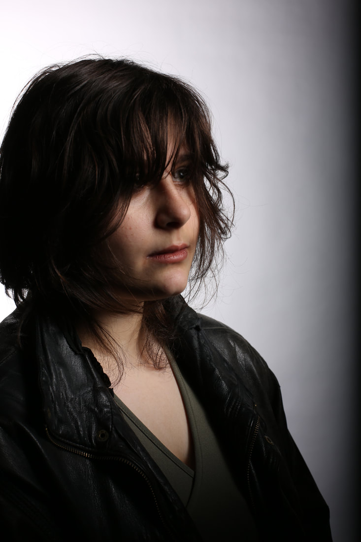
My best photo from the shoot
The reason I like this photo the most out of any other photo from the shoot is I see the least amount of problems within it,unlike most of my other images there isn't actually a lot of blur in it,as well as this the lighting was good in this photo and makes it seem more natural,if there was only one thing I would do differently with this photo it would be that I didn't catch it at a point where the hand was in between movement.
|
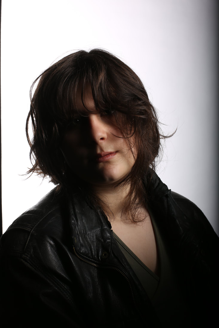
My worst photo from the shoot
The reason why I hate this photo the most is because of how wrong nearly everything seems to me,I think a more further away approach to this photo would've been better than doing a closeup/head shot,there was too much blur in this image too and it seems the camera is focusing on something else rather than the person,the lighting could've come of as better in this but its the best thing from this photo.
|
My moodboard

I have created this mood board as these photos appealed out the most to me, the photoshoot in general was a shoot I wanted to explore, the composition stood out to me too with the positioning of the models. I didn't have much to work with so this photoshoot was all I had to work with, but it still stood out to me.
Plan for Shoots
Project Title/ shoot number:
Portrait project-shoot 2
Description of aims for shoot:
What I'm aiming for with the shoot is to create the essence of a sport campaign shoot that is aiming to promote a topic for discussion within the world of sport and to get it out more,make it encouraging to the youth with the topic that relates to them and stops them.I will be using the Reebok photoshoot that promotes women to be more involved in sport,while replacing it with a topic of my own that I would like to put into a photoshoot.Which is to support people with disabilities physically and non-physically as well as medically,to encourage them to look past what disability that puts them down and to go far.
Links with Photographers
I intend to take a lot of samples from the photoshoot of the Reebok women in sport campaign.I couldnt find out the photographer of the photos, only the agency that was contracted by them,which is Venables Bell & partners.
Location & Props/ items needed &
Kit needed e.g. lighting, tripod, backdrop, macro lens:
School
Sport clothing/kit,cricket bat,football
Tripod,camera
Camera settings I will use:
F-Stop :
White Balance:
Shutter speed:
ISO:
I'm planning on using a low F-stop for some of the photos, most of them involve having the model as the main focal point. But maybe having a small usage of a high F-stop for 1 photo.
Which compositional rules will I use?
I have an idea of using a 2 thirds,maybe a body shot and a headshot for some compositional rules.
Second Shoot
Black Backdrop


Best Photo
Despite the image being out of focus, I find this to be my best image as its all in the background frame, the position is right and the centring is good, as well as this its one of the rarer images around this photoshoot that isn't that out of focus, in the process also making it one of my more favourite images from the shoot in whole.
|
Worst Photo
I find this to be my worst image as its all over the place, I think I rushed it too much and its completely out of focus, even if it was clear too the models position is all over the place and the angle definitely is bad. I seemed too eager to look at the photo quickly. I could also make the point that my model wasn't even properly ready for the pose, from this I know that my patience on how long it takes to take a photo needs a work in case.
|
Black backdrop (with sport objects)


Best Photo |
Worst Photo |

I see this as my best photo from this part of the shoot because there is a good emphasis on the subject matter, the backdrop is also fully in frame and the lighting is just right. Despite the photo also being out of focus the ISO seems to be in the ideal setting and the White Balance is also in good shape for how the photo came out.
|

I see this as my worst photo from this part of the shoot because I didn't seem to know what I wanted with this photo, my camera options weren't good either, but this part of the photoshoot wasn't great for me. I definitely needed to be closer to my model as In reflection a closer up would've worked far better for this segment in my photoshoot.
|
White Backdrop (with objects)


Best photo |
Worst Photo |

I see this as my best photo from this part of the shoot because I got my camera settings right on this photo, the white balance is what I got right in this image the most, I like the models position in this image too and the focus on the main subject has a good amount of emphasis applied. I also could feel as if the photo is the best from the shoot in general, it stands out as being well in focus, being fully in frame and its ISO and White Balance settings being good, accompanied by a good F/stop.
|

This could be my worst photo from this part of the shoot as I think the shutter speed wasn't right on this, plus I'm not content with the fact its out of focus and I don't have my model centralized, which is what I wanted with that photo. I also see the background seep slightly out which despite being slightly out, makes the image feel much worse than if there was even more out, accompanied with the model not even having a good position in the shot makes it clear to me to work on the final touches before actually taking the photo.
|
Shoot 3 (Outdoor)
Javier


Finn
Javier (in front of blue background)


Finn (in front of pink background)


Best Photo
From the shoot I find this as my best photo because my camera settings were optimal, I had my ISO set at 200 and my White Balance was the one I wanted for this photo, my models position and expression is good for my outcome, as it doesn't feel emotionless either, its one of my better photos to me so far.
|
Worst Photo
With this photo I see it as my worst from the shoot because its not a portrait photo for a start and its not a photo of Javier's head and shoulders only, which was what our focus was in this shoot, this photo was also very rushed into and I didn't adjust much properly and needed to make changes for an ideal output. The other students in the background don't help the lack of actual thought into the photo.
|
Salford Quays shoot plan
Description of aims for shoot:
Get good angles of our models and get creative with our angles and surroundings
Links with Photographers:
I will be doing street photography. One thing that stood out to me were the models and their poses.I would like to go with more low camera angles and maybe use the Imperial War Museum, Millennium Bridge and the BBC gardens especially to get pictures.
Location:
Salford Quays
Props/ items needed:
Casual clothing
Kit needed e.g. lighting, tripod, backdrop, macro lens:
Camera only
Camera settings I will use:
F-Stop :
I want shots where my model will be the main focal point for photos. Maybe a few where the background is in focus too. Ones that only have the model as the only in focus object will need a small F-stop of maybe 5.6.
White Balance:
Since I'll be outside, I'll have to rotate but the main ones I'll rotate between are Daylight, Shade and cloudy depending on how my camera is on the day, maybe even having to use auto white balance to my advantage.
Shutter speed:
I will primarily use a fast shutter speed of 1/1000,but could change depending on what I want from the model on the day.
ISO:
I will use an auto ISO for my shoot ,but if I got inside then maybe 200-400
Which compositional rules will I use?
I will attempt a wider range of compositional rules as I want to just get creative from this shoot and experiment more. Ill use rule of odds and even numbers for some photos and maybe occasional odd numbers too, I want to get into maybe trying to get a couple of leading lines photos too. Maybe asymmetry and symmetry too if I really feel like it. Worms eye view is something I want to also pursue.
Moodboard

Salford Quays Shoot
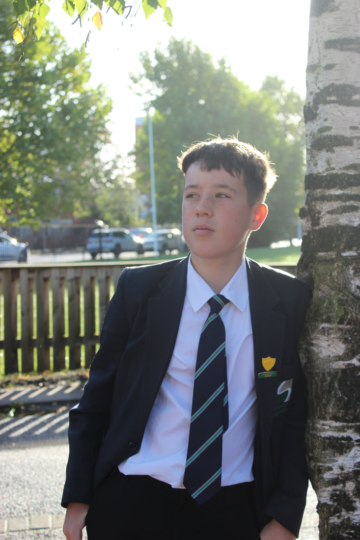
Imperial War Museum
IWM(Finn)


IWM(Javier)


Best
From the photos I got of Javier at the Imperial War Museum I liked this one the most, the blurred background and the position of my model and where he's looking helps the photo too in looking good, the higher presence of the sky to the building compliments it too and generally rounds off the smooth feeling to the photo. Again the Auto ISO here is being shown to be the ideal choice for photos, a really wide Aperture, F-stop roughly around f/2.0 and the Auto White Balance approach makes it one of my favorite photos from the whole shoot.
|
Worst
This image I liked the least because it just feels rough to me, my model wasn't looking into the camera, the positioning of my camera feels too close and even though the camera settings were mostly fine and its all in focus, I should've taken this photo from a further back position. The camera settings I feel I should've used is a Shade White Balance and an F-stop of f/5,6.
|
IWM(Mariam)


IWM(Shahbaaz)


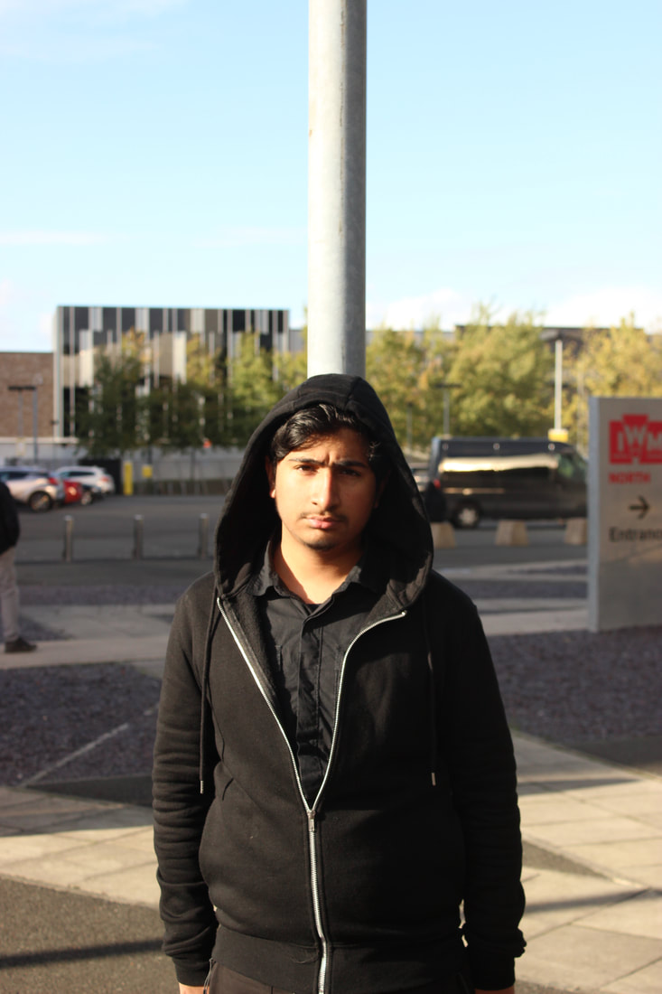

IWM(Theo)


Best
From all my images at the IWM,I found this to be my favorite, the out of focus tram in the background and the expression of my model helps it all look good, generally there's so much I love about this image despite how little there is to say about it. The setting also all seem light they're right, ISO at 200,an Auto White balance and the F-stop of around f/2.8 all feel have been adjusted to make this picture much better than it would be, with the addition of the really wide lens aperture.
|
Worst
From all my IWM images, this was my worst one, there is a good depth of field and decent white balance, but the positioning of me and the model just doesn't feel good enough with me, I took more photos with my model after and they were much better, this one just feels the worst in general to me. This image could maybe look better if I was centered too, my intentions when taking this was for my model to be on the left but now upon reflection I would definitely go back and be in a centered position. Daylight White Balance was used which helped the final result, but making the Aperture lens much wider and changing the F-stop to a more suited f/4 could've also helped the image out slightly.
|
Bridge
Javier


Mariam


Vicky


Hamza


Shahbaaz

Best
I see this as my best photo as I really liked the way the sun is shining on my model, the position and angle that my model is at too really moves this photo up in quality and the daylight white balance with the focus in this photo really enhances it, at this point I think I was moving into using an Auto ISO, which helped my pictures later on really come to life and look better. The Aperture in this photo definitely utilized a wider lens of F/4, good for making my model the prime, distinct thing in this image. A Shutter Speed of 1/1000 was in the image too, as all images were. The Auto White Balance showed its quality well here too, one of the select photos to do it well, but using a Sunlight White Balance wouldn't had budged its quality up by much either.
|
Worst
This photo was the worst one I took from this part of the shoot, what mostly kills this photo off for me is that my model isn't looking into the camera and one of his hands isn't on the railing. Additionally my photo seems slightly out of focus. The White Balance could been turned down to Shade for this too, it would've made the outcome much more save able. The other photo I got of my model was much better than this in contrast too, although the aperture seems ideal to me in this photo, a smaller or wider lens probably could've made the image much worse.
|
BBC Gardens
Mariam


Finn


Vicky


Groups


Best
I find this to be my favorite image from this area of the shoot as my model is the clear subject of the photo and its perfectly centered to me, I also like the position of my model in this photo as its natural and fits well, the little spots of light on his hoodie too make it have a nice touch to it. The camera settings applied in this image can be an Auto ISO, this was mainly in part of the fact the weather was fluctuating that day, I used an Auto White Balance on the day too despite me switching regularly between Auto, Shade and Sunlight. The aperture is a middle but wide enough lens to make the model stand out, I would put it at F/5.6. I can definitely say there's a fast shutter speed also, in the 1/1000 region.
|
Worst
The reason I didn't like this image is because of how bright the image is with the sun rays slightly seeping through, I also feel my photo is out of focus and that I would rather have my model looking at the camera instead of looking away. My white balance being Auto has hurt the image too, putting it at sunlight would've been more appropriate, I do feel the Aperture wasn't up to my liking either, but making it a wider lens wouldn't have made it much better either, a smaller aperture of maybe F/11 or F/16 could've made the image better.
|
Lowry
Mariam


Albaraa


Millennium Bridge
Vicky


Vicky and Mariam


General Public


Plan for shoot (with professional photograpaher)
Project Title/ shoot number:
5/professional shoot
Description of aims for shoot:
I want to make an edit of this shoot that follows money engraving, so in this shoot I'll be looking for close ups of my group in shots and maybe looking into some full body shots.
Links with Photographers
Bruno Bisang, Nadav Kander, Frank Ockenfels III
Location:
School
Props/ items needed:
Own clothing
Kit needed e.g. lighting, tripod, backdrop, macro lens:
Lighting, tripod
Camera settings I will use:
F-Stop :
30
White Balance:
Auto
Shutter speed:
1/1000
ISO:
Auto/200
Which compositional rules will I use?
I will be mainly using close ups in my work for this shoot, as its the main source of money engravement edits, I might get a few upper body shots too but not any full body shots or anything that will have a large field of view, I'll also have my models utilising a variety of poses too and maybe change if they’re standing up or sitting down. I want to use the work of Frank Ockenfels III and Nadav Kander for some photos and maybe a little of Bruno Bisang.
Moodboard for shoot

Me working with the professional photographer at shoot


Professional Photoshoot
Mariam


Best Photo
From this part of the shoot, I found this picture to have been my best for how good the lighting, expression and positioning of the model, the lighting is more focused onto the neck and chest of my model, but does hit onto the face slightly, creating a good visibility of my model, whilst allowing a slight area of darkness to creep in. One thing I also really like about the image is the feel of the model stopping the darkness of the background from setting in, like her body stops it and allows the bright white to remain behind her in frame too, the darkness looks like its hitting her body but cant get past in my eyes.
|
Worst Photo
This image for me was my definite worst part of this shoot, the framing is the most obvious part and additionally the lighting makes her face unseeable, we did get the picture we wanted right after however as this was a more unaware mistake. It still stands out as the worst image from this part of the shoot. The lighting too wasn't what I needed but if you look at the picture after you can see this too was just because of where the model was standing.
|
Vicky(White Backdrop)


Best Photo
This image in this part of the shoot was the most abstract one of them all, while the model subject isn't fully in center of frame its the most likeable expression to me as being a more laid back photo instead of the more serious ones I was getting through out the whole shoot, the light hits the subject too at an angle where nothing can be seen on us taking the picture behind, where only the edge of the lighting kit can be seen, but it also helps with in the image of making a slight white and black crossover, I would only make it so that no hair at all is in the way of the glasses.
|
Worst Photo
This was definitely the worst photo of this area of the shoot for a few reasons. I firstly think that I see the expression as very forced, I might've tried a bit too hard on making a natural emotion come from my model that it just doesn't stick as easily. I do remember from the shoot we struggled a bit with helping the models get that sense of feeling through but we did get some photos that do naturally show it better, the other important thing was how off-center the model was too we did have problems a few times with the centering too. I do like the ring coming forward though I could've used that more as a way to get some little extra shine on some images.
|
Vicky(Black Backdrop)


Best Photo
As I was running short on time for my part of the shoot, I could only use Vicky for the black backdrop, that aside and most of the photos from this part of the shoot were actually pretty good in their turnout, this one is my favorite however for how its got a good casual feel about it, the change of jacket and the stance of the model was good, the lighting too hits the left side of the face dominantly, except for a little bit of the right cheek, that lighting choice elevated the photo from being alright to a favorite of mine. The hair also gets this nice silky feel too from the lighting just getting a few areas on the face.
|
Worst Photo
This was one of the worst photos from this part of the shoot as mainly the expression throws me off, I can say here that the lighting is really well done for how it comes out it ejects this kind of beam following down the models hair, face and body, the ring however I would've preferred if it was in the direction of the camera to have a more leading lines effect, I would've changed it so that the model is looking at the camera too to loop back round, in which someone else would look at the ring then up to the models face. This photo however has the model fully centered and its helping elevate the photo slightly in terms of quality.
|
Salford Quays Edit Moodboard

Salford Quays 1st Edit
Video I used to help:
Process


Starting Product |
Finished Product |

|
|
What I used in Photoshop
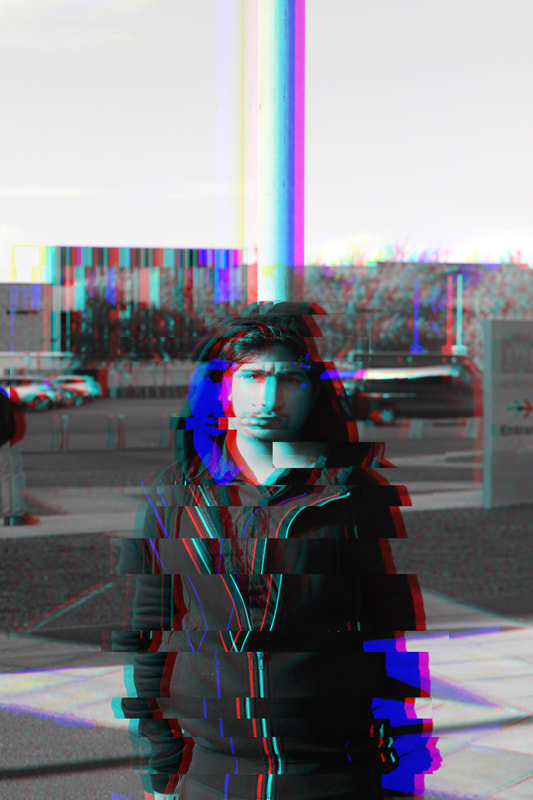
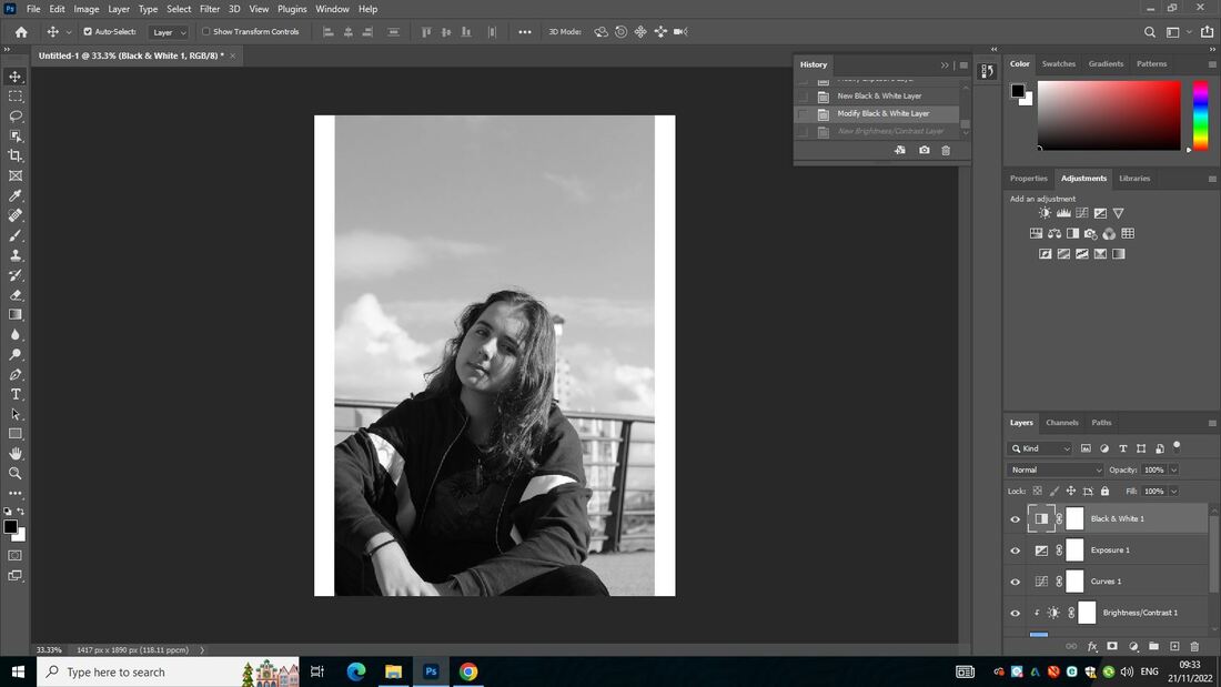
When making this, I wanted a glitch outcome and that's what I got. I got to this point by mainly using the tutorial to help me and using tools like the rectangular marquee tool which helped me make the glitch effect with nudging it around after selection,I also manipulated the RGB colours on the layers after desaturating the whole image.The rectangular marquee tool was used to distort the image and slide around the models body,this was crucial and instrumental in the final out come of the whole edit.I enjoyed doing this part as I really got to manipulate the image most and drag it away from looking regular to the other images.There is one thing I would personally improve and it way to maybe to glitch the face a bit more,The image still looks good without but maybe there could've been more with the face effect.When it came to challenges in this process,I overcame them by taking some steps back,looking through the tutorial more thoroughly and making saves so that I would have something to fall back on in case I didn't save before closing or photoshop crashed.My biggest tip to someone doing an edit like this would be to desaturate the image,then duplicate the layer and change the RGB colours on the duplicated layer to really start the glitch effect.
Salford Quays 2nd Edit
Video I used to help:
Process


Starting Product |
Finished Product |

|

|
What I used in Photoshop
When making this edit I did a lot of what I did in the last edit, but I tried using the wave effect, which didn't change too much but subtly showed the effect. I got a glitch effect again but it isn't as good as I was hoping for. I mostly again did what I did in my last glitch edit and was using it again, I used the rectangular marquee tool in a slightly different way and made some cutouts in the boxes of the cutouts, unfortunately, the effect was nowhere near noticeable and after experimenting with the wave it kept getting worse, but I darkened the image a bit and in the end got a somewhat okay image to me.
Vintage Edit moodboard

3rd Edit:
Video I used to help me:
Process


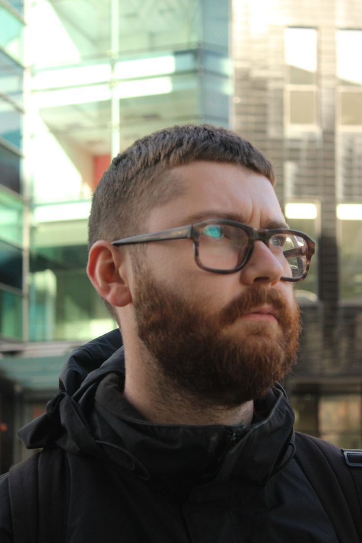
Starting Product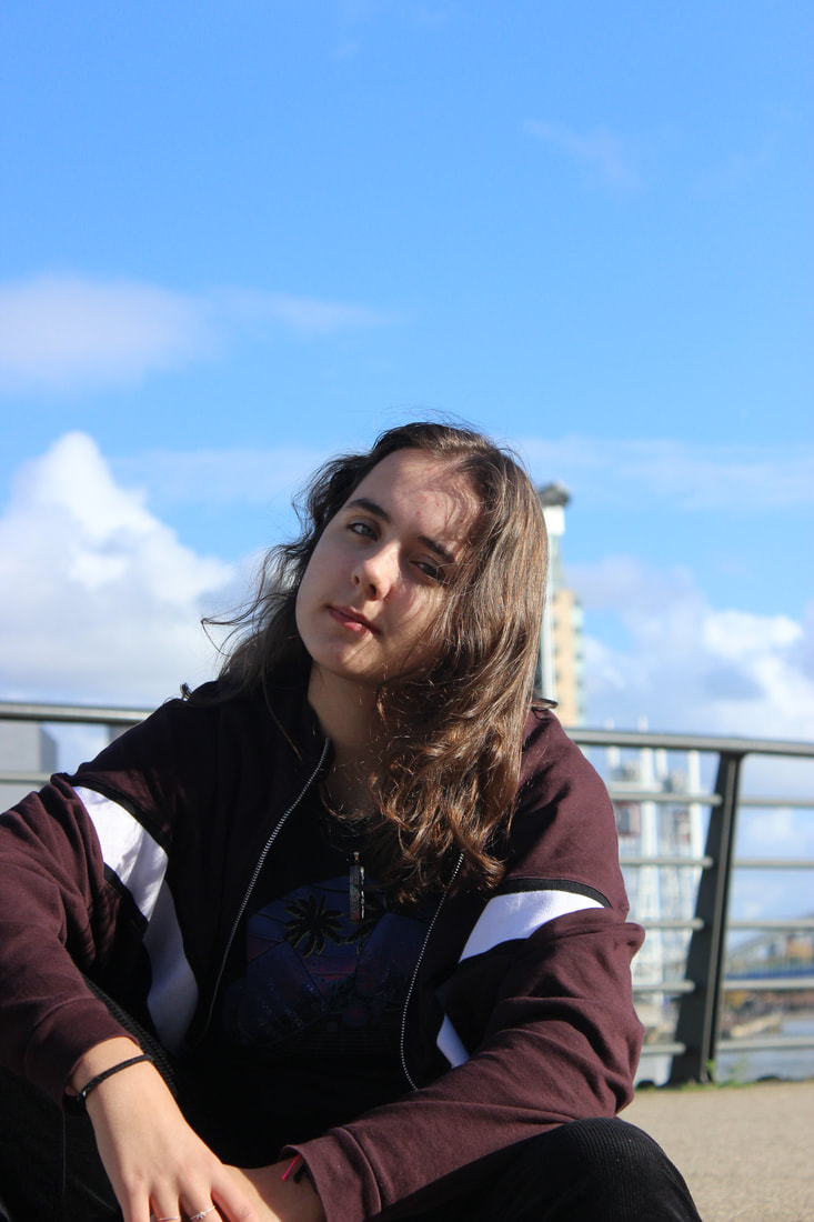
|
Finished Product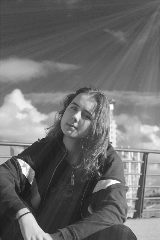
|
What I used in Photoshop
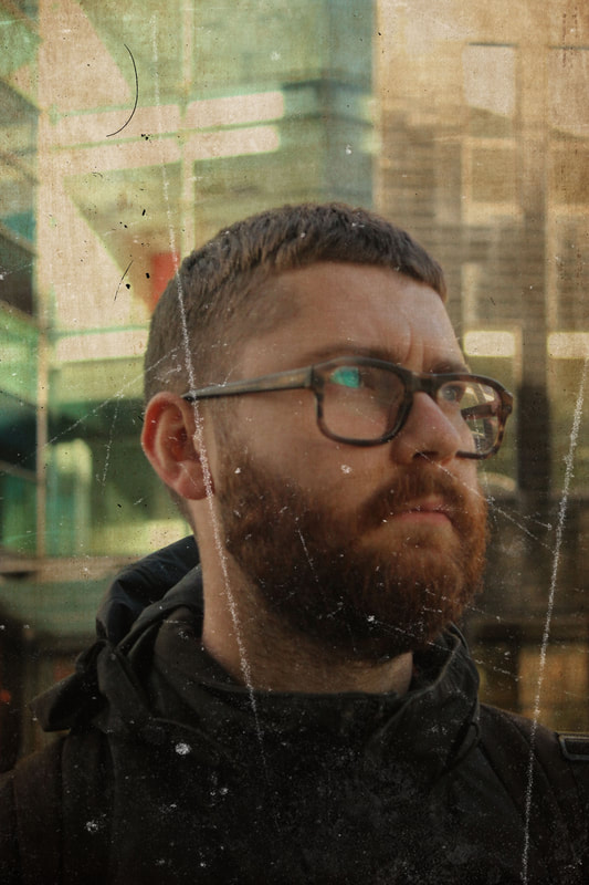
For this final product, I started with experimenting around with the brightness when I didn't have really any idea of what to do, I was mainly moving between different options that I was using but never was in the final product like using the clipping tool, changing the curves and other features that stood out to me, eventually I looked for a sun ray effect and making it look like one was shining down on the camera, So I put a black and white filter on it too, and at this point the image started shaping up for me, I made a gradient fill to create the sun ray with a youtube video I found and after a switch back to normal colour and back, plus changing the layer type, I was finished.
2nd Vintage Edit
Video I used to help:
Process:


Starting Product |
Finished Product |

|

|
What I used in Photoshop
As this was a new type of edit, I used many different tools in photoshop to help make my image come to where it is. I worked with the level and colour lookup tools for the first time to help with my vintage outcome and as shown in the tutorial, which I made sure to carefully follow and use to my advantage, I also did a lot of opacity changing in layers, layer mask deletion, rasterizing all my layers and a bit of the hue/saturation work. After all this work though I have created the first vintage edit of a few, and I find this to be one of my favorite finished edits, its an edit that I feel has made the vintage aim land and stick, and while its not exact to the tutorial, its different enough for me to feel that I haven't just copied it full on.
3rd Vintage Edit
Video I used to help:
Process


Starting Product |
Finished Product |
|
|
What I used in Photoshop
For this edit I decided to use a different tutorial and ended up with an image that has a somewhat different look to the first vintage edit. This process was shorter then other edits as I decided to not follow the last few minutes of the tutorial, as it would've been quite useless and too much to me. The only new tool I used was inverting the textures I got, I speeded through this one and got an outcome that I personally really like, despite the image originally only being a tester to see if the camera was working when I put a new battery in, I ended up making it into what is one of my personal favorite edits so far, this image surprisingly projects a decent vintage outcome despite the lack of snips I got to show for it.
4th Vintage Edit
Video I used to help:
Process


Starting Product |
Finished Product |

|

|
What I used in Photoshop
This edit was more longer than my previous edits that I have done, I had a bit of a troubling time midway through but in the end I got an image that I feel was a mix of good and bad, the frame feels alright but I couldn't use it all as the whole frame didn't fit into my dimensions, this image actually saw me have to make changes and do some things before even starting what I was going to get into, using mainly the identical tools and making the same changes in photoshop, I did use the colour lookup tool for the first time however and it definitely helped with the images outcome, I also got a chance to come back to levels again for the first time in a while too, the final edit feels very different than the final product from the tutorial, but I had a lot of struggle with the background frame so I settled eventually for this one, overall however, I like and don't like this image, there's parts that are good and some that aren't so good, but there's more good to bad for me.
Glitch-Vintage Combo Edit
Video I used to help:
Process


Starting Product
|
Finished Product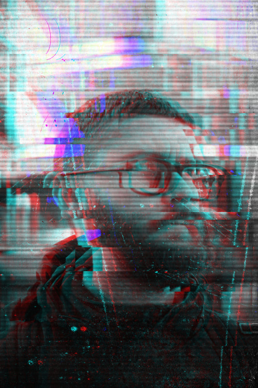
|
What I used in Photoshop:
This was my first combo edit I did, so beyond that I was using a lot of the same tools as before, but I did go further than where I set at my glitch edits, choosing to implement a scaleline image into this combo edit, which I hadn't done in any of my previous glitch edits before this, I got to use the rectangular marquee tool for the face glitching effect again, and it took up most of what my snips are, and at the end got a small usage of the brightness/contrast tool and levels tool, which were used to accentuate the loudness of the glitch which I wanted to give off, a bit of grouping layers were done too as I needed to make a copy of the 3 layers in one to start using the marquee tool. Finally I used the desaturate option to fully make the image black and white at the start. Overall this is an edit I really liked, the roughness and aged feeling of the vintage edit feels strong still, while a modern glitch and bugged feel to the image can be created and expanded in, its a cool fuse of modern and old that makes the edit feel like this cool crossover blend, and makes me have more enjoyment in seeing this edit again.
Glitch-Vintage Combo Edit 2
Process


Starting Product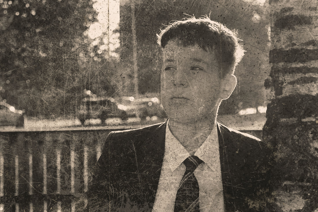
|
Finished Product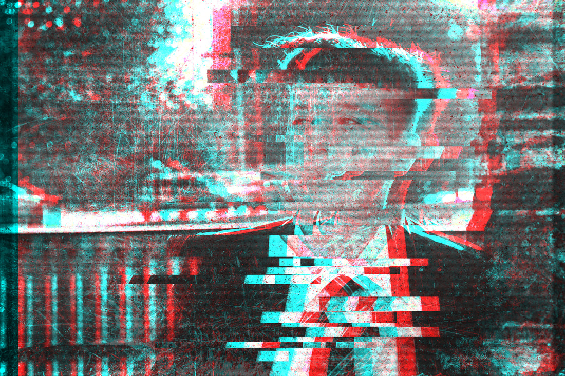
|
What I used in Photoshop:
For the second glitch-vintage combo edit, I again chose to fully go along with one of the videos techniques instead of stopping midway through to get this great outcome. In doing this I got to experiment with the levels layer and brightness/contrast layer again, adjusting the layers and messing around with them and fine tuning the layers too the make the ideal final outcome. As usual I used the rectangular marquee tool and different bending options, crucial tools to make this glitch-vintage combo edit work and properly present the effect. Overall I really liked what I got in the end, it fuses the two effects together properly into the image, with the glitch effect coming in well but the vintage effect not being lost either. I did use a different scaleline image this time for the outcome, which a key factor into why this outcome is distinct from the other combo edits, the other key factor being the edit I picked for this combo edit as all of them had different tutorials I followed.
Glitch-Vintage Combo Edit 3
Process


Starting Product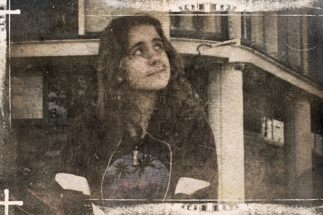
|
Finished Product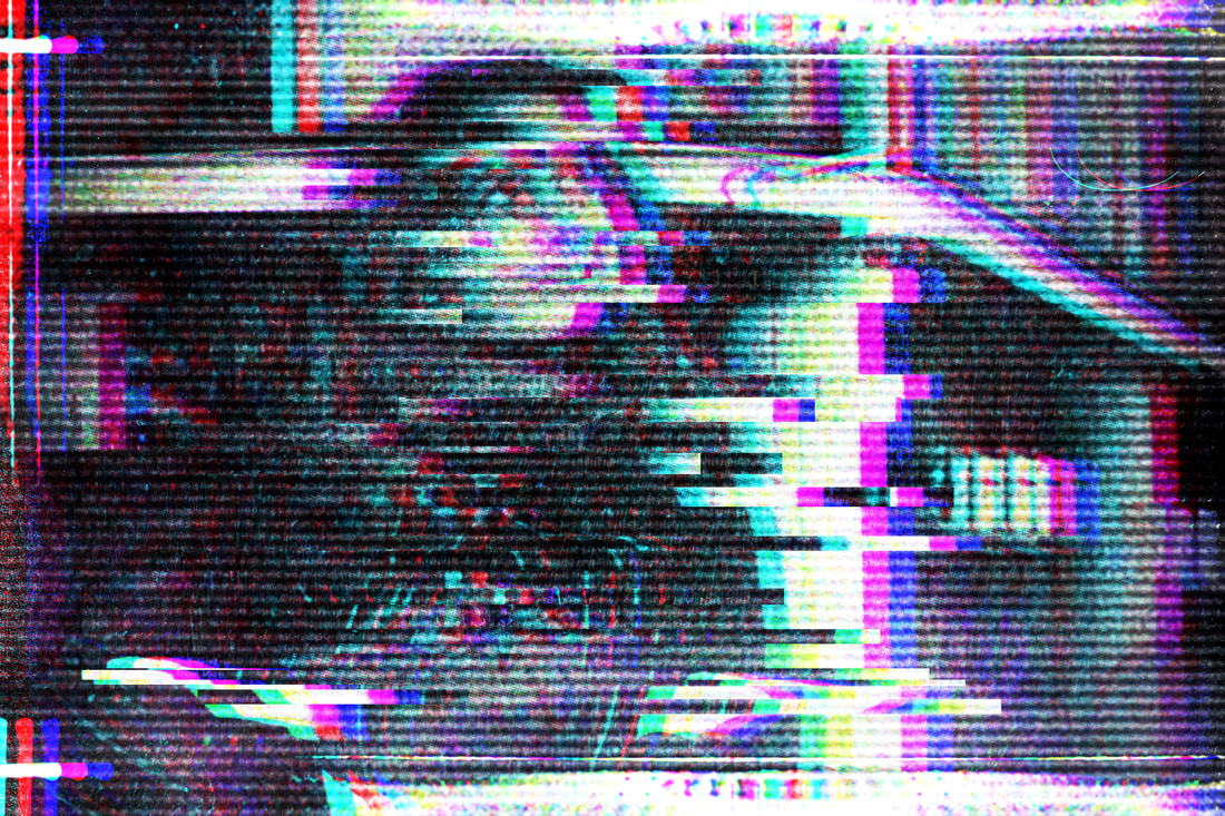
|
What I used in Photoshop:
Like the last two edits, nothing much changed in terms of photoshop tools except the scale line image. However what I do think is that this edit is the best out of all 3 combo edits, the glitch effect is really maximized and exemplified on this outcome, it shows this level of volume that hasn't been projected in the last two edits as much. Because of that this edit really stands out and looks gorgeous to me especially that the vintage effects haven't properly been pushed out of this edit either, you can still see some vintage features here and there whilst the glitch effect dominates in a good way. My model is almost completely erased from the image too but can still be made out, which is a good example of how extreme the glitch effect is in this edit. The scaleline image too was a great pick that helped the outcome, the scale line here looked more like tv static but felt more rough too which is exactly what I wanted. The glitch effect makes the image feel more erratic.
Final Gallery
Vintage Edits 1,2 and 3
|
|
|
Combo Vintage-Glitch edits and Glitch edits
|
|
|
|
|
|
Photos I took that I really liked
|
|
|
Evaluation
Through this year I have been flowing through different themes, thinking if I wanted this or that and while still not fully conclusive on what I'm really wanting, there's definitely a better idea of what's in my interest. I have explored themes of many through the year, but in raw photoshoots I have shown more of a professional serious sense in my best photos, I used a lot of close ups, low shots/worms eye was used too, I did get a little rule of thirds in too but it wasn't as in there as wanted. These themes were ones I've liked throughout this year but its semi slid here and there, but its in my taste still and I don't plan to stop using these themes but expand them more and put more themes I'm looking to use later on, as I can see my implementing of them was slightly better.
I have researched photographers through the year too, however my interest in replication of their photos has been in and out, and in general I haven't been that good at implementing a style of a photographer into my shoots in general, one of my weaker points of this year, but some photographers like Hark1Karan and Cindy Sherman from my identity portion in Students choice has been reflected as photographers I would like to more replicate the style of, not just for identity but in general of image outcome, I did also discover the photographer of Frank Ockenfels III who's predominantly a headshot photographer who I discovered via media and TV promotional material, otherwise my other photographers were discovered via research conducted in my own time and for assignments, the themes I have commonly addressed is the framing of my models, I have been very exact with where I want them for photos and other times they have helped with what I want out of a picture, I have really emphasised making my subject and models the real main focus of my images, which can be factored down to how out of focus my images are when it comes to these close ups, I would like to use the leading lines more though as it could do much more for me in really centralising my models and directing all of the image to them.
When it comes to experimentalism in media, I couldn't argue that I have been more experimental in my photos nor edits, I have tried of course but along the line I was either not able to finish on them due to how challenging it was to me, but my edits do show some element of my playing with photoshop and definitely understanding the basics of the program better, the glitch-vintage combo edits can be a placeholder of me taking both of my skills acquired from the vintage and glitch edits alone and making a pretty good fusion of the edits for me, I also have allowed myself to get into photopea and photoshop at home too, with me making edits casually too. Refining work has been done a bit too, I tend to struggle with understanding a task sometimes too so when that feedback is given through and I am given these improvements to make, I have thought and revised my plan and ideas carefully too, hoping to at least take 5 steps forward from where I started. I could argue that I may need a little bit more guidance on how to improve and make it better at times though, as there are times where I do feel I miss the mark on improvement, I feel though that I can find my faults more on my own now, and with a little insight of peers, It allows me to make more refinements and add polish where it can be implemented. Working as this kind of photographer does have many challenges, I have found it hard to improve in photos moreover. While I can do it, its just difficult to really take ideas in my head on how to improve and put that into notation, additionally knowing where to find to plug them holes in, I can generally think something else is a problem and hyper-focus on that, only to realise that there's a bigger problem somewhere else. I have really changed up more by looking for others to help me find my issues so I can properly take off from that and make it good, peers particularly have educated me better too.
In the end this project has felt like a mix of bad and good, I know that what I have in images here can be used to make a meaning, what it is though I still am yet to fully make a judgement on, but ideas are hanging up there and I do think there could be a gallery that talks on cultural or social class background, anything for identity that I have resonation on is something that can be explored with people like me and around me, I could say my images in the final gallery are representation of how relaxation is different in all people around us, and how us being casual is so hard to see unless close up due to stress of life, its like this idea I have of being casual, we aren't really showing it unless nothing really is actually happening, and these images have some like shallow feel that cant really grab a deeper feeling inside, its that relaxed feel in this image that can be grabbed essentially, all in all my theme in a semi unintentional way make this casual theme. Its definitely a stretch as I went into all these shoots with the intention to enjoy it and take photos, but I could make a whole set of photos with a deep meaning behind it, I just was looking to be able to present an ability of good photos that can be used to present out even better edits in the near future. If given more time I would've gone more into an identity and theme of diversity being everywhere now within community, I would've also used the community spaces beside me too as green areas would've been a better way for me to make a more united feeling. To me there isn't anything personal really about these images, personal photos wouldn't been an issue too much but its not really crossed my mind yet to go personal too much on a set of photos. But some of the photos I have taken I can say are really good and I have pride in them, I wouldn't hate to show them off if someone wanted a sample of what my photos look like, for now at least.
