Statement Of Intent
For this project, I picked places and spaces to do, in which I hope to capture images of places that are personal and close to me, getting photos in many points of the day. I want to have more night shoots to show off, for this I would ideally like to do a night shoot in Manchester and really show its vibrancy in the nightlife, with places like Sale water park or the Liverpool docks being other locations I would like to get some shots in, I want to add more places too but at the moment I have only a few locations in mind. I dont have plans to go far away though.
For photographers that I'll research, Liam Wong has caught my eye for his vibrant and cyberpunk way of capturing Tokyo and its cityscapes, Nicholas Goodden was another photographer with photos that I want to aim to replicate or use for inspiration. One more photographer that was interesting to me was Nobuhiro Nakanishi, who's artwork of layering so many images together in a cube and making it look like his photos have been dissected to such a detailed level was a good look of how to get really creative with my works too if I go into that direction. As this project goes on too I would like to encounter other photographers who also intend to capture places and spaces and I get inspired and interested in thoroughly. My shoots that I do will be in places that hold a personal edge to me, capturing the city as well as countryside and landscapes is something I would like to do. Having a balance of shoots like those would be in my personal preference, but at the moment getting out there and getting shoots done is a priority to showing off that there is work and effort put into this project that I am interested in exploring.
With the camera, for night shots know ill be using longer shutter speeds, my ISO being higher and for city settings potentially just using a wide rage of different white-balances. My idea is to get more experimental with the camera when taking my photos, in terms of photoshop I don't want to add too much to these photos and instead keep them as close to the raw product in front of me. The minor exceptions of making things more vibrant/bringing the colours out in these images when editing. My hope with this project is to be good at doing outdoor shoots regardless of how the surrounds may be, I reckon it could let me get more resourceful with where I am and what the weather is like. I mainly want to make my night shoots look good and learn more about what to do and what settings I should prioritise when in these places. I cant be for sure what my final format will be, but I know it will involve the ideas I have put into this statement of intent, possibly this project could develop for me much more than what's currently going through my head.
Analysis

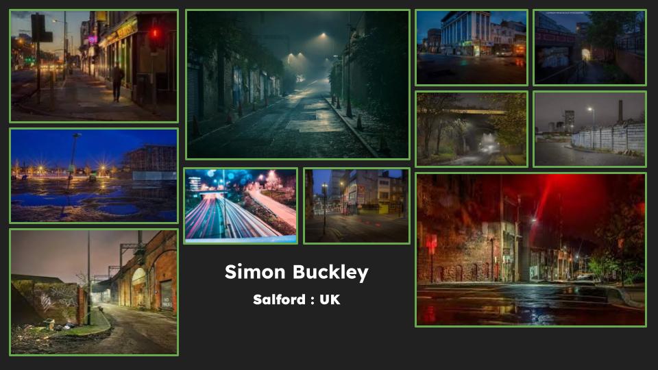
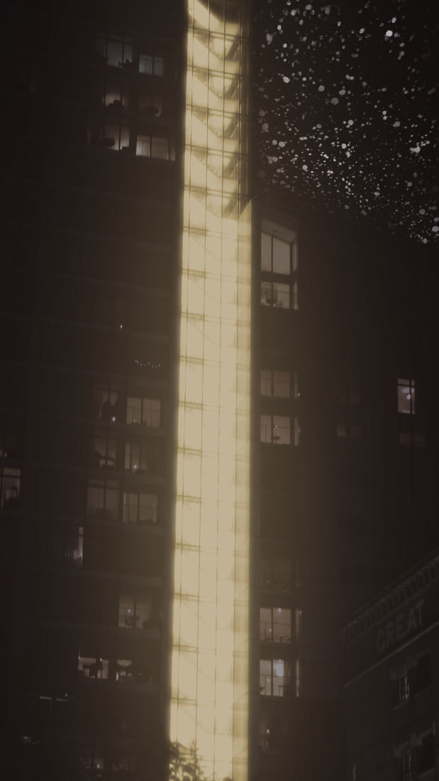
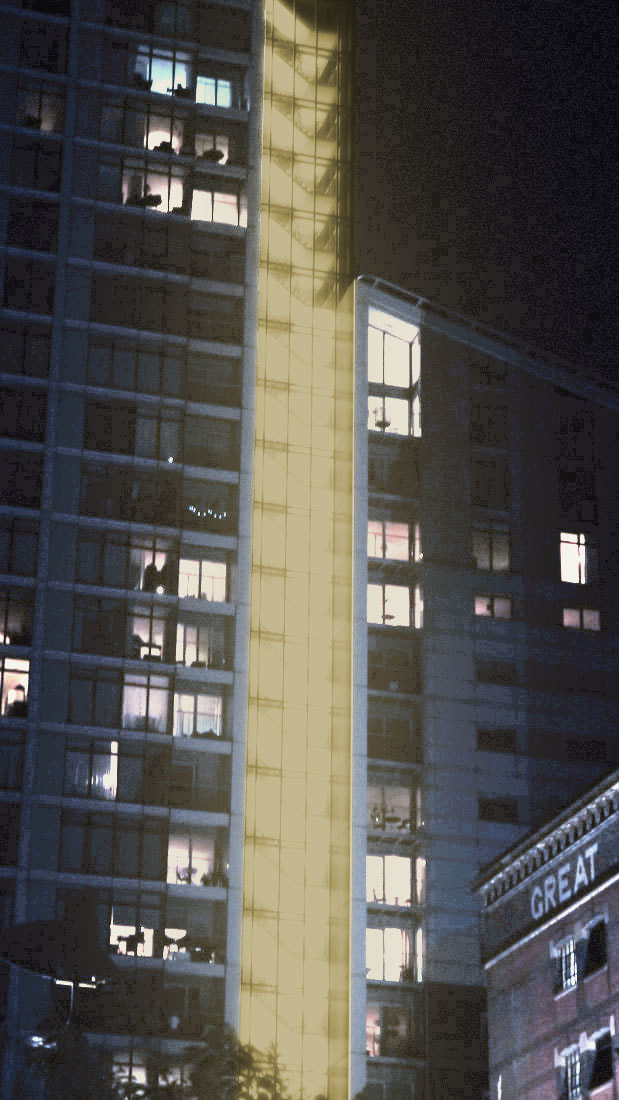
The image here is an architectural photo taken by Simon Buckley, titled ‘Great Eastern Hotel’. It is a part of a collection of images taken in Salford, which was taken to show the progress of the Cobden Streets at the time, in 2017. It was also taken to demonstrate the progress of the Industrial arts of Salford at the time, these photos of construction are taken by Buckley for the developers and architects of the buildings. Normally he would follow the buildings whole history of construction and keep the images after as a way of archiving its history. This photo is largely in line with his other pieces of work, which all involve Architecture. Buckley is also heavily insistent on representation of many areas of Greater Manchester, so this image isn’t out of the ordinary for him, but he has also photographed the streets of Liverpool too. Aside from the links to Cobden Streets, there isn’t any bigger picture or political message shown from 2017. From what I have found online, the building being constructed here is the Great Eastern hotel in Salford. What I have found too is that his works and this one specifically have made it into some other projects. For example the 'YOU LIVE WITH US, WE LIVE WITH YOU' project has several Simon Buckley photos in the project (notquitelight.com/5-plus-architects-manchester-london/). (Other websites used: simonbuckleyphotographer.com/construction/).
Looking at the image, it is a night time shot, showing in the centre the completed buildings of Cobden street. With an unfinished building on the right of the image. The bottom half of the image is dominated by the construction, showing people currently on site when the picture was taken. The left of the image shows a mural, being obstructed by the structure and two beaming lights of the crane. You can see it has a theme of the local community around it, with the message; ‘Love will tear us apart again’ and it’s all in this landscape image. The work definitely represents the industrial quality of Salford, being a space where there is a mass amount of new construction and plans happening everywhere within the north of England. As the larger bodies of images this is a part of, they all embody the progress within Manchester in recent years, industrially. The titles of some of his other images were called ‘Walk the Plank’ which could be a nod to how risky construction is, with potentially turning into a life or death situation if things go badly on site; which is why it is often praised in the North for how much construction it gets done every year. A lot of the images too are taken in higher places, with the building being unfinished, the title could also signify how careful and agile we have to be around construction sites. The beams of light have been brought out more in the image, overall slightly taking away from its’ realism, but in general the image isn’t manipulated much to make sure the image isn’t unrealistic. The message of this image could refer to the growth and development of Manchester since the mid 20th century, speaking on how new construction is always being planned and executed as we can see both newly finished and unfinished construction in the background of this image. It could also speak about the efficiency of construction in Manchester as a whole for how quickly new work begins after the other ends. Seeing as this is part of a bigger album this photo could a small fragment in the bigger picture of Mancunian construction and how quick it is, with Salford and Manchester being the centerpiece for ongoing construction. My last interpretation would be that since these images from the collection show interesting or different takes of construction taking place in Manchester, this image could be trying to communicate the innovation of how buildings are constructed in Manchester as a whole. The cites that Buckley photographed are ones that are of buildings that show a different edge to how the constructors went around making them, none of the images blend in from one another and all stand out and with a photo like this, Buckley perhaps wanted to hold this photo as one of the best examples of how Salford and Manchester are innovators in the construction world.
The composition in this image potentially is achieved via leading lines from the unfinished building on the right and the mural on the left guiding us to the orange lights and finished construction of the London-style buildings. The lights are also made to look like they’re shining down on the construction site below, possibly being another part of leading lines in this image. The three buildings in the background could also be implementing the Rule of thirds of how well all three buildings fit into each other. The depth of field could be alluding to the construction below as its’ focal point. The dark colour palette feels to be dominating the image, and therefore works on being the most in focus part of the architecture of this image. No framing looks to be used for this photo, but I think that a tripod has been used to take the photo, for how still it is. The white balance to me feels in the range of Auto, there isn’t a blueish exaggeration feeling being brought out in this image in my eyes to be Tungsten, nor a too vibrant projection to see a White Balance of Shade or Cloudy. The image doesn’t come out as noisy/ grainy, I’d estimate a lower ISO of 100 to 300 for how crisp and clean it is to me. The aperture personally feels like it is letting more light in because of the stand out appearance of the lights, an f/stop of around f/2.8, f/5.6 and at most f/11 is a safe estimate to me for how the image doesn’t lose too much of its focus either, but also still being presented with the lights coming out at you. Which could also lead me to think the shutter speed is 1/15 or 1/10, the beams come out with a more stand out appeal to me, but the light isn’t completely dominating the image. Potentially the pillars of support in the ground have helped this image to feel more smooth. The pillars all connect through pipes to guide us to the underground works, in which we start to see these constructors and the resources down there as well, it helps the actual ongoing construction to be the central focal point to this photo, one where there are many more vibrant colours in the background based on the mural and glamour of the Salford streets, yet the construction is what gets brought to the front based off of its distance from the camera and the pillars.
I’d sum up the image as one that I like, its composition and leading lines is the stand out feature to me, accompanied by the late night sky of Salford creeping in makes me think of this after hours, over time kind of construction work in architecture. The outcome of the lights aren’t really to my liking however, I would’ve turned up the shutter speed so that they weren’t being very out there, more so be more subtle in the way it attracts you to them, they do help with the late night idea in my head however. The slightly unequal proportion of the buildings in the background, with the right wall dominating more of the frame accompanied by the mural on the left and circular building in the centre strikes well, additionally, the two streets split by the building being slightly shown is a nice incorporation to the outcome of this photo, letting the mural and wall semi-fade in to the walls of both streets. I would argue that the composition is what links with me the most, I like the idea of having three people in a portrait, with two of them guiding you towards the third. The slightly more colourful background also links well with me, as I like night shots to generally have lighting that makes the model look like they are hanging around a lamp post. Generally, the clean, low ISO looks to me as one that I like to keep consistently throughout my shoots, with noisiness or grain taking away from my outcome and how satisfied I feel about it.
Simon Buckley Moodboard
Places & Spaces analysis: Liam Wong

Context
Taken by Liam Wong, this photo is titled 'Blade Runner Blues' which is one of many photos taken in Tokyo, Japan. There isn't a specific date for when this picture was taken but by the fact this photo is in Liam Wong's book 'TO:KY:OO' which was published in 2019, this photo might've been taken a few years before or in 2019. This work doesn't stand out too much from his other works, as his website is heavy on the Japanese nights but also days, the vibrancy of Tokyo and other cities is something Wong captures heavily in his work, with himself also capturing portraits of famous video game designer Hideo Kojima, French actress Pom Klementieff and other infamous figures from their industries. His work doesn't tie into political history much, but he likes to rather draw inspiration for his sci-fi style of photography from films like: Blade Runner, Akira and Ghost in the Shell.
Content
The image here depicts the night-time ambience of Tokyo, Japan. In the front appears to be a couple businessmen enjoying their night out, with a pair of 2 people in the lit up alley walking with a bag or two. This could be from some shopping they have done. One the streets a cluster of bags of rubbish sit on the side, in front being some cones and flattened boxes as well. The brightness in this image are drawn from the advertising boards on the sides of the building. In my opinion the image seems to be part of the bigger meaning of Wong's photos, to capture the ambience and calmness of Tokyo's nightlife, but to also show the vibrancy in its night time state with the haul of colours presented to us. The title being 'Blade Runner Blues' could be from the fact that like the movie Blade Runner 2049, this image mirrors it in its colours that are heavy in vibrance. Its purposefully done by Wong because of the fact he likes to draw inspiration from the movie for his photos. The blue and red glow is one that heavily resembles the movie and its city colour scheme, creating a futuristic feel in this image too, many of Wong's images in Tokyo does this, the colours and presentation of the city is what makes images like these add this retrowave tone to it. The image isnt anywhere near of unrealistic, only the colours and light of the advertising boards potentially have been brought out enough to capture the peoples eye, but I would say that this image contains the raw, unedited spirit and feel of the Japan nightlife. Personally, I see the theme of this image as one that's just following a calm, cyberpunk theme. Nothing here feels busy and this photo isn't trying to hold a full feeling to it, Its calm, lo-fi and peaceful. Its message to me just feels like one that wants to take things easy, or that the night time shouldn't be a time to be stressed, only relaxed and at peace.
Composition
When talking about composition, I can first talk about the leading lines in this image. Why we look so deep into this image is from the curve of the building on the right and the cut off the left building leads us into the alleyway, and as we look deeper in, the blue and red neon bars of Japanese text carry us through the picture, seeing the fainter details that we wouldn't have noticed. The leading lines here are smooth too as its dead centre and subtle in the image, as viewers we are swayed into one side of the image or another different side entirely, we keep looking into the centre and begin to look to the sides when the middle ground and background are covered in that alleyway/street. The foreground begins with the railings and 2 buildings leading into that street. The middleground being the street and the people, car and objects that are placed there and the distance being the faded buildings and the glimmers of bright light in the advertising boards and signs. I couldn't see this image as being framed ,Wong's works really come off as naturally taken and not prepared beforehand, which is what I think he's trying to achieve in his works like these. He may or may not have used a tripod in this image, I would personally say it looks like its leaning into a shot where a tripod has been use, but I wouldn't be surprised if he didnt use a tripod either. When discussing the camera settings here, I would start with the whitebalance, potentially using tungsten to emit that 'Blade Runner' feel and make the image more somber in tone, the advertising boards and signs are more blue in colour, with the night sky also looking blueish. Wong's ISO here is probably a higher one due to the lower light setting of the night he's in, but not too high to the point where grain begins to set into the image, an ISO of around 800-1600 would seem realistic for me. A slightly smaller aperture would seem right too, the distance is tough to make out, but can be seen to a certain degree. While the middle ground can be better seen and the foreground being really clear. My estimate would be an aperture of f/11 or f/5.6. The image here as discussed before depicts a really calm and ambient mood, so a shutter speed of 1/1000 would match that as nothing in this image is moving at a quick speed.
Connection
The features of this image that I like are the colours, the neon whitish blue of the advertising appeals to me and draws me in, as well as the alleyways depth that makes us see the the foreground, middleground and background of the image. Wong's captured the ambience of the Tokyo night here in a soothing way, compared to his other works where the busyness of the city is meant to rise up more as the main theme. Wong has also managed to get the image in a neo-cyberpunk perspective from the colours of this image also, making it more aesthetically pleasing when the mood in this photo matches that cyberpunk theme. What I don't like about this image however is that it was only one image. I'd would have liked this to be broken into a collage, different angles and more closeups to the ambience depicted here. I think that from what Wong has captured, he could've definitely made a collage from how much was seen in this image, the business men or a closer up of what's happening in the alleyway. Regardless, I think Wong could have definitely broken this image down into a deeper gallery even if its part of a wider, more vast gallery that all link in with the setting of Tokyo. I do want to implement his way of city photography later on in this project, going into Manchester at night to do this. I think that his sci-fi way of taking photos of cities sticks out to me, he's visually captivating in his photos no matter the time, day or place. If I wanted to work towards outcomes more like Wong's, more wide shots should be utilised and captured in as many angles as can be used. Additonally getting images with an Auto and Tungsten outcome.
Places and spaces 2nd analysis: Nobuhiro Nakanishi

Context
This work, made by Japanese photographer Nobuhiro Nakanishi, is titled 'Layered Drawings' and is part of a collection of artworks of photos with the same name. His way of making these works revolve around Nakanishi photographing a scene or object repeatedly over time, then laser printing each shot and mounting it onto acrylic, with each frame capturing change in some form. Once layered they become sculpture installations. The overall effect shows movement in the subtle passage of time, with him goin deeper into it by saying: "We are all subject to the passing of time, yet each of us feels and perceives it in our own way. Time itself has no shape or boundary and cannot be fixed or grasped. When we look at the photographs in these sculptures, we attempt to fill in the gaps between the individual images. We draw from our physical experiences to fill in missing time and space, both ephemeral and vague.". This piece of work was made for Nakanishi to just show off. Nakanishi seems to really like making these works too, there are many more these works are made for certain exhibitions and festivals, but this work I cant specifically pinpoint the exhibition that its made for. Of these works Nakanishi has made sure it peaks the interest of people. He doesn't tie his images to any political history or messages, these are simply just his works of photography manipulated and outputted in a very artistic and creative way for masses to see. (Source used : homeli.co.uk/layer-drawings-3d-sculptural-photography-by-nobuhiro-nakanishi/ ).
Content
This work comprises a series of photos that were taken in what appears to be a forest setting. All images look to be the same from a first glace but all of them are different shots laser printed onto acrylic. Looking at the image normally, we would see a shot of jungle ambience, not much going on. Nakanishi doesn't choose to make this image a busy one though, as the abstract work of art this is acts as many meanings to what the work represents. I personally think that this work here is trying to say something about how rich our environment is in its detail, like its layers that all make up the beauty of the world around us. All shots here being different too elevates that layered feeling, as if you could bunch it all together and make a coherent image but strip it down into many different complex layers and be a work of art itself. Nakanishi naming the work 'Layered Drawings' is what further makes me think this off the image and potentially what he wanted viewers to see in this photo too, but he never speaks about these works in that direction, more so describing these works as a reflection on time as mentioned earlier. His images are realistic with how he gets them, but he does exceptional in keeping this realism while trying to pick at the images and manipulate them in radical ways. Therefore making this work stand out from other exhibition photographic art. He's creative at keeping his meanings in the art while making them look great too, when he attaches his viewpoint, we as viewers see it clearer. His theme being time and how abstract time is alone, you cant assign something or an image to it as time is anything that can be, because everything revolves around time essentially in one way or another. Its a very deep theme to explore and Nakanishi uses this work as a platform to demonstrate how time doesn't have an attachable quality.
Composition
As this is a physical artwork, Nakanishi hasn't had to go into the area of composition much, but since these images are all in the same place at a different time, he would've definitely used a tripod and had his shot framed too. From what these laser printer shots show, I can't see much grain on the forest, so I reckon a low ISO of maybe 100-400 has been used. The sheets show the forest in focus too, so a deeper depth of field and an aperture of f/22 could've been used by Nakanishi. A yellowish tint seems to fall on the sheets here too, which could mean a more vibrant White balance of Shadow has been used on the photos unless another factor in this photo is giving the illusion of this. As Nakanishi also took these pictures over a length period of time too its probable that he has used a fast shutter speed of 1/1000 as no motion blur appear in the photos either.
Connection
Although I don't aim to make work like his, I like Nobuhiro Nakanishi's ideas on how he gets these pictures alone, the idea of going somewhere and sitting around for 100 minutes and taking a photo every 10 minutes could be something interesting to explore and try, making an outcome that might be more digital but mimics Nakanishi's way of creativity clearly, with me fusing my own ideas into the process and showing my creativity too. It's definitely something to consider as an option, Nakanishi delivers great artworks physically and making a more virtual but still creative edit of the photos could be done, a double exposure edit perhaps or something along the lines of that. My most direct link in my work to his is that his layered works are all of outdoor locations, and my photoshoots are in outdoor locations too.
Architecture Moodboard:

More About The Artist:
Julius Shulman was an architecture photographer born on October 10, 1910 and died on July 15, 2009,best known for his photography on American buildings of major importance Julius was born in Brooklyn, New York, USA. He was born to Russian-Jewish parents and moved to Connecticut to live on a small farm, but he soon moved to Los Angeles despite being a little boy.
He attended the university of California briefly in LA, and then in Berkeley, while there he made pocket money by selling his photographs to fellow attending students. Later in 1936 he went back to LA where he became enlisted by a friend shortly after working as a draftsman for Neutra. He would take photos with his Kodak in Hollywood's Neutra-designed Kun Residence. After Neutra looked back at the pictures, he requested to meet with the photographer and gave him his first assignments which assisted Shulman in launching his career in architectural photography. In 1950 Shulman opened a studio in LA, at this point Shulman was drawing most of his work from magazines based in New York.
In 2006, Shulman was given a Golden Palm Star at the Palm Springs Walk of Stars. And finally in 2009 Shulman died at 98 years old right before his last expedition, as a result it was extended by 2 weeks.
I like Shulman for the black and white use in his images, as well as the composition and focus of the buildings, Its something that well appeals to me and something I want to incorporate into future photos I get.
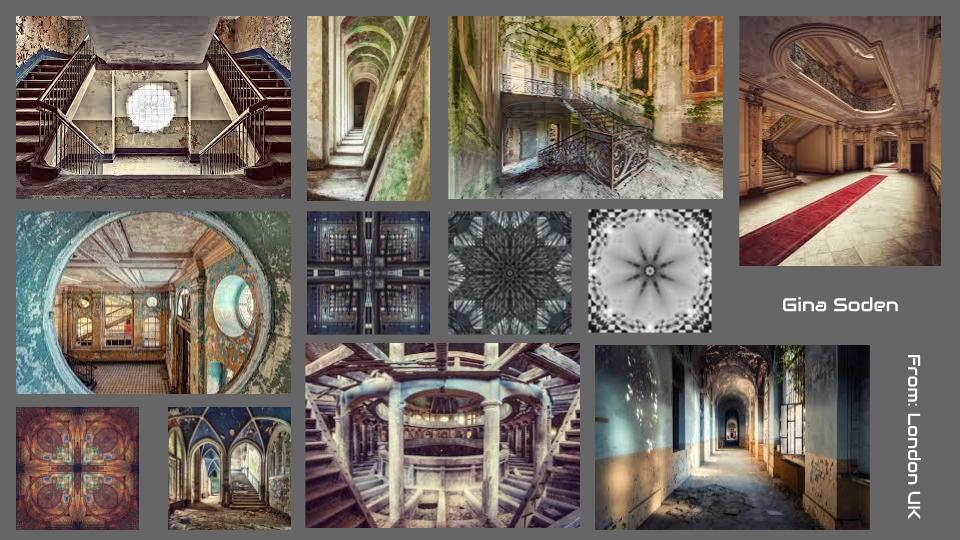
Gina Soden:
A presentation of her work:
Summary of her:
Gina Soden was born in 1985 in London, United Kingdom and is a photographer most synonymous with her abandoned building work and all her exhibitions which stretch all the way back to 2011 on her website.
She has collected awards along the way additionally with the first recorded being in Spring 2010, with Gina winning the photograph of the year by the Royal Windsor Photographic Society. She has also endeavoured in some charity work too, in 2021 she was tasked by Rankin and WaterAid to transform a toilet seat into a work of art to raise awareness of the 1 in 5 people who don’t have access to decent toilets, which can be a testament to the incredible individuality of her being able to work the most unusual bases into a photo or work of art that is given life and depth.
Gina Soden is established in the photography game and isn't showing any will to slow down in producing, despite her last work being done in 2021. She can also be credited with her detective eagle eye, looking at Google Earth regularly, looking at local news papers and conversating with co-conspirators in order to help her find new locations for shoots, Soden personally believes in her work being painterly, with the photos of architecture showing the former memories and moments alive.
Martin Dietrich:
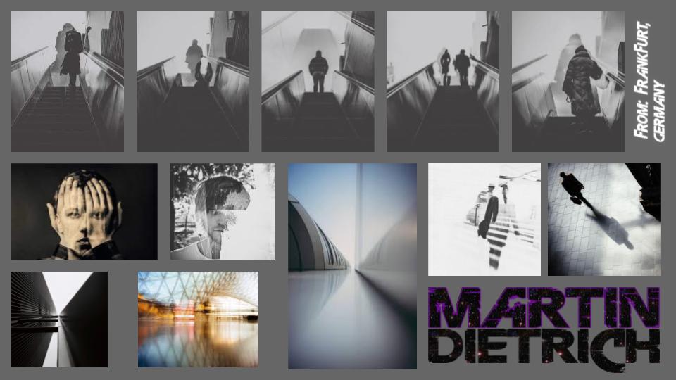
Born in Frankfurt, Germany, Martin Dietrich is 31 and has been taking photos for many years, in February 2014 he founded his own company Neoprime International Fine Arts Label with Marius Vieth. They sell photography as fine art prints and try to give young & uprising artists and their photography a bigger stage and a breakthrough in the possibility of selling their work though Martins and Marius' label. Although the website didn't launch until May of the same year.
In November 2015 he made his own fine art magazine with Neoprime and he stands as the designer, editor and curator. His camera is the Fuji X-Pro 1, despite him being a photographer however this isn't his main avenue of business, with Dietrich being a Tax Auditor and Entrepreneur, he also has an avid interest in discovering music and football, being a passionate supporter of local football team Eintracht Frankfurt and going to home and away games all across Germany when it comes to the Bundesliga and DFB-Pokal and going all around Europe when it comes to the Champions League. But he most of all he enjoys spending time with his wife.
He first picked up being a photographer in 2009, doing it to escape the work-related state of facts and figures that he was contantly going through. He took a Pentax ME and 10 rolls of film to Paris, which soon caught on with him and then caused the spiral of his passion with film and digital photography.
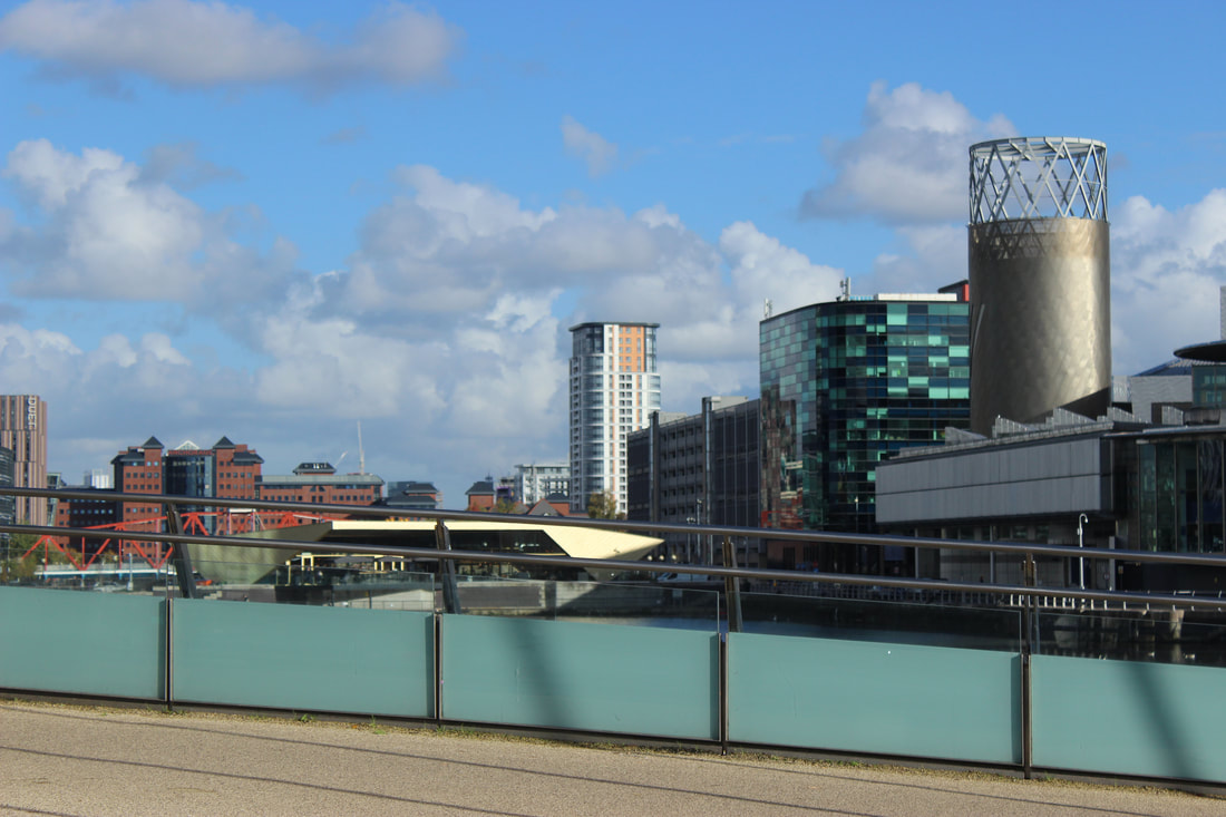
Salford Quays


20 images homework


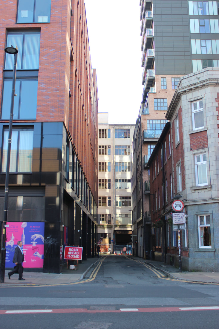
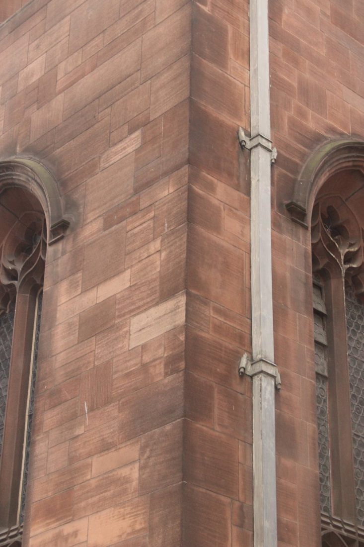
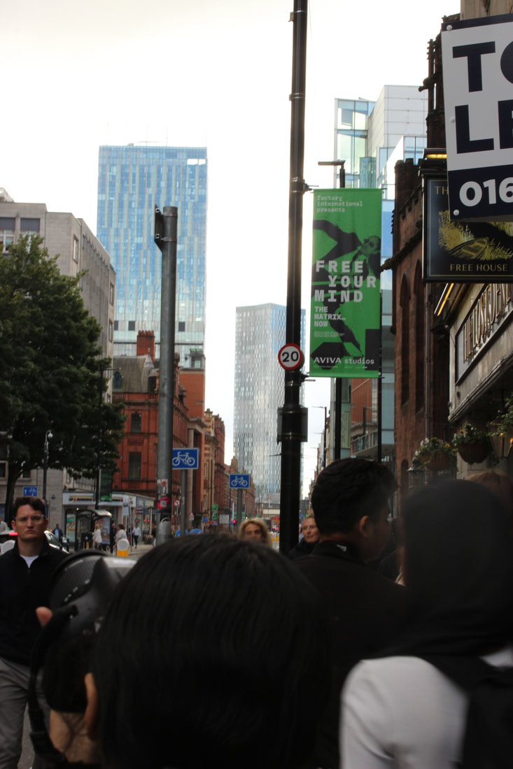
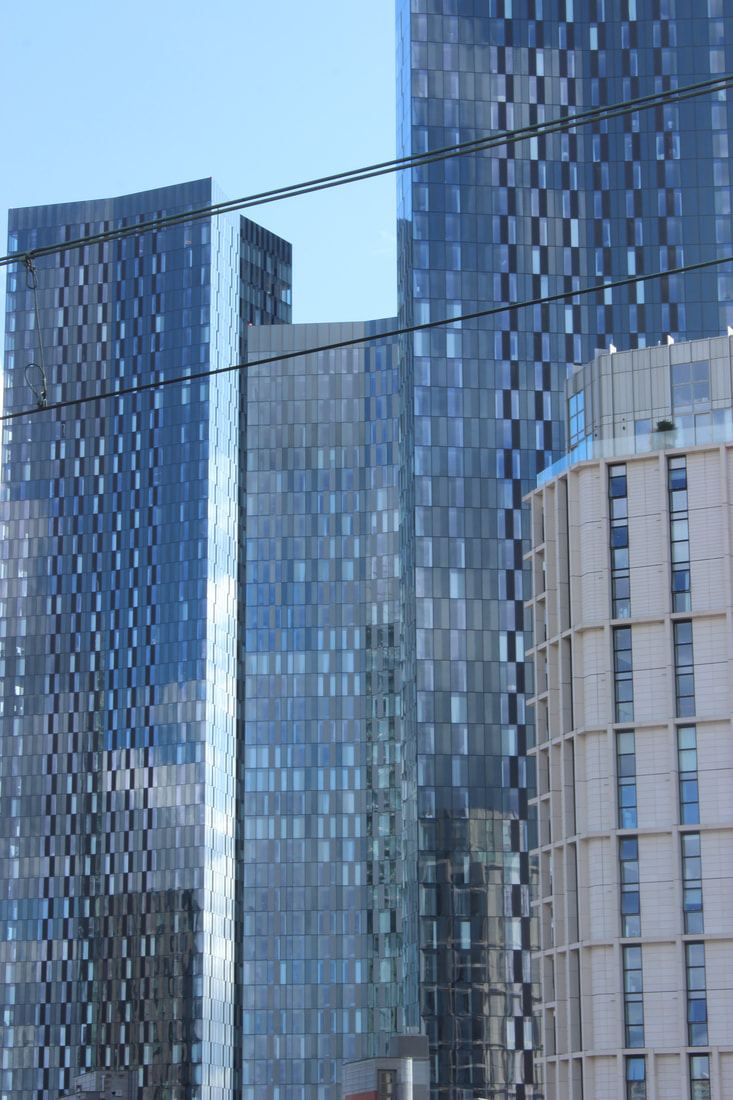
Manchester Identity shoot - Architecture photos


|
|


Best |
Worst |

This image to me was my best from this part of the shoot mainly because of how colourful the building was and how it shines out to me even when the light hits the mural and stairs. All them dark spaces that emerge from the stairs are also what makes this image the batter, allowing the light to hit the wall sweetly and make it look like theres a split between the shade and sunlight.
|
When out on this trip, my main aim for the trip was to capture photos for my identity student choice project, so I have a lot of images that weren't taken with anything in mind to capture, This image to me just didn't have anything it was trying to capture. I could've definitely gotten some better shots when on the tram too compared to this pointless shot.
|
|
|
|


|

|

|


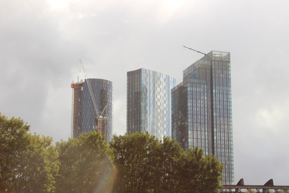
Best
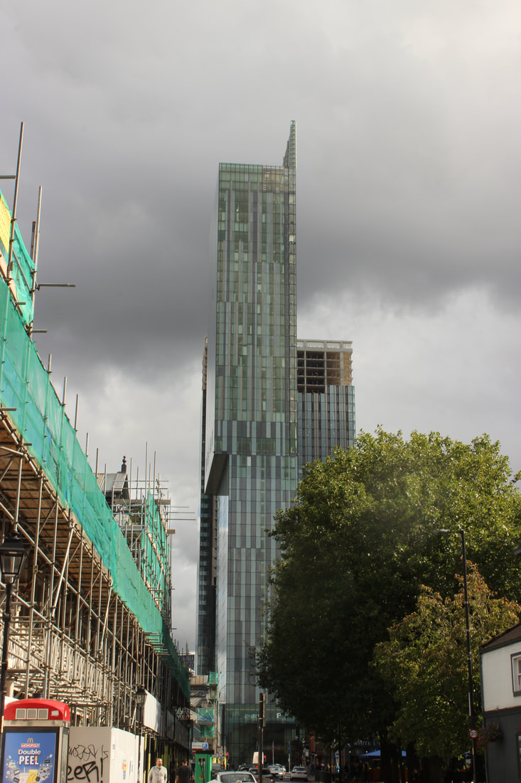
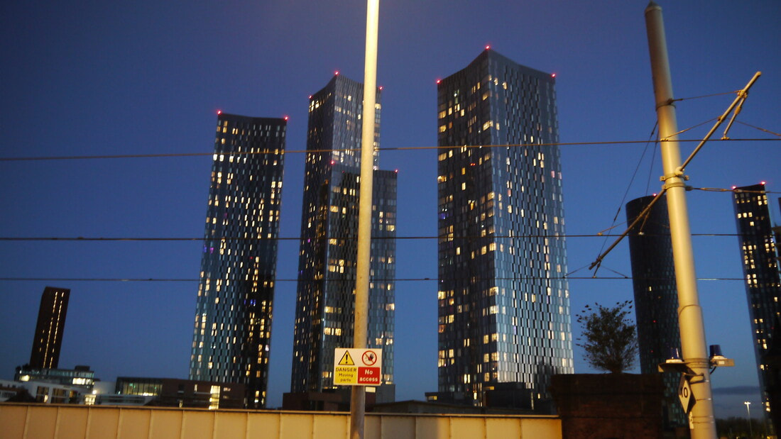
I really liked this shot for how well the light came off on it, the touch of the lens flare on the lens was a nice subtle touch that further elevated the outcome of this image, the skyline being front and center with the buildings being nicely aligned with one another really helped this image feel nice and appealing to me, this image was one of my favourites I have taken in Manchester too.
|
Worst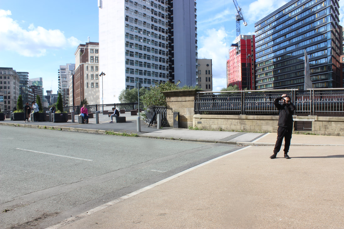
In this shot I initially wanted to get a couple photos of the building closest in this shot, in the end this was the only one I got and I was disappointed that this was the one I got, it also looks like a throwaway test shot.
|
Plan for shoot:
Project Title/ shoot number:
Places and spaces shoot 1
Description of aims for shoot:
To get photos of places that have personal/sentimental value to me.
Links with Photographers
Liam Wong, Nicholas Goodden, Nobuhiro Nakanishi
Location:
Sale Water Park
Props/ items needed:
None
Kit needed e.g. lighting, tripod, backdrop, macro lens:
Tripod (if at night)
Lights (if at night)
Camera settings I will use:
F-Stop :
f/4-f/11
White Balance:
Auto/Tungsten
Shutter speed:
1/1000
ISO:
700-1600
Which compositional rules will I use?
I plan to get more shots of specific angles, symmetry may work for the place that I want to go, Rule of thirds may be an area of composition to work into and focus on. For this first shoot I want to mainly focus on getting a lot of photos rather than experiment so much, later on I want to focus on being more experimental.
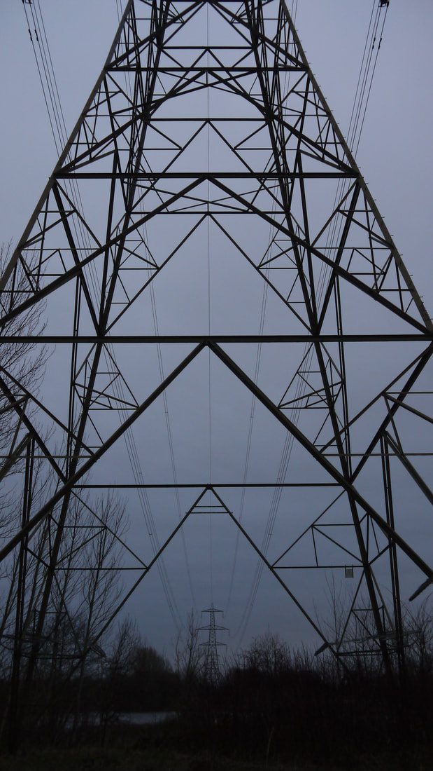
Places & Spaces shoot : Sale Water Park


Best |
Worst |
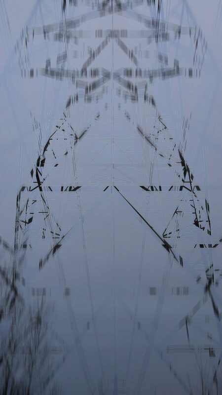
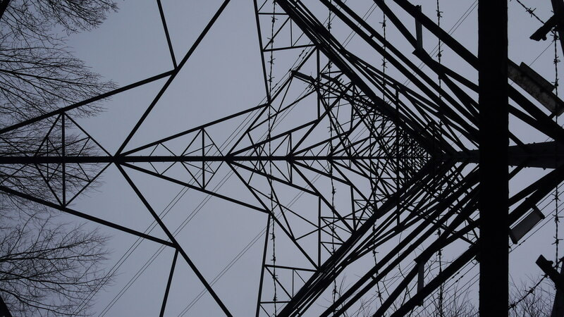
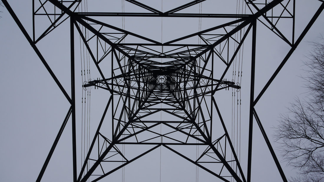
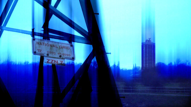
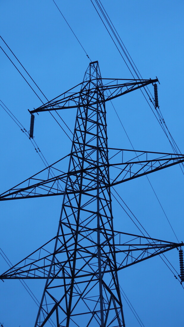
I found this to be my best image from the gallery above here for how much it stands out of all the pylon underneath shots as well as how many leading lines are in the image. Its forming all these different triangles and triangles within them, to me its very visually pleasing, the best use and angle of the underneath pylon I was photographing. The rippling arrows in the centre and the outside triangles going inwards are really likeable leading lines in this image, if you look to the right of the image you can see these straight barbed wire lines that cut off right in the sweet centre of this photo. There's also this slight gradient of the sky that feels like they're fading in the background. My camera settings here were ideal too, the Auto Whitebalance instead of cloudy has definitely played a part and the 200-400 ISO made this image the right brightness.
|
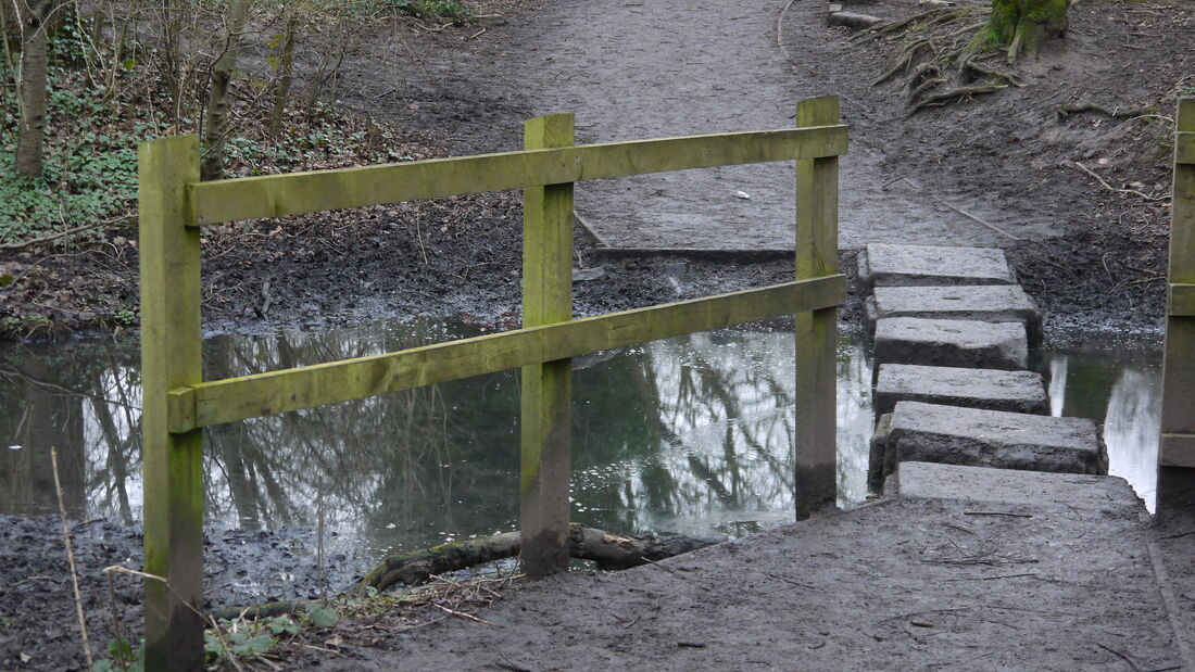
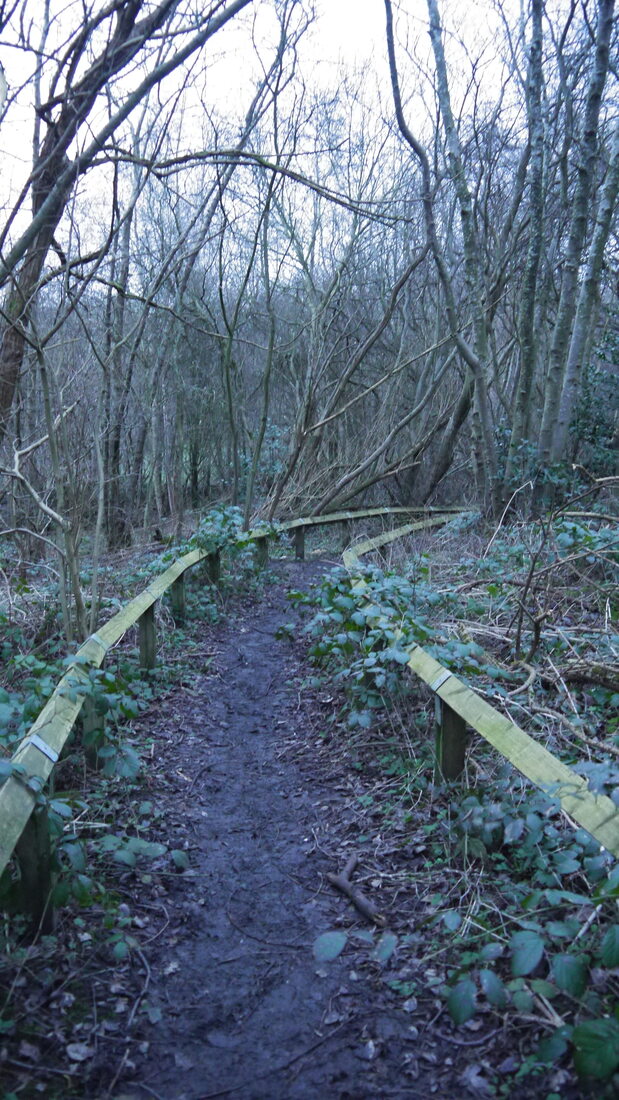
This image to me felt like my worst one off this gallery because of the lack of a central focal point here. It feels like a test shot to me, even if the rule of thirds and leading lines are included in this image it isn't one that would stand out from the gallery. If I could go back to this shot, I would've gone more closer to the ground and positioned myself to be more central to the 2 gates with me further away. That outcome could've potentially illuminated the stepping stones more as its central focal point. Additionally I think there could've been some nice symmetry going on in the image with that outcome, despite the ground being unbalanced. This image however does hold more symbolic meaning that the best image, the calmness of the water and ambience of the photo really reflects how I associate the location I shot at. Its a calm area and a good place to think, the landscape here is very aesthetically pleasing too. A lack of noisiness makes this to me an amazing place to gather thoughts and contemplate.
|


Best |
Worst |

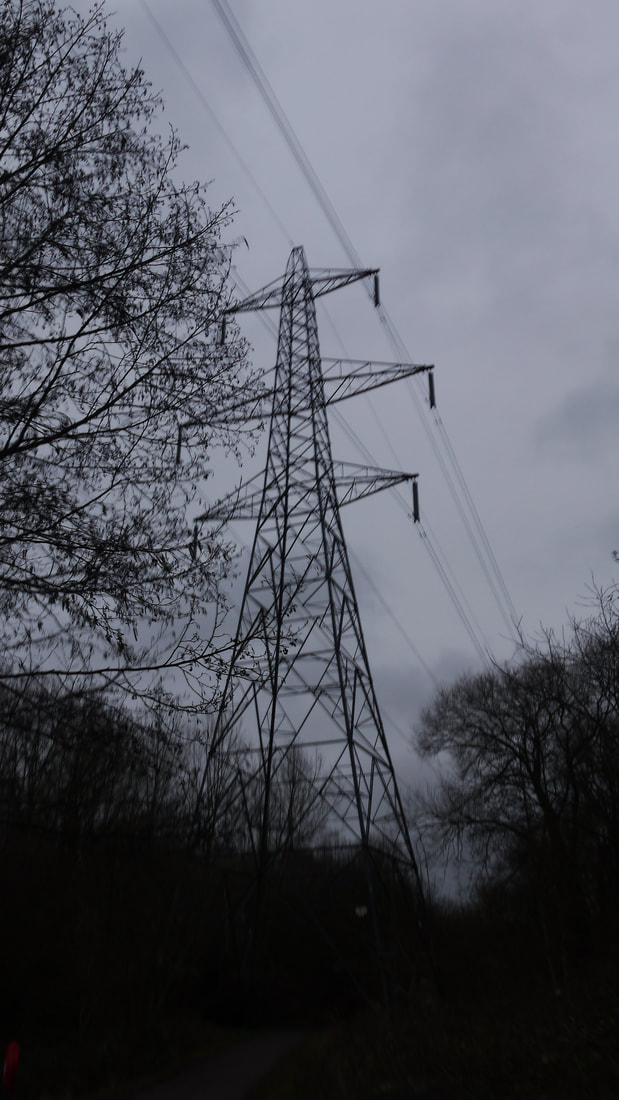
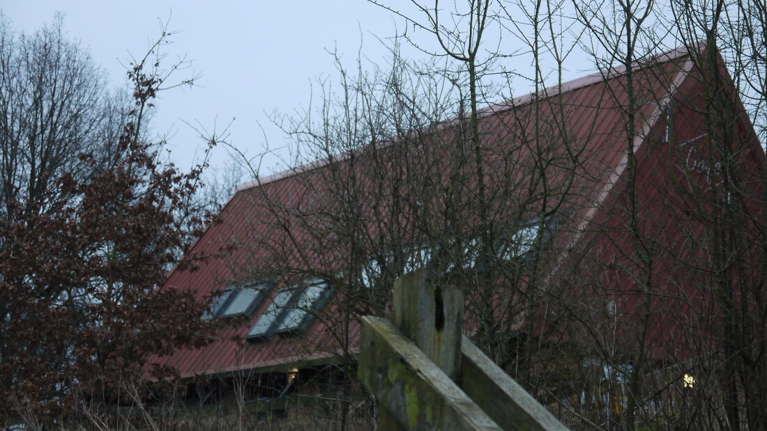
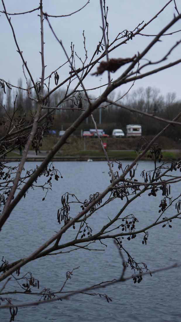
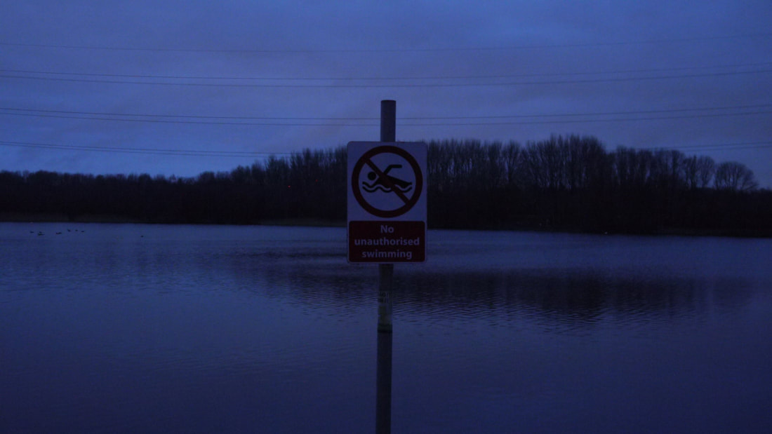
Although not as visually impressive or as soothing as other images in this gallery, this one was my favourite for how much of how well it makes this location hold personal value to it. As a photo alone, the power lines in the sky go across this image nicely, without really compromising or getting in the way of the central focal point of the lake. It doesn't utilise many camera rules compared to other photos, but the long shot of Sale Water Park here is very nice. Using the Tungsten White balance here was nice too and made the image look better, although I think this image did drift into having a more somber tone from it. It's one of the better images to really hold some sentimentality with the location, the river would be where me and my dad would go to feed the ducks when I was younger. I also think this image depicts the calmness I associate with this location nicely, which is one of the main themes I wanted to capture with these photos. One more thing I'd say about this photo is that its inspired and imitates the nature photography of Nobuhiro Nakanishi, the only nature photographer I had on my plan to look to. His photos before becoming abstract works are of wide shots of nature like these.
|
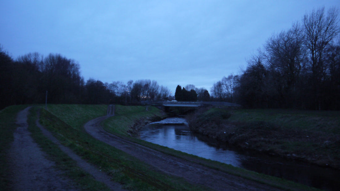
I personally think was the worst from this gallery because of how little of creativity this photo really holds, plus the lack of relation to the personal meaning of the location to me. I would start with how clogged the image looks, when taking these photos I didn't want there to be many separate parts of nature all in one image, I wanted less parts of nature to be so close to the camera, so I would be capturing zen feelings. I don't see much wrong with my camera settings here though. By this point I had stopped messing with my settings as much and set my camera to the program feature, so that the camera could automatically adjust the exposure and shutter speed only, but I could still choose between different ISO's and White balances. If I could go back to this point I wouldn't have taken this shot, I now see it being an uninteresting image overall.
|
|

|


Best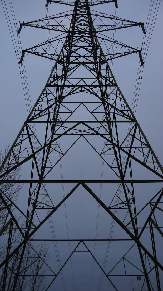
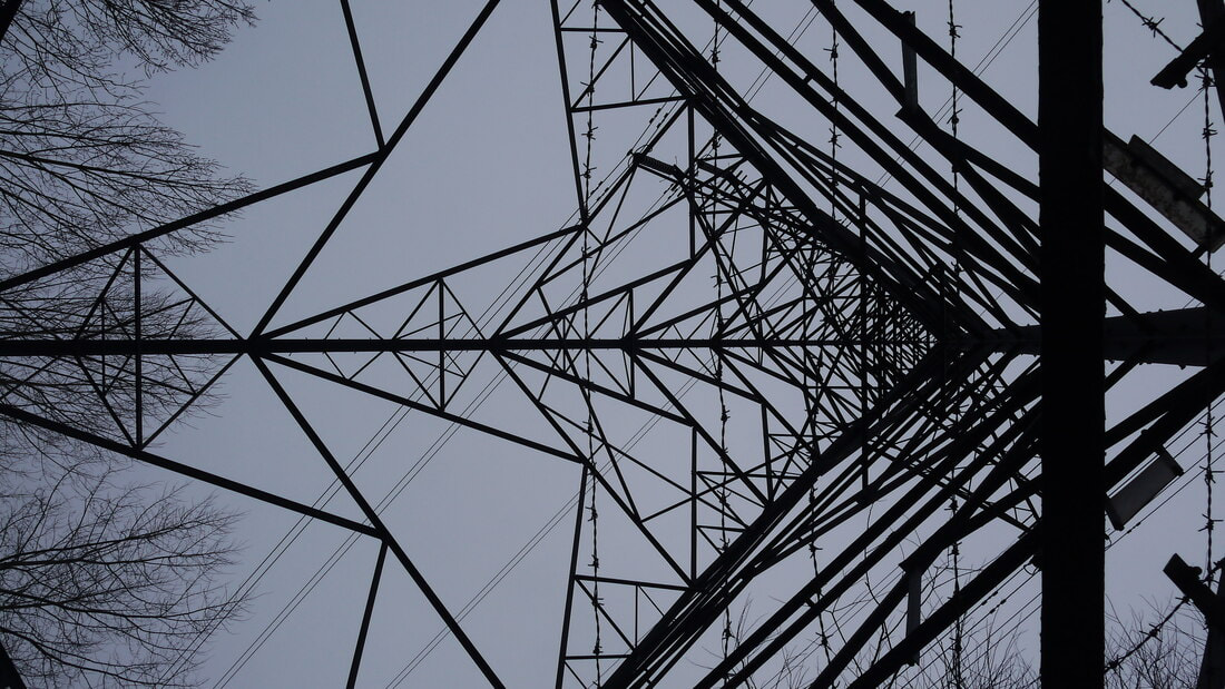
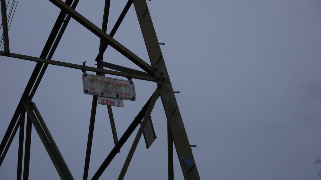
This image was a standout favourite for me in the gallery and shoot as a whole for the stunning leading lines in the pylon lines, as well as the pylon being framed as like its the Eiffel tower with the way it leads up the photo. The whole image captures the perfect symmetry of the pylon, almost as if the image is mirrored. the sky holds a consistent dark tone, even if it slightly goes from dark to light. The clearness of the sky too makes this image more aesthically pleasing and nicer to look at. The trees on the left side of the image do take away slightly from this photo, but they are also a nice touch to keep this image from looking like it wasn't even taken on location. They also stay to the sides of the photo, where the viewers eye is less likely to be drawn to becuase of all these leading lines in the photo. My camera settings were an ISO of around 100-200 and with an Auto White balance,
|
Worst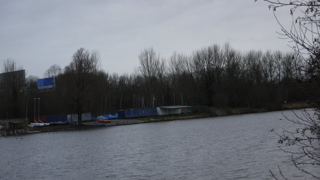
Looking back to this image does make me realise how pointless this shot was, I think I wanted to have a few ambient shots but amongst these other images, I dont feel like they are showing anything or guiding a viewer to these photos. This shot falls in line with it to me. I think with this image here that it definitely gets in the way with wanting all my shots to have an interesting aspect in it. While most shots do have this quality, its the few shots like these that have nothing going for it that make this shoot feel less useful as well, as there isnt anything I can do with this photo in photoshop for an edit either.
|
|
|
|


|

|


|

|

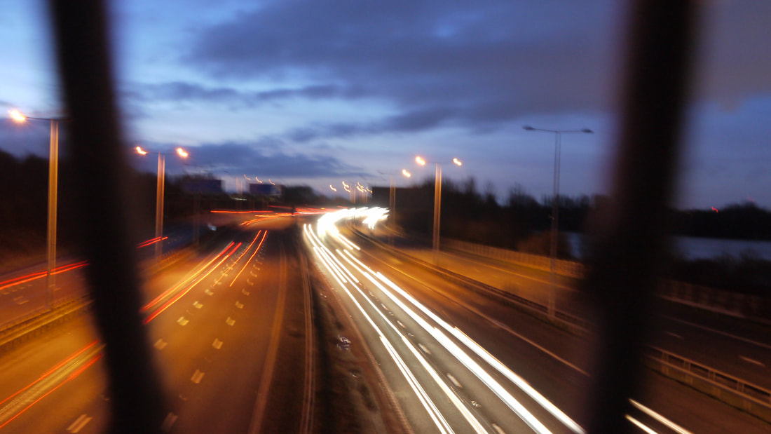
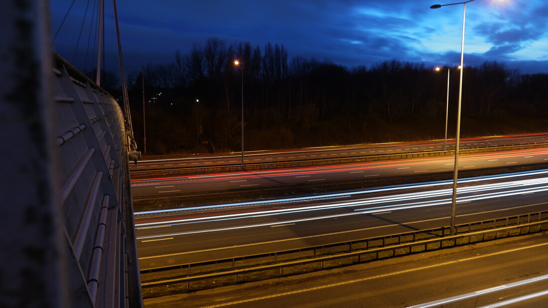
Best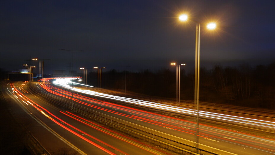
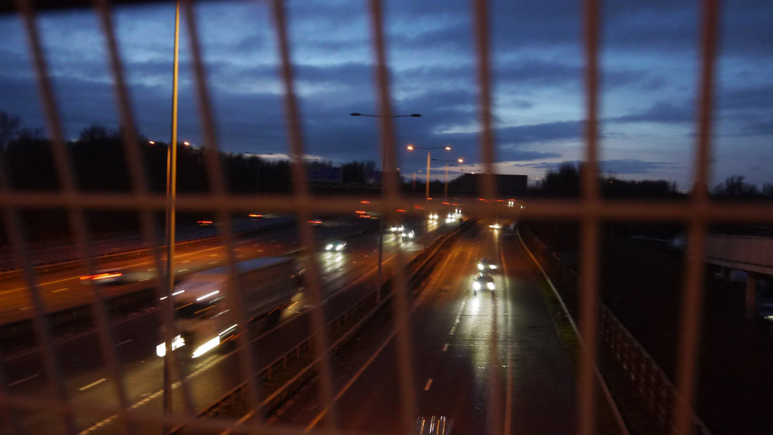
I found this image to be the best from this part of the shoot and of the whole shoot in general. What makes it really stand out from the other photos though that have similar outcomes to this photo is the sky and the illumination of the lights in the photo. The sky here has this constant night grey gradient following through all areas of the image and ultimately helps the lights also come forward and direct the attention all on the motorway. I also think that the flow of the cars here are more smooth that other photos here, they're like strokes of paint here. My camera settings here didnt change, I went with both an Auto ISO and White balance. But I did change the shutter speed to get me this outcome, a much slower shutter speed of 1/2 to 1/4. That was definitely determining factor to make this photo look so nice.
|
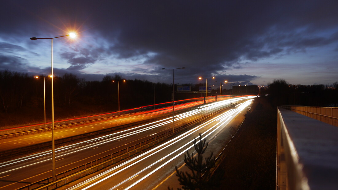
Worst
Personally I think that this image here in this part of the shoot was the worst. I can mainly attribute that down to the fact that I had the ISO set up too far, I wanted to experiment with that setting to see what the outcomes could be, this is definitely one of the higher settings between ISO 800-3200. That's why the photo graininess shows so clearly here, asides from the ISO however I would say that the photo is decent in its outcome, especially as the motorway is clearly in focus and the bridge barrier isn't. The ISO issue also doesn't help with taking this photo to edit with, as the grain in this photo could get in the way of making an edit outcome looking better if the ISO was lowered or put on Auto.
|
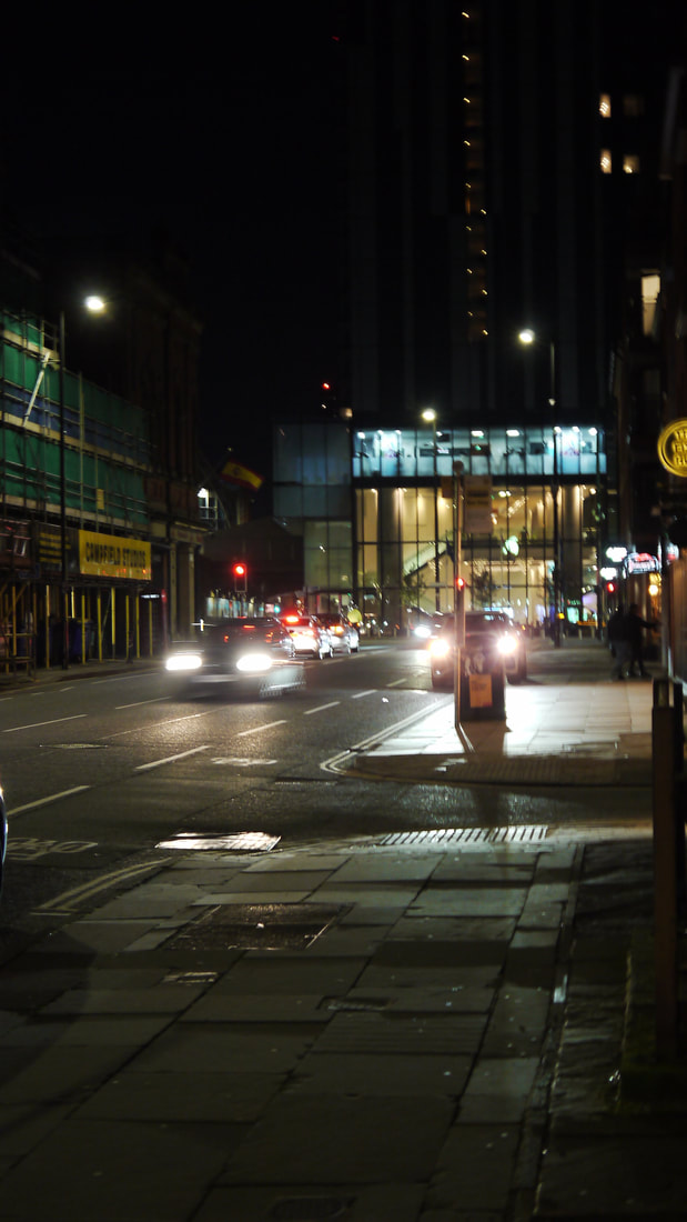
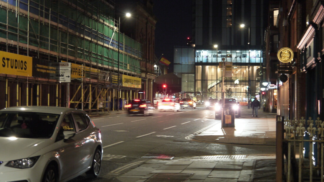
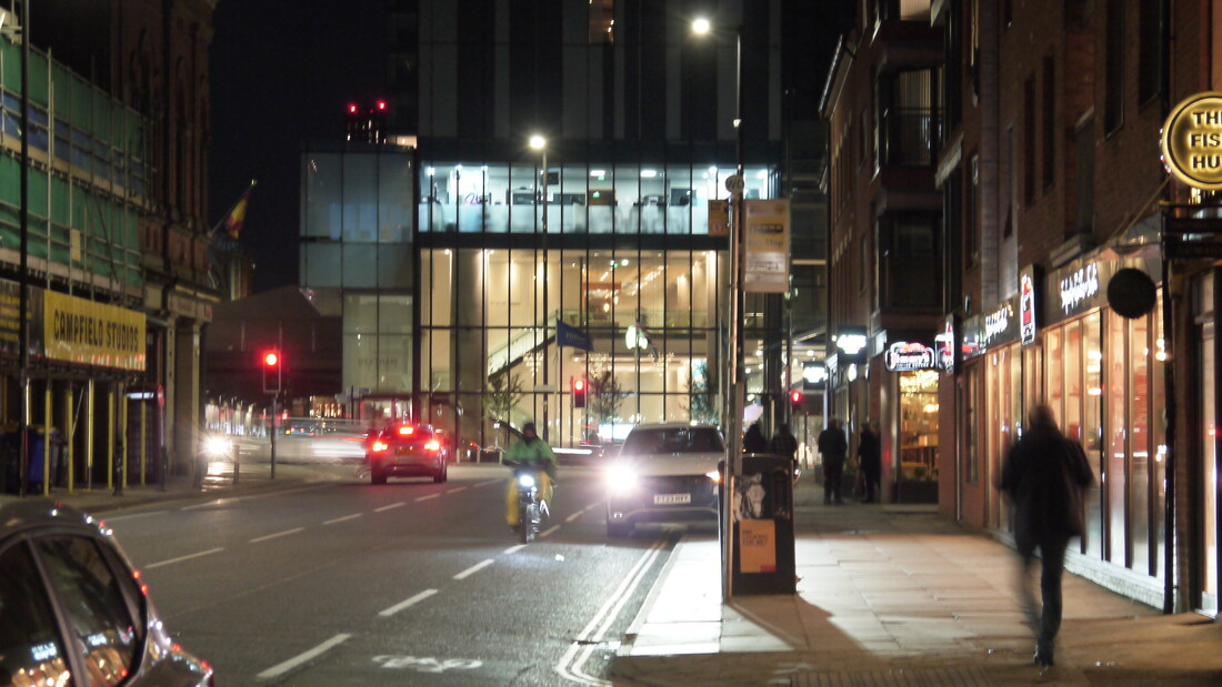
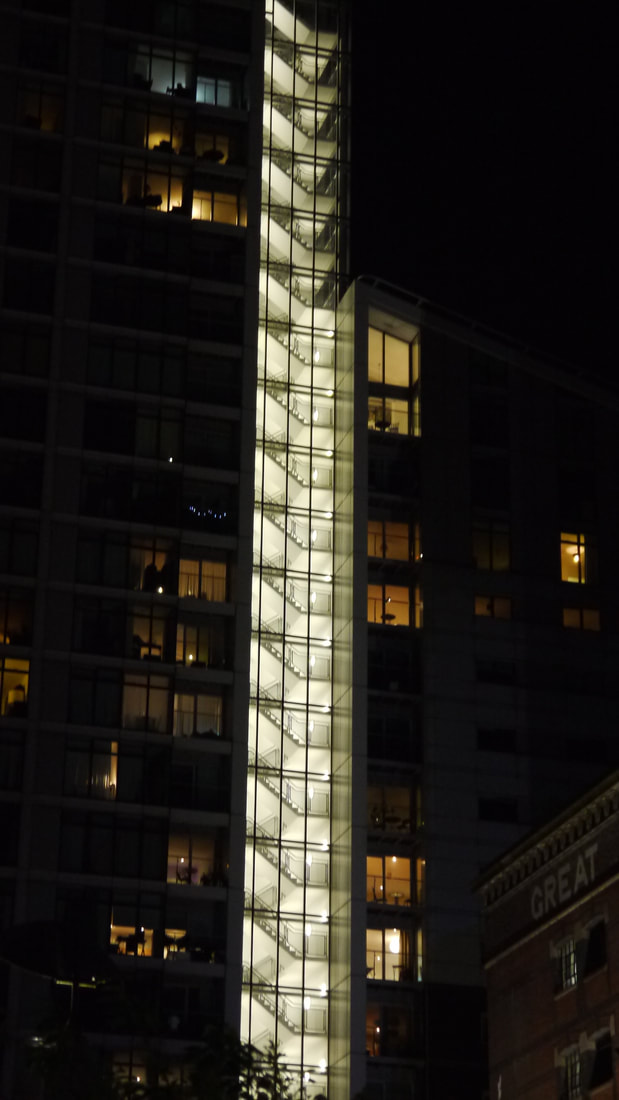
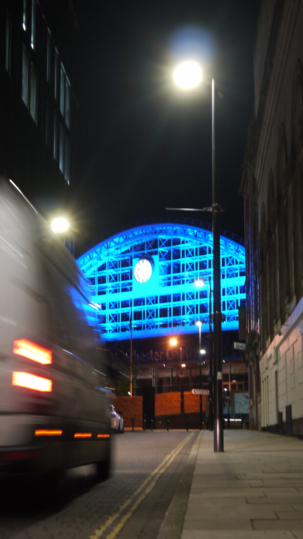
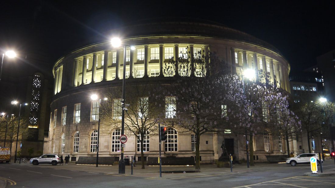
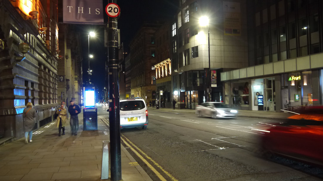
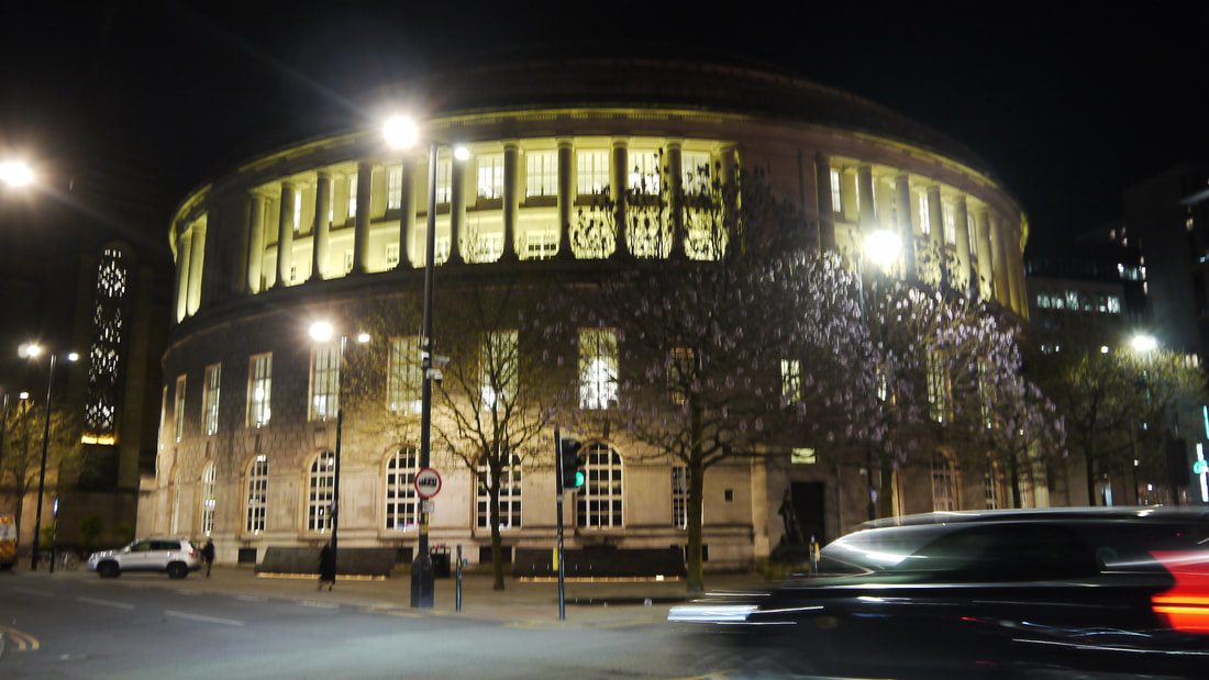
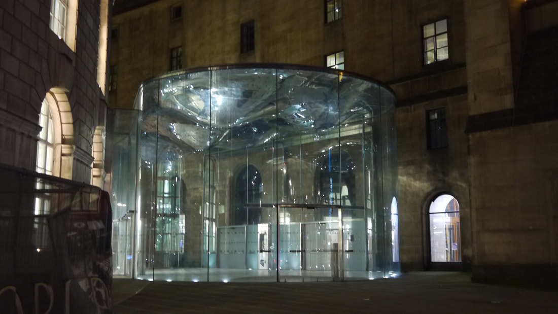
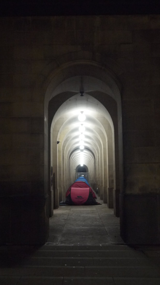
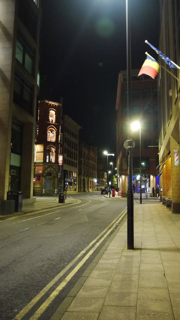
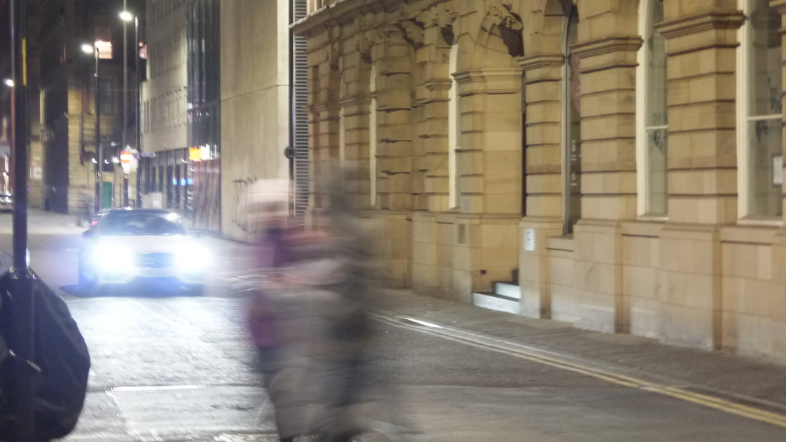
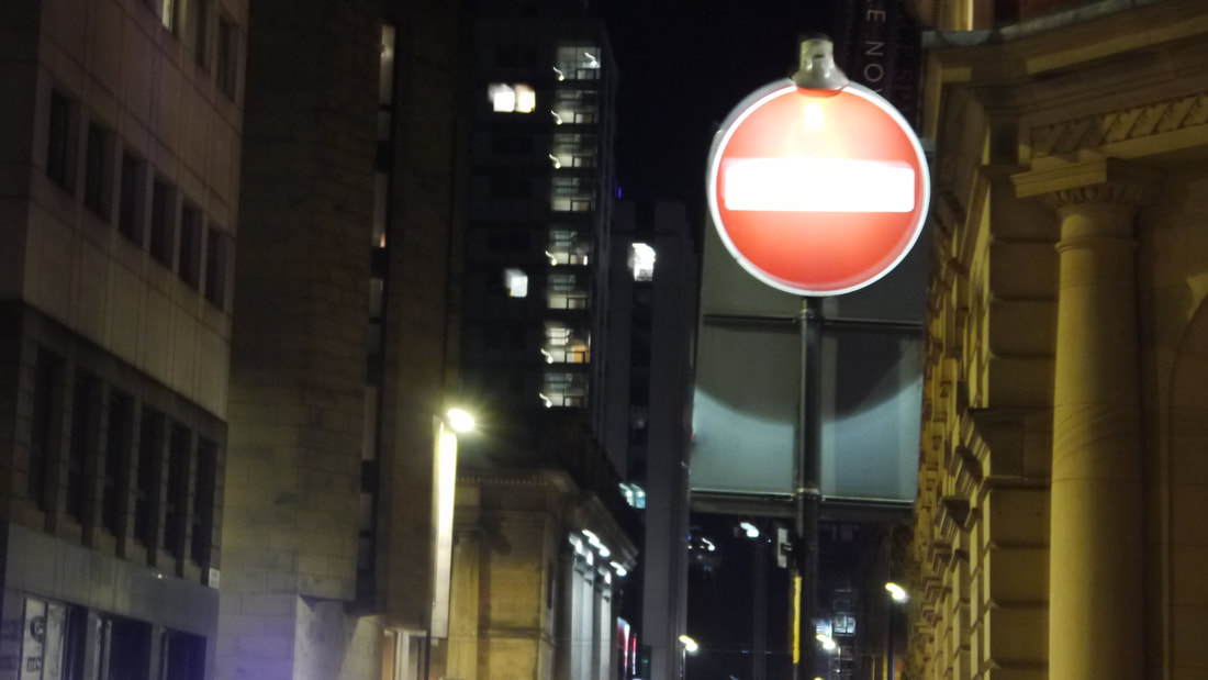
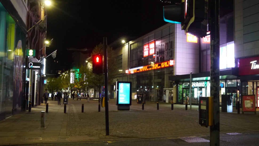
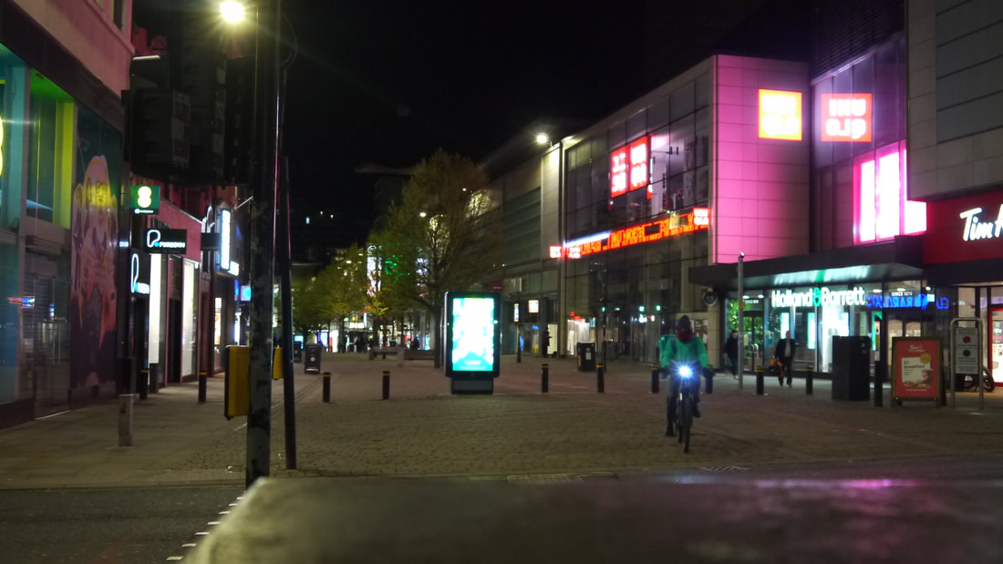
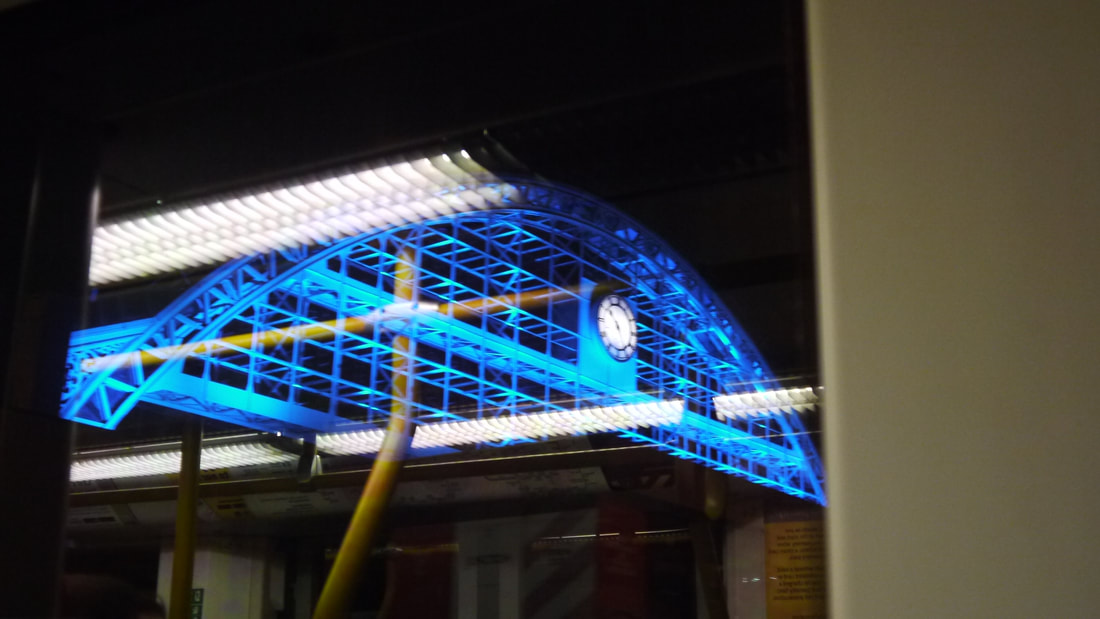
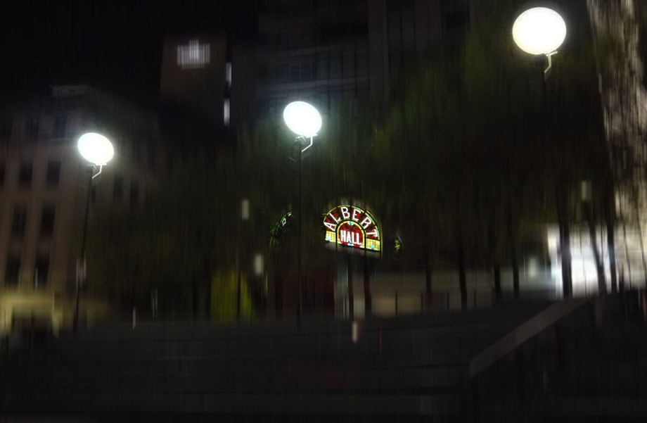
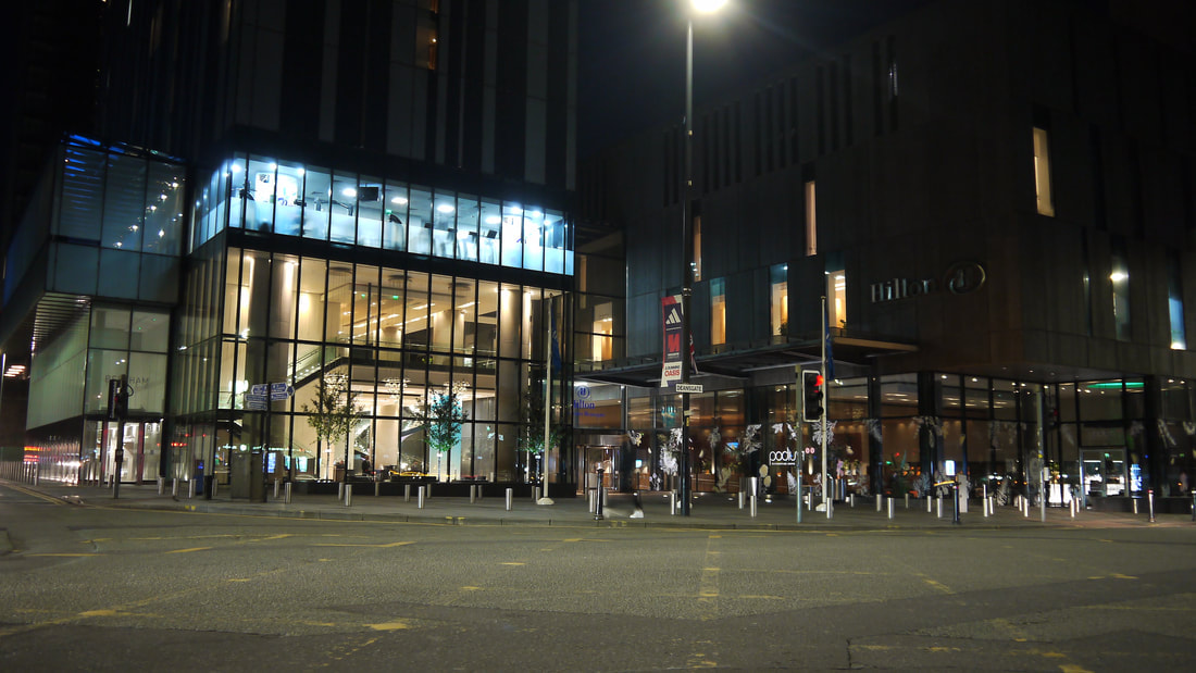
Places & Spaces shoot: Manchester City Centre (Night)
|
|
|


|

|


|
|


|
|


|
|


|
|
|


|

|
|
|


|
|


|
|


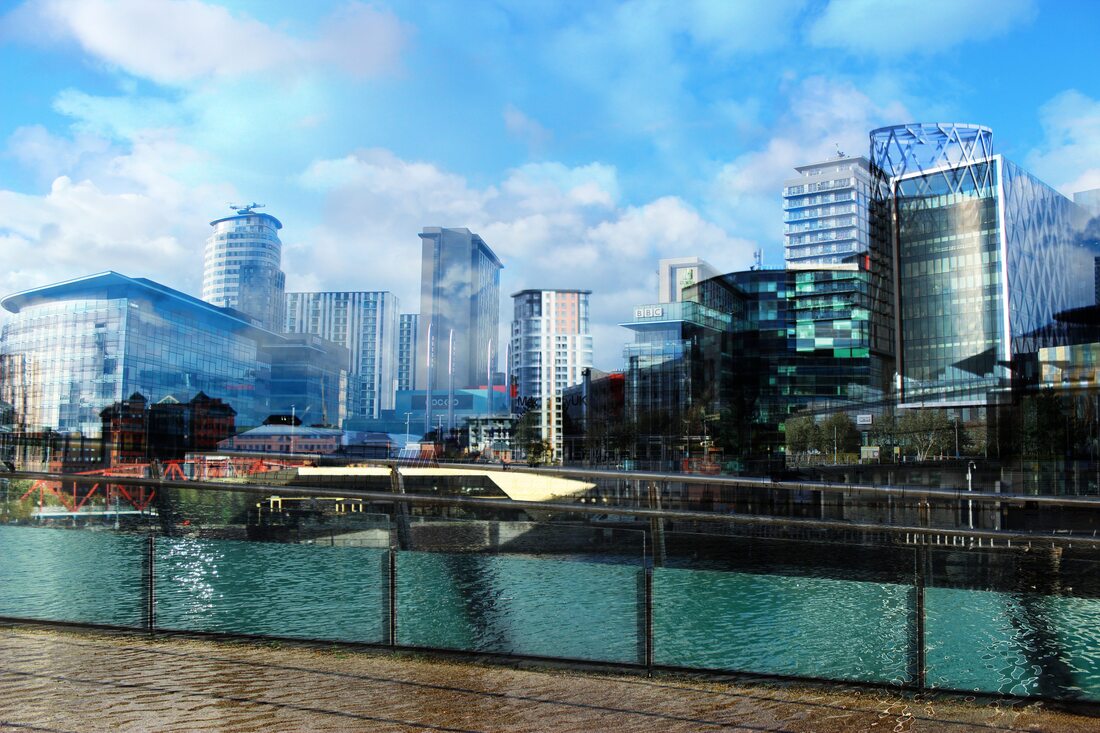
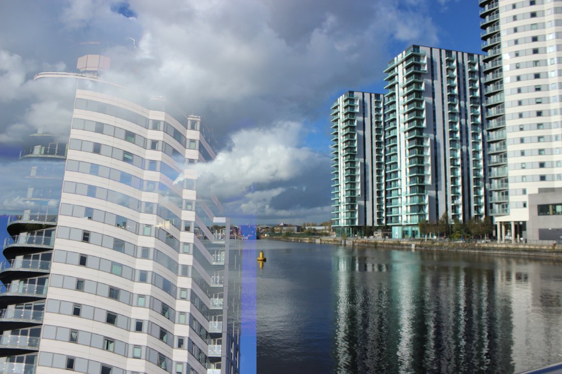
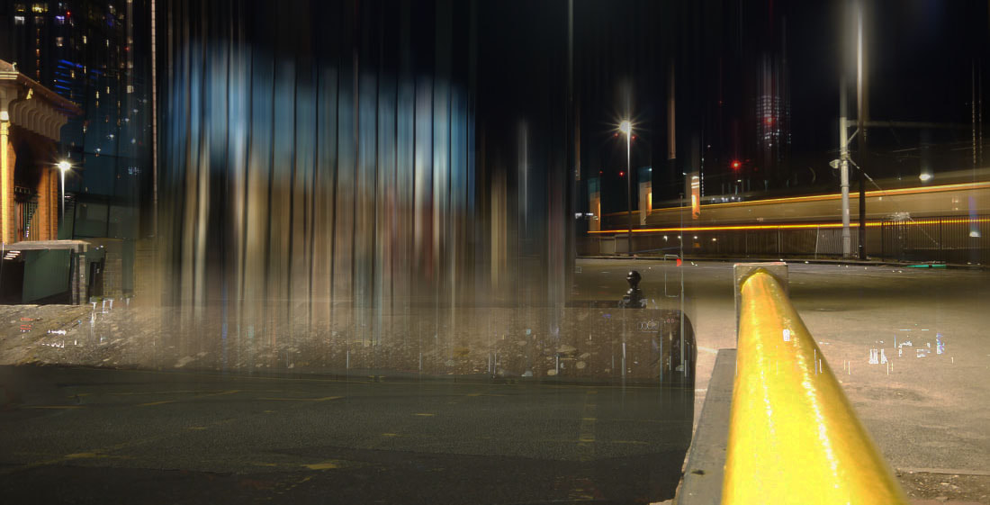
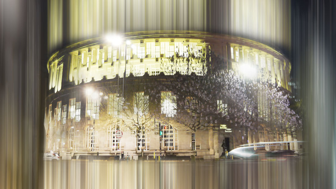
Experimental edits before exam
Tutorial I used to help with these edits:
1st image
2 images combined: Before

|

|
2 images combined: After

Process:


2nd image
2 images combined: Before
|

|
2 images combined: After
Process:


3rd Image
2 images combined: Before

|

|
2 images combined: After
Process:


Architecture Edit 1
Process:


Before
|
After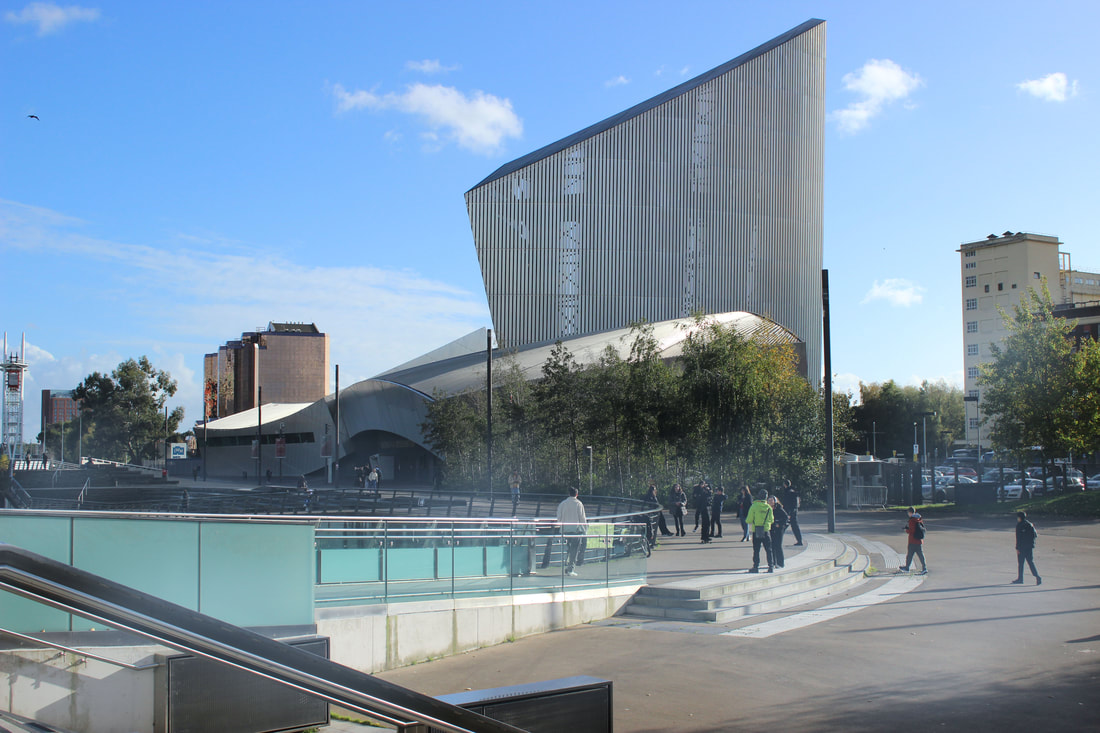
|
2nd Architecture Edit
Process:


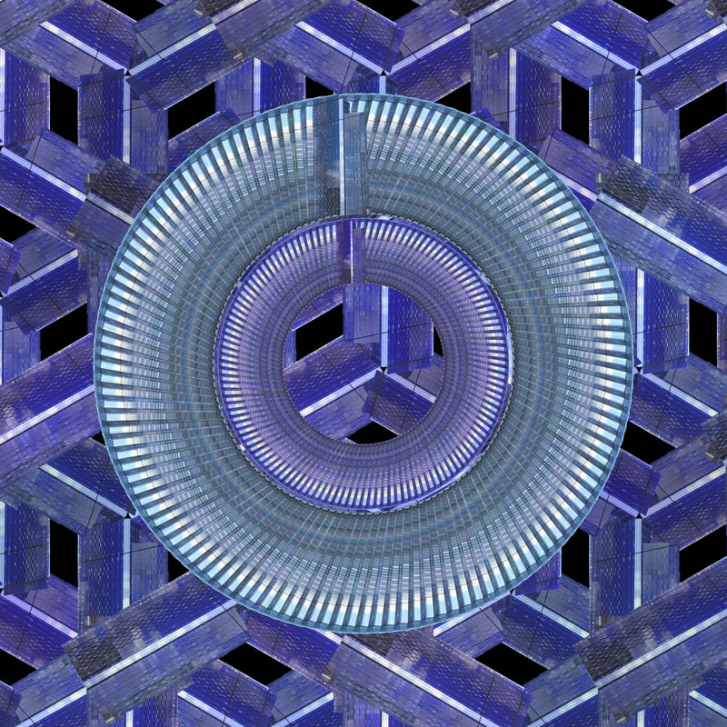
Gina Soden inspired Kaleidoscope edit (before exam)
Video I used to help:
Process:


Starting Product |
Finished Product |
|
|
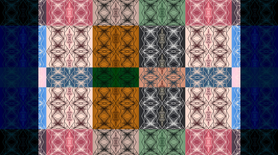
Kaleidoscope edit 2 (before exam)
Video I used to help:
Process:


Starting Product |
Finished Product |
Alternative Products |
|


Exam prep edit 1
Tutorial I used to help:
Process:


Starting Product |
Finished Product |
|
|
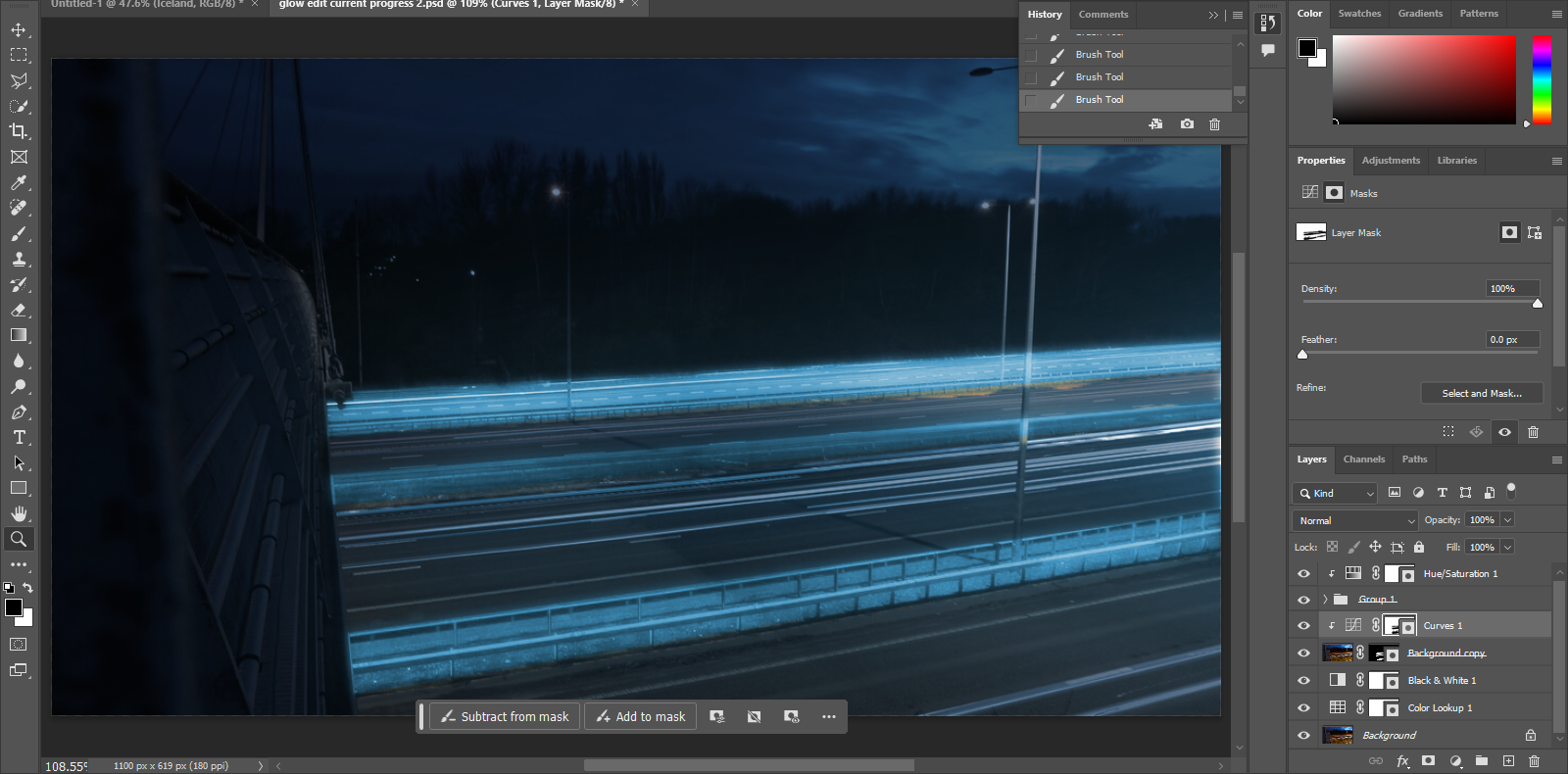
Photoshop Process
For this edit, I decided on trying to be much different on what I wanted to do compared to edits in other projects. I went with a glow effect in the end due to my night shots of my shoot fitting well for that effect. In photoshop I found myself repeating a lot of steps at times, specifically the gaussian blur effect and giving it various radius's to its effect on the image. There were several new tools I got to use as well here, using new tools like: polygonal lasso, colour lookup layers and colourise. I was able to understand these tools better and see what purpose they serve to the image. I would say overall I'm somewhat satisfied with this image. the colour lookup layers have helped it transform this edit with the added starry background pushing it up some more. But I think I could make better edits than this despite the outcome being pretty to me, For a start however I am happy with what I have created from photo to edit.
Exam prep edit 2
Tutorial I used to help:
Process:


Starting Products
|
|
Finished Product

Photoshop Process
This edit originally had another outcome to it using a different tutorial, but after scrapping it and using the other tutorial I have gotten an outcome 100 times better than I thought I could get. The process was short too, so I could make these edits quickly and end up with potentially even better outcomes than the one here, if I had 2 images that were more identical then I definitely would've had a better outcome. But with what I had to work with I think I fused the images well together and made this image come off more appealing than what was pictured in my head. There weren't any new tools used in this edit its one of my least experimental edits in that regard, but its also one of my best looking edits too. There are some parts of the image I would've liked to not get into the final outcome, an example being the sides of the bridge that I didn't really do much to try and remove. But I still really like this edit, most specifically that the lines going straight on in the edit look like they're progressing down the image and almost down a hill.
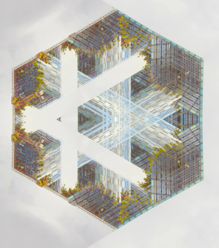
Exam prep edit 3
Process:


Starting Product |
Finished Product |

|

|
Photoshop Process
This edit wasn't actually following a tutorial, instead following a kaleidoscope type edit and having a really nice outcome. I made this on a 16 : 9 canvas and this final product is the result of 4 of these outcomes, 2 being flipped vertically and 1 being horizontally flipped. Although the process is really simple, its a really nice outcome from the fact that it was developed from an edit outcome. Therefore I could get this eye outcome that looks really nice on its own and gets rid of weaknesses of the finished product before.
Exam prep edit 4
Process:


Starting Product
|
Finished Product
|
Photoshop Process
Like the last edit, this one didn't follow a tutorial either, instead enhancing the last edit and using the colour lookup too along with the duplicate tool to make multiple outcomes into one canvas, all with different effects applied onto it. I think that what I made with it looks nice especially with the colour lookup layers I chose to use, but I think maybe using a couple more tools and manipulating the outcomes could make a more interesting edit. Maybe I should make an even bigger edit from this, not just using 6 final outcomes but maybe 12 or 18 of them all in one a3 canvas and see where it goes. Perhaps when I'm in the exam editing this I should start experimenting on the outcome after all the steps as well and see where that takes me.
Edits done in 10 hour exam time frame
Session 1
Edit 1
Process:


Starting Product |
Finished Product |
Alternative Product |

|
|
|
Edit 2
Process:


Starting Product |
Finished Product |

|
|
Edit 3
Process:


Starting Products
|
|
Finished Product
Edit 4
Process:


Starting Products

|
|
Finished Product
Session 2
Edit 5
Process:


Starting Products |
Finished Product |

|
|
|
Edit 6
Process:


Starting Products
|
|

|
Finished Product

Edit 7
Process:


Starting Product |
Finished Product |

|

|
Edit 8
Process:


Starting Product |
Finished Product |
|
|
|
Edit 9
Process:


Starting Products
|
|
Finished Product
Edit 10
Process:


Starting Product
|
Finished Product
|
Edit 11
Process:


Starting Product
|
Finished Product
|
Edit 12
Process:


Starting Product
|
Alternative Product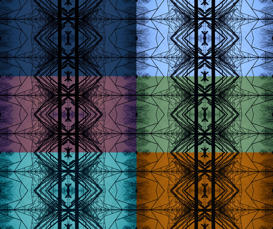
|
Finished Product

Edit 13
Process:


Starting Products

|

|
Finished Product |
Alternative Product |
|
|
Edit 14
Process:


Starting Product |
Finished Product |

|

|
Edit 15
Process:


Starting Product
|
Finished Product
|
Session 3
Edit 16
Process:


Starting Products
|

|
Finished Product |
Alternative Product |
|
|
Edit 17
Process:


Starting Products

|
|
Finished Product
Edit 18
Process:


Starting Product
|
Finished Product
|
Edit 19
Process:


Starting Product
|
Alternative Product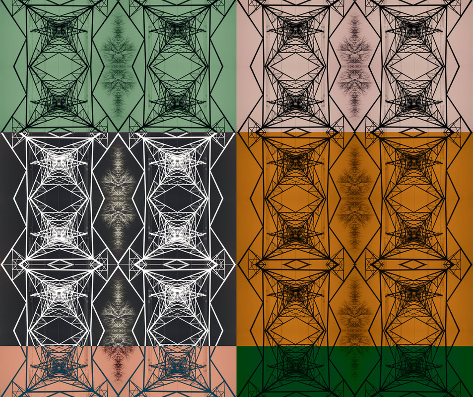
|
Finished Product

Edit 20
Process:


Finished Product
Edit 21
Process:


Starting Product |
Finished Product |
|

|
Edit 22
Process:


Alternative Process:


Finished Product
|
Alternative Product
|
Final Gallery
|
|
|
|
|
|
Edits:
|
|
|
Evaluation
In Places and spaces, I had chosen to go to locations nearby that had some good personal meaning to me in one way or another. Overtime I picked out my places to go and what edits I could make from the photos when coming back to photoshop. Through the whole project I did find that I could make many edits without needing to go a load of places, as long as I got a good quantity of photos, which in the end I definitely got a lot of raw outcomes to use as edits and to show alone (without editing). In this project I had a look at only a few photographers to take inspiration from in one way or another. I had done an analysis on Liam Wong, Nobuhiro Nakanishi and Simon Buckley, these 3 photographers I used as main inspiration for some of the photos I was getting in this project. Overall I would say that I got photos that mimicked Wong's photos best, as his photos stuck out to me as the best of all the 3 photographers, but I would say that for photographer Nobuhiro Nakanishi, I wanted to use his creativity as an inspiration form my edits, to not just make edits, but make edits of those finished edits and see where it could take me. When compared to Nakanishi its not the same level of creativity but his way of breaking away from the photo and making it into something so far away from its original outcome was what I wanted to do with my photos too, which I feel is best represented in my edits here.
In this project I also made sure to get as many shots following different rules as possible, to really ensure that none of this photos were boring or didnt hold an interesting aspect to them. I know that symmetry has been shown a lot in some of these photos but along the way there has been rule of thirds, worms eye view and a few close ups too. I would say that in the time frame that I have been given for this exam, that I am happy with what I have in front of me today, there's more than my other projects on my website and I'd say that I made good use of the time given to me in this project. I'm additionally also quite proud of it as well, I don't feel as if I lazily slumped my way through but rather actually gave it the most of my effect that can be given from my end. Obviously the project isn't perfect but I haven't got any complaints personally or regrets in this project overall.
In this project I also made sure to get as many shots following different rules as possible, to really ensure that none of this photos were boring or didnt hold an interesting aspect to them. I know that symmetry has been shown a lot in some of these photos but along the way there has been rule of thirds, worms eye view and a few close ups too. I would say that in the time frame that I have been given for this exam, that I am happy with what I have in front of me today, there's more than my other projects on my website and I'd say that I made good use of the time given to me in this project. I'm additionally also quite proud of it as well, I don't feel as if I lazily slumped my way through but rather actually gave it the most of my effect that can be given from my end. Obviously the project isn't perfect but I haven't got any complaints personally or regrets in this project overall.
