Statement of intent
For my student choice project, I have chosen to go with the main theme of identity that will visually capture the ideas and inspiration taken from the identity photographers I researched, using their work as a sample to how I will go about my photos, all to create a gallery that displays identity in forms that are personal to me, along with capturing identity in ways that aren't as close to me as well, adding up to a good level of variety being displayed in the timeline. Within this identity project I will look into even experimenting with other themes like black and white or even framing at times that can ultimately be a layer on top of the main theme that I am going with. The locations that I plan to shoot at hopefully will be erratic and not just fixed to a few locations, places like Manchester's city center always have people coming through that all are explicitly diverse in their own individual and sometimes abstract ways, I see it as a perfect place to capture a wide variety of identity in people, the combination of that and then utilizing my researched photographers in person will be crucial in demonstrating a balance of exploring different themes but also sticking to identity in there, hopefully helping to also make my gallery stand out with its diversity and experimentalism. Other places along the lines of a park or local communal places would help to bring my more personal themes of identity to come out more, using my friends or potentially family as models as they all embrace diversity within them externally or internally that also match the central themes of identity that I will hopefully explore most throughout this project, If in public too I will use the time to try see if members of the public would be open for letting me take photos of them.
I have done research on a decent amount of photographers in identity, with the aim to sample their photos in my shoots. People like: Hark1Karan, Theo Gould, Marcel Duchamp, Hank Willis Thomas, Kiran Gidda and Cindy Sherman are photographers with gallaries that show identity in a light that I want to work around and use so that I could elevate my outcomes of shoots, with what they do to influence the outcome of their photos, is hopefully what I want to do to influence my outcome too. Theo Gould uses a lack of colour in his gallaries to help with drawing negative connotations to the viewers head, whereas Hark1Karan has his photos show a heavy amount of colour.
In this, I also want to merge my ideas with identity in as well, using just more than their appearance to create a feeling of identity, but to tie it to more universal things like expression, stance, emotion and more general ideas that allow an outside perspective to see half of what the image is trying to communicate without the context behind it. I'll also hope to get more experimental with the camera settings and manipulate the effects of some of the settings, like using a higher ISO to add that grain and noisiness, potentially in a photo that's identity is all centered around a feeling of anxiety or to represent mental health in one way or another, so that the grain can act as a symbol to help elevate the outcome of the image too, before any editing has happened. In photoshop I would like to take on doing more unique, colourful edits, accompanied by some colourless edits too that has its core focus on more negative and tougher parts of identity, not only making them colourless but trying to make them unique in their own style too so that no part of my edits feel empty or feel like they're missing something.
Identity Coggle mindmap
Student Choice Plan:
Identity Photo Analysis: Birthe Piontek
Context:
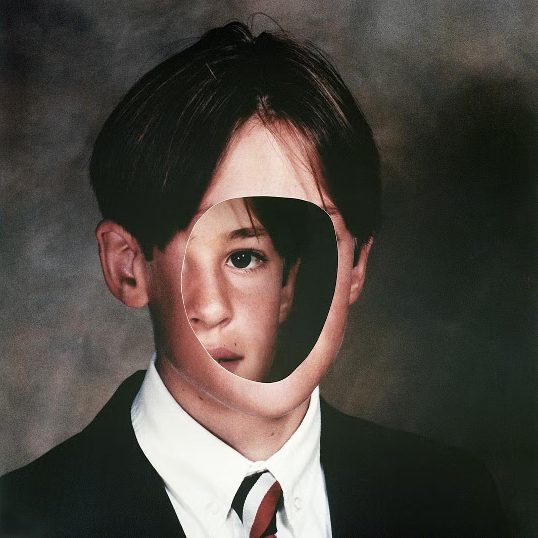
The image here was made by Canadian photographer, Birthe Piontek and often spends time making images by looking on Ebay and around flea and thrift markets, primarily looking for images like studio portraits and other non-candid scenarios where the subject gazes directly into the camera. The image here has an unusual name of 'Untitled #11', which is part of a set of untitled pictures from 2013 and 2014, there isn't a specific reason to make this photo apart from it being a part of the Untitled series that Piontek has made, it demonstrates purpose of it being as vague as possible and allowing the viewer to interpret it and make its own footing of the image. Piontek has said she collects these photos to make her own fiction about them, the portraits of people she doesn't know at all as well as the model gazing straight into the camera undistracted is her ideal for collecting these portraits, its what she can work with best. “I usually spend quite a bit of time with the image, looking at it and familiarizing myself with it," Says, Piontek. "In a way I try to get to know the person that is shown in it, and figure out the essence and uniqueness of that particular image.” (Information from hafny.org/blog/2014/12/birthe-piontek )
Content:
The portrait here shows us what we could assume to be a student picture, due to the fact he is wearing a uniform. The side of his face has then been cut out and then stuck on his face directly, hiding more of his features. This then makes this image a standout one in a collage, The cut out makes all the difference as it adds meaning to this photo and allows us to form ideas off of it. What I think Piontek has done here is that she has made a copy of the image and then got that circular cut out in the copied image, followed by sticking it on top of the actual portrait, the white cut out lines and uneven cutting gives a makeshift, rushed cut out feeling to the image. I can interpret this photo as a potential representation as a theme of anxiety and Piontek trying to paint it as the student isn't comfortable with their portrait. The picture's realism is there without the cut out, but we know normally a portraits outcome wouldn't look like this, I think its realistic though in the regard that someone with anxiety like this would do this to stop their face from being shown if they could, self-worth is a nessecity to confidence and perhaps someone struggling with it this much could drive them to try become as invisible as possible. The colour of this image already has little vibrancy, but I think Piontek has used that to her advantage as the portrait can't hold any positive feelings and at best a neutral feeling, so that the theme of anxiety cant be interpreted differently too much. The dimming of the tone and light was important so that the anxious theme could be more exposed. The image has been created around a typical realistic theme, as many areas of Piontek's work have been. The cut out of the student being the only edited thing about this image is that one thing that repels the image from having the physical realism engraved into it. But the edit also serves to add virtual realism to the image if Piontek is trying to associate this photo with anxiety. Piontek does these things to make sure that her work is standing out, but to also demonstrate her creative manipulation of photos. There couldn't really be another theme with this image apart from the anxiety representation the image gives off, but from what I see in the cut out, this could be a sub-theme of anxiety as a whole, confidence and self-worth. There are many themes of anxiety, in specific this theme could revolve around a lack of self-worth/confidence in the student, causing him to try and hide as much as possible from the world. Hoping to make his portrait harder to match his face to exactly. We could even use the pictures title as way to find more meaning. The title ‘Untitled #11’ could add narrative to the anxiety Piontek is portraying, that being self-worth and that the boy is anxious to a point where he doesn't label or rate himself at all, but this could also mean nothing too. There's so little to say about the rest of the image but the cut out itself and where its placed. With cut out's Piontek is aware of how many ways you could look at why the cut out has been done, what its trying to say to us and why its there. She's done it over his face to potentially draw us into the anxiety theme or maybe even into a deceptive theme. Seeing as the cut out is of the side of the boy's face you may even see it as him being two-faced and masking his whole self by using one side of his face to hide the whole other side and perhaps more deceiving part.
Composition:
We now move to the composition and there isn't much to point out here. Firstly no leading lines can be seen as the student portrait shows. The depth of field can be seen as a medium as the foreground and background are seeable in this photography. The shot would be framed obviously as it’s a student portrait meaning it would be framed the picture to me is very still so it's probable that a tripod was used in this photo. If we go to the main part now which is camera settings, I think that there’s an Auto white balance because of how warm the image is, it doesn't seem to be using any outside White balance options like Tungsten or Halogen nor Sunny as it's more used outdoors, Tungsten also has that slight bluey outcome in photos. There could be an ISO between 1500-2000 because of how grainy the image is in outcome, the background looks very noisy so its more likely that a higher ISO has been used to make this outcome. The aperture here could revolve around a smaller aperture, as there isn't that much of a depth of field being presented here. From that the F-stop might be around f/5.6. The last camera setting being the shutter speed looks to be 1/250-1/30 as there's not that much light in the image, it looks more dimmer than a normal picture so not much light has been let into the camera. But there are some elements of light being shown in the image, mainly the persons head takes up a lot of the light, which leads me to also think 1/30. The composition of the image seems to be more barebones, this is a portrait but there could be asymmetry because of the way the models face is cut out and moved in a little to have an unequal level of background to the model. The models face dominates the space more than the background in a 75/25 way of asymmetry.
Connection:
To me, I like this work for the creative cutout idea Birthe Piontek worked with, she chooses to use the manual edits she makes to make us think about how this could relate to different forms of identity. What she done is completely create a different story/ meaning to this image from when she originally bought it. Piontek turns a regular portrait into a work of identity, culminating in a common ideology of it suggesting anxiety or nervous feelings. The work links to mine in the theme of identity, our face not being there can really grab connotations of someone with a mystery or a scared personality to us, personality is what shapes up our social identity, an important part of people's lives. I do have the idea of using this image and using closeups as images to cut out and then move their face inwards to make a sense of social anxiety or a feeling of irrationality. Her small transformation of portraits is one that completely redefines the meaning of it to most, we use natural thoughts to understand the portrait, Piontek leaves the image in an open field for us to dissect and form our own ideas of the image, her cut out work is common, but its really impressive.
Identity Photo Analysis: Cindy Sherman
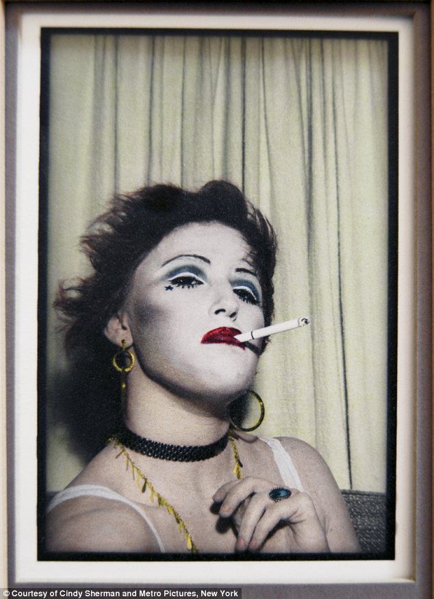
This photo was made for one of Cindy’s exhibitions in Vienna, Austria at the MoMA exhibition but became one of many lost ones and didn’t show at the exhibition. This was also part of 3 images that showed her take on Jerry Hall's Vogue cover from 1975. Cindy Sherman can relate to this in the way that she's in this image and it's obviously a self-portrait, but also that this mime face paint she holds is quite common across her other shoots, commonly popping up being in one place or doing something or having a different expression. Constantly in her work Cindy Sherman is manipulating her looks to convey identity out in her photos, she's a photographer that is very self-sufficient in making her own works, not only when making MoMA exhibitions, but also when making her own, independent works too, it doesn't come as much of a surprise to find out that she's a close worker with MoMA. Cindy Sherman as an identity photographer doesn't choose to challenge political themes, her works play with the visual and cultural codes of art, celebrity, gender, and photography, Sherman has works that have been perceived as having feminist messages, but she has said that the feminist message is more meant to be implicit than explicit. (Information from https://www.moma.org/artists/5392 )
In this picture we see Cindy Sherman herself in the portrait in bold looks, a mime looking face paint on her, a cigarette in her mouth and clashing clothing choices. She chose to look very quite to her actual self in this image as she's almost unrecognizable to people. We also see this photo trying to convey a feel of a retro photo booth with an variety of different colours and an chilled tone in the image. Sherman wears earrings that are unequal in ring size, capturing comical, spontaneous features of the image that add to the overall eye capturing image. On her neck being a black collar and a necklace. The way she has her cigarette held in her mouth and how her hand is positioned, accompanied with her daring expression provides a cinematic tone to me, as if she's in an Italian mob or mafia. We know that the image is a self portrait of Sherman and the image could be covering identity in terms of personality, this portrait sees Sherman with a lot of different facial features mixed with wearing and holding items that unrelated from one another, which could be some symbolism on how a bunch of different factors determine the overall personality of someone. Her smoking a cigarette while she has that deep but vibrant red lipstick on are polar opposites, as smoking is usually linked to addiction and draws bland connotations and tones to people, whilst her red, vibrant and grand lipstick sparks thoughts of glamour, stardom and paints a picture of someone who lives fancy in our mind. The two opposites are fused in this image to focus on personality that might represent that unusual part of us which is the more erratic and crazier side. The use of Sherman being in mime face paint and smoking can show that creative weird side of a person and how its being embraced, we normally don't let that side of us show for fear of judgement from others around us, especially in places where you may not recognize anyone around you, the title of this picture (although I'm not concrete solid on it) is ‘Cindy the Vamp’ ,the title could use the word 'Vamp' (commonly short for 'vampire') is more of an abstract word that Cindy Sherman may be using to describe herself. She could be trying to use the alternative meaning of a vampire which can be also defined as a woman who ruins, degrades or exploits men they prey on. , crazy but still some somewhat kept in part of Sherman as the image still retains this classy, laid-back feel, kind of like being out of place but it feeling like it's just fitting into my original thought. I wouldn’t say any parts of the image have been exaggerated apart from potentially the pictures edits, to me in summary its clear that the message communicated here is that the weird parts of us aren’t too bad to show, the oddities and different things can just represent the weirdness of us as people and how we use them to make interesting things left exclusive to a small group of people.
Composition can be a rather slower field here but we know this is taken in a portrait angle, she positions herself off centre here, nothing feels out of focus except her hair. her distance from the camera could be in a middle space between far from the camera or close to the camera, which could serve as a reason to why her facial appearance is all in focus but her hair and part of her shoulder is out of focus. The shot feels framed as it's got that 70's vintage photo booth vibe. A Shutter speed of 1/1000 in the image has probably been used as its a very still image, nothing is in the middle of happening when the photo is taken so there wouldn't be more of a need to change the Shutter speed. In my opinion an ISO of 800-1600 could've been used due to the image having a more noisy look to it, which could've been done to make the distinct visual vintage effect come out clearly, the heavy grain making the photo feel older and helping match the themes of a vintage photo, it really feels like this photo has been taken on film, or if the effects were amplified after taking the photo. To me an Aperture of f/5.6 and an Auto or Tungsten White balance is potentially given off because of that very slight blueish/blackish look around the corners of the image, it semi eludes the focus all to her face, like she's coming off as slightly magical. The curtain behind her potentially act as well as a faint element of leading lines, with some of the curtain lines almost hitting these dints in her hair and one curtain line just directly aligning with the cigarette, looking as if the cigarette is warping the straight look of the curtain lines before. The lighting in this image looks to be coming from directly behind the camera, not left or right. This could mean she's used the flash on the camera to get this outcome. This then helps illuminate the feel that she's in a photo booth, and that this picture is taken as if it were the flash goes off in the booth. The setting is open to interpretation too, the background doesn't indicate a specific setting by what's behind it. The only theme that I'm pointed to is the vintage theme for the camera settings being used and vibe of the photo. I personally think she's in a photo booth for how closed in the setting feels and because of the frame that's been used, the lighting being right behind the camera also creates the illusion that its the photo booth flash and therefore gives me these these connotations.
I like this work because it has that very casual vintage implication to it, with a knack for a clear strange discrepancy in the image. A weird theme but one that I like in a more subtle way, that feeling of something off and that being used to be expanded on is something that would be tough, but cool to explore and see how and what could be done to make that, these kinds of vintage images is what I aim to mimic as its got that good aesthetic to me, but with the idea to not do a vintage edit, but only make a photo that sets a vintage feel raw and the edit taking off from that and transforming its feel to be a cross between. The painting vintage feel so like its old enough to look like it but still able to be seen and recognized as a person has that warm feeling to me and its something that I would like to revisit in the future. The one weakness I have in mind is that she should have a photo where the cigarette is lit and a little slither of smoke come out, I really like the smokey projection of her hair because after her head in the bottom left her hair fades into a more softer and silky look in the way the image comes out, the ISO making the image noisy could've enhanced this look of her hair. In future shoots I could get my models to give me a quickfire list of 5 items and then see how I could use it to show that kind of oddness in the photos with those items as props that can be held/put on/used. It would elevate an off tone with the picture when it comes out. The colours in this image too I have had used in images before this, the whiteness of the background could be used in one way or another in my images for sure, and the red definitely to me illuminates as a colour that comes out in many different cultures, whether it be in a piece of clothing or item, red is a colour that I like being linked to identity. One more colour too that I would be interested in putting into a shoot is gold, as its got that luxurious feel behind it and it'll make my shoots have more of a quality feel to it, but the quality will be centred around my pictures and how they come out and what direction I take on when it comes to the shoot. I would like a variety of colour to come out in my shoots but its not my primary focus, as long as areas of identity that I want to be covered are being covered it'll make me satisfied.
Identity Photo Analysis: Theo Gould

This photo by Theo Gould was taken in 2021 as part of a gallery named 'Mixed', being made for the Sony World Photography Awards that year, Mixed went on to be one of the winners galleries that year. The gallery was made by Gould to explore racial and cultural identity, dealing with themes that are specific to people who have mixed heritage and capturing the essence of what its like being mixed. Theo Gould also saying that it explores the experiences of each subjects but also his own. As his website says the 'Mixed' gallery is still ongoing, with him adding more to the gallery over time. Theo Gould was born in London but his mum was born in Kenya and his Jewish dad was born in Manchester, England, his family being from Iran, Syria and Eastern Europe. The main message Gould tackles here is the complication of being mixed race, how you could be mixed race into many different cultures but never be fully part of it. He also said that for each model, he had a face-to-face conversation on what it means to be mixed race, Gould described the conversations like this: "The conversations focus especially on the contradiction of fitting in everywhere but nowhere at the same time, and the resulting shoot is a collaboration that encompasses the themes considered." (Information source from: https://www.worldphoto.org/sony-world-photography-awards/winners-galleries/2021/professional/shortlist-mixed-theo-gould , http://www.theogould.com/mixed/rivjiy2mjrx0u43m6ptm3c25mmyk1i and https://www.buala.org/en/face-to-face/photography-and-identity-interviewing-theo-gould )
The photo depicted here is a portrait of a woman facing away from where the light is, her eyes just being able to be made out to recognize her looking down slightly and her head also slightly angled down. She is seen to be wearing an earring in the photo, with her clothing embodying some of the mixed race identity trying to be captured by Theo Gould. Her hair is also tied up by a hair bobble, which could be another nod to her keeping that cultural essence in her identity, tied up hair can be seen in many different cultures and religions around the world. We know here that the work is representing cultural and racial identity in people, her facial look seems disappointed, as if she isn't satisfied or that she doesn't exactly match her cultural identity stereotype. Her clothes, hair and earrings can be seen more as just an appearance choice perspective, rather than in a cultural perspective from first glance to show her mixed race culture. Perhaps without the title of the full gallery being 'Mixed', someone could just see this image with a more vague idea in mind, just her being dissatisfied with something. The context and title of the gallery that Gould gives to us however can help us see the photo in different perspectives. Potentially that we get that factor of the tribulations of holding mixed identity through race and culture and how she could be disappointed. This could come in the fact that she sees herself as someone who isn't embodying the cultural roots that she holds strong enough, even though we can get a good idea of her having some cultural identity through her clothing and appearance. The image holds no form of unrealism, it is realistic in all aspects except the black and white filter it has, this image also being really easy to recreate. The image becomes much more in its meaning and not its framing and camera choices. As we know the theme of this gallery is identity in mixed race people and people of mixed race background, the message of it in this image could be the communication of the struggle some may have when trying to embrace all parts of their mixed culture, not being sure if they're representing their culture in the right way or not, or doing too much when trying to embody it into their personality, its that faintly disappointed look she shows from the side that we really think about the negative connotations she could be feeling, the black and white filter getting rid of all forms of colour only adds more negative feeling to the image here.
There are a few levels of composition to this image here that might not be too noticeable, where there is a lack of a creative camera angles, there are implicit things in this image that helps add nice touches to the outcome and make a more satisfactory image. One of the most obvious identifiable ideas used here is that this shot is a upper-body, side-profile angle of the model, but the light on her back and hair fade into the darkness and work as leading lines to lead our eyes to her disappointed expression, her hair is also tied back in a way that the light hits the long strands of her hair being held by the bobble and acting as more leading lines through her side-profile to make us notice her expression more. This shot does seem like it might have used a tripod, but there is a good possibility that Theo Gould hasn't used a tripod for the image too. Gould here uses a close up angle and her features are all captured in focus, backed with the plain, drab white background, he could've used a narrow or large depth of field, seeing as all of her features are captured well in focus however, it could be more conclusive with him using a large depth of field. What Gould might have gone with here in terms of his camera settings could have variety, looking at the White Balance used here Gould could have possibly used Auto or a more cooler area of White Balance. As these photos were taken indoor and no real natural lighting is being used, it seems more likely Gould here has used Auto or a custom cooler level of White Balance, the black and white filter doesn't make it easier to figure out here. When looking a little closer into this image here, we can see that an element of grain emerges from that background on this image, albeit a light touch of grain, but still enough for us to grab that Theo Gould here could've used a higher ISO of around 1400-1600. The grain does add more noisiness and volume here but not enough to completely dominate the photo and take away from the model being the central focal point here in the image. The image being a still shot with no movement or motion occurring could lead to a used Shutter Speed of 1/1000. The Aperture here also doesn't feel large either, Gould has potentially used a smaller aperture of around f/22 to let a decent amount of light through the lens and keep all of the model in focus.
Overall, I have a nice liking for the image here, as for the whole gallery of 'Mixed', Theo Gould pushes that theme of being mixed race and the struggles some people find within it. Not only in this image but in many other images in this gallery Gould is able to experiment with the camera settings, the model and what they're doing and what's in front of the camera as well. He shows a wide variety in identity here and it ultimately comes up to having rich diversity and not relying on the persons race itself to show off different emotion and feelings of being mixed race. Gould does this in the way of their expression, how they're positioned towards to camera, if they should be doing something or wear different clothing, where they should look and many more ways Gould has come up with. While the images can be seen in a vain thought when not given context or the title of the gallery, the meaning definitely adds more value to the photos when were given context in which were able to create more ideas from. The gallery holds a good link to me when looking at my photos, like Gould my identity project has a higher focus on race and culture, as they're themes that resonate with me strongly personally, despite me also wanting to get to other outside forms of identity to me. The side-profile shot of the model is a shot I like to use too when given the right backdrop, its also an angle that I want to use more too, my only difference being that I would incorporate more colour into the outcome, unless I chose to focus more on the struggles of identity too. To get shots that take off from Theo Gould distinctly, I would need to look into using a higher ISO in my photos more often, and potentially do photoshoots with less active backdrops if I wanted to be very exact with sampling Gould's style.
Identity Test Shoot Moodboard

Plan For Shoot
Project Title/ shoot number:
Student Choice Shoot 1
Description of aims for shoot:
I will use the shoot to make my identity ideas come to life and to also use photographers that I am using as research and make a collage of photos that sample their style.
Links with Photographers:
I want to look at the way Hark1Karan and Cindy Sherman make identity look in their eyes and implement it to my ideas too, with the potential of using Nontsikelelo Veleko too as an idea.
Location:
Outdoor spaces/School
Props/ items needed:
Nothing in mind exactly
Kit needed e.g. lighting, tripod, backdrop, macro lens:
Tripod, (potentially) Lighting, (potentially) backdrop
Items that represent brown or cultural identity
Camera settings I will use:
F-Stop :
Since my ideas on identity focuses on making the people the main subject and maybe doing many closeups, a large aperture and f/stop of perhaps f/2-f/11 would be appropriate
White Balance:
My white balance can vary on location, I might try be more outdoors than indoors, so a Daylight White Balance could be alright, but in general I may use Auto White Balance
Shutter speed:
I don't plan to have a lot of movement in my identity so 1/1000 is a good Shutter speed
ISO:
My ISO seems best fitted to being Auto or 200, but an element of more darker shoots could be in my head so I will also say 800 or so I like the idea of some noisy grainy images
Which compositional rules will I use?
I could look at leading lines as I may plan to use more than a few people for my identity, the thought interests me. symmetry could also be a composition rule to explore, patterns too maybe but there's no ideas there, rule of thirds I'll also hope to incorporate sooner or later.
Birthe Piontek Moodboard
Cindy Sherman Moodboard
Plan for second shoot
Project title/ shoot number:
Manchester Identity student choice shoot
Description of aims for shoot:
To capture a gallery of photos that display identity in one way or another, it can be through clothing, image, race, ability or anything else, the main idea being to show the diversity that surrounds the Manchester city centre.
Links with Photographers
Hark1Karan, Cindy Sherman, Marcel Duchamp, Kiran Gidda
Location:
Manchester city centre
Props/ items needed:
None
Kit needed:
Tripod, spare battery
Camera settings I will use:
F-Stop:
When there I would like a balance between photos that let in a lot of light with a large aperture and photos that wont let in much light, with a minimal sized aperture, f/11-f/2 is the range.
White Balance:
I will mostly use Auto throughout the shoot but if the conditions change then I could switch to using Daylight/Cloudy
Shutter speed:
I intend to mainly use 1/1000 to get pictures, however the busyness of Manchester city centre could open me up to using a slower option like 1/15.
ISO:
I don't want these photos having a lot of grain in them, at most perhaps a slither of grain setting into the image. I'd say an estimate of 100-400 is realistic enough.
Which compositional rules will I use?
There's a variety of rules that I would like to explore, some more than others but I want it to be experimental on the compositional front. I'll look towards using Rule of thirds and Symmetry for this shoot, I could even look into leading lines as a grounds to work on, low angles of people could have potential too to me, including upper body shots and importantly headshots.
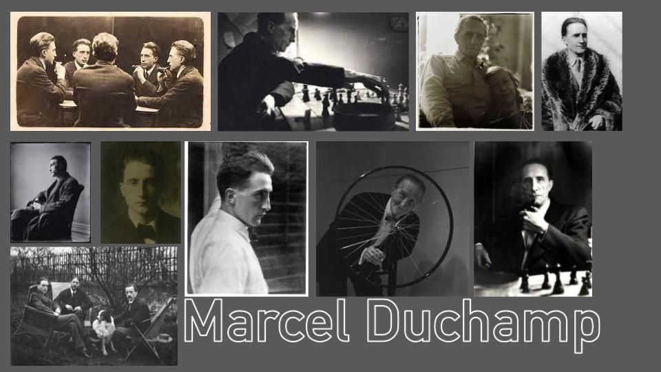
Marcel Duchamp Moodboard
Manchester identity photoshoot
Piccadilly Gardens - Exchange Square


Best
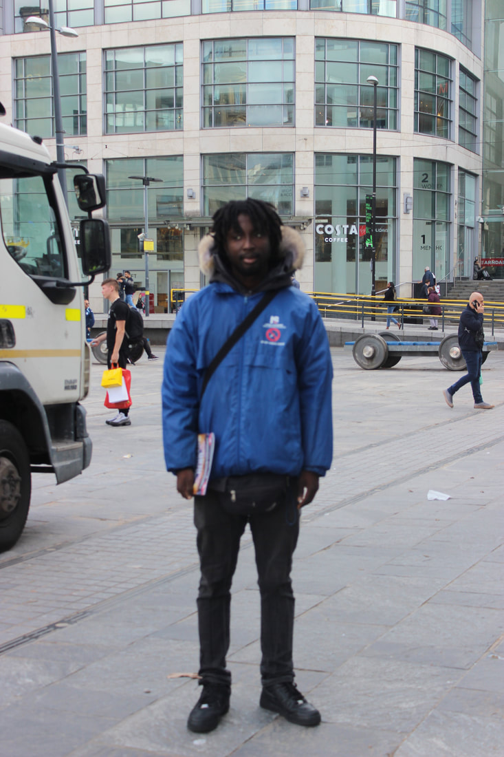
I found this image to be one of the best from the whole Manchester shoot in general for the way I went around framing the model, how the model posed for the photo, the camera settings and how this was one of the best ways I got a picture that felt very relative to my Marcel Duchamp mood board, while still feeling independent from Duchamp's photos, a link that can be subtly made. Choosing to go for a slightly behind the model angle worked here well too as I maintained decent distance from the model so it could also help make a rule of triangles between the coffee cup, phone and models face. The model was also great with their expressions, really helping it feel as if he's got somewhere to be or is planning his route, as what his phone screen suggests, the blurred motion behind him too helps add a nice little touch to the outcome. In my camera settings I ended up using an ISO of 100 in the early part of the shoot for the most part, with a Shade white balance due to the sun not really hitting the spot we were getting these photos in.
|
Worst
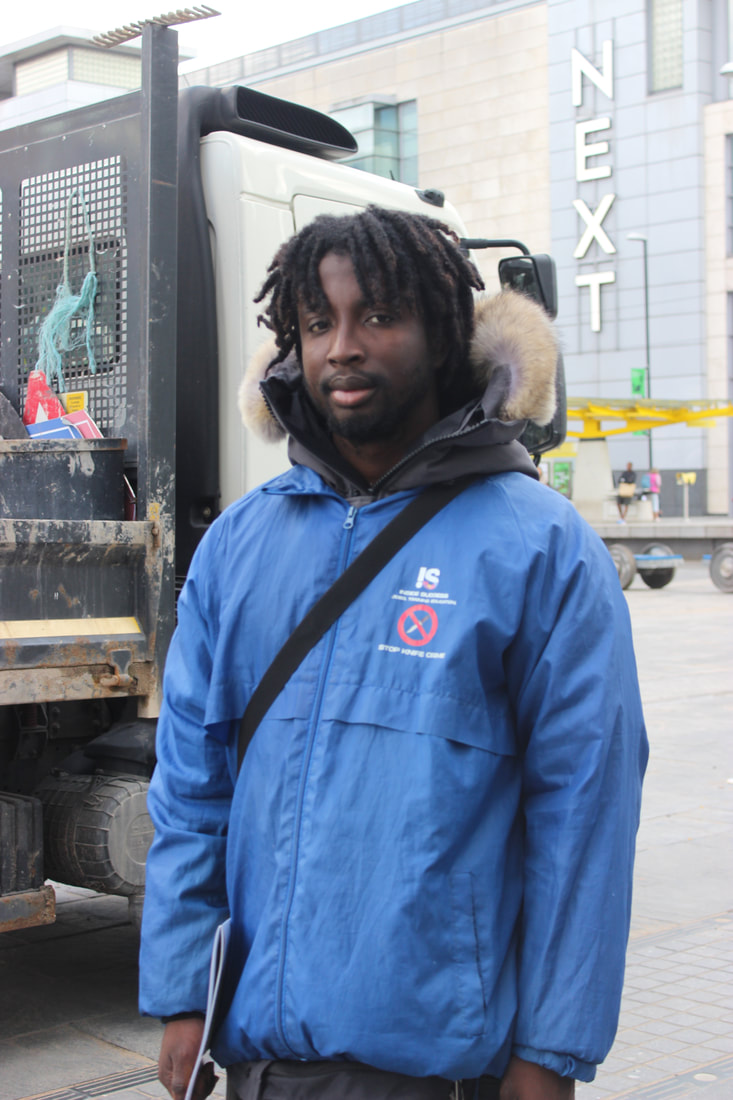
This image to me is the worst one from this part of the shoot for how the fully-body shot doesn't come off well in this image, as well as this I would've definitely put the phone in the pocket upon reflection and gone back a few steps and zoomed in with the lens, with that the image could have a much better outcome, additionally getting some of the other photographers in this image accidentally further makes the image feel worse for how its lost its natural feel, I also should've made the aperture a little bigger as the model here feels a little out of focus, setting the f/stop to something around the lines of f/8 could've helped the outcome too. Getting this shot from a front view could've also resulted in a better outcome for the photo.
|


Best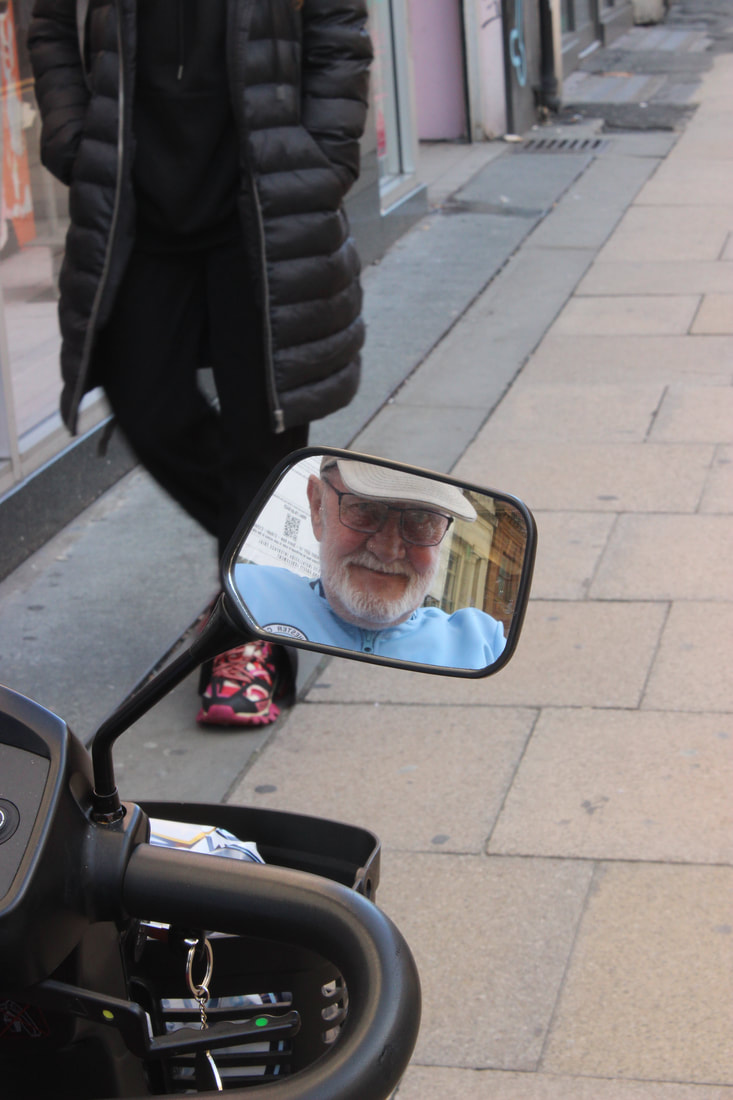
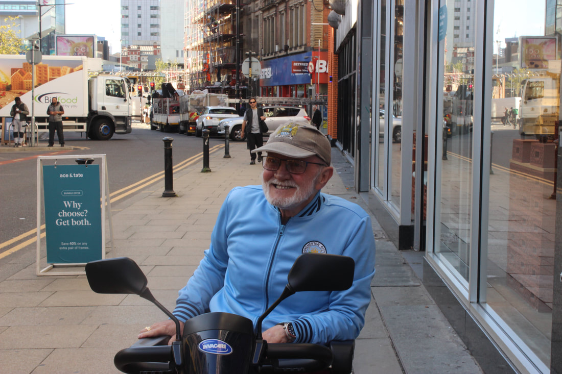
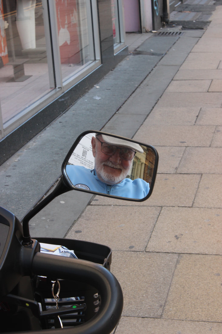
This image is also one of my main favourites from the whole Manchester shoot in general for how well the image came together, it was another one of my more unique ideas I tried out in this shoot, using his mobility scooter mirror as a way to capture identity is a nice mix of his facial appearance and items to represent age. I used the Shade white balance at this point in the shoot, as it was early in the morning in Manchester at the time. My ISO was on Auto-300 when taking this photo as I started to play around with the ISO at this stage. There seems to be a smaller aperture for this image and an f/stop of around f/5.6 for the image, keeping the pavement out of focus for this image really helped make the outcome look better, the scooter being in focus only and the reflection is one of the most appealing things about the image to me, it helps being the model more out and feel more like the central focal point in this photo.
|
Worst
While this image isn't bad by many means, this one when compared to the photos around them makes it seem much more less. If I was to retake this photo I would've done in in portrait and used a more creative angle then just going for a upper-body shot of her, considering her Jamaica bag embodied her identity well, I could've found another way to incorporate that into an image with her.
|
|
|


|
|
|
|
|
|


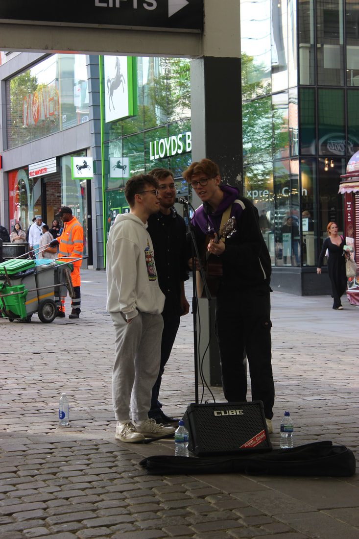
Best
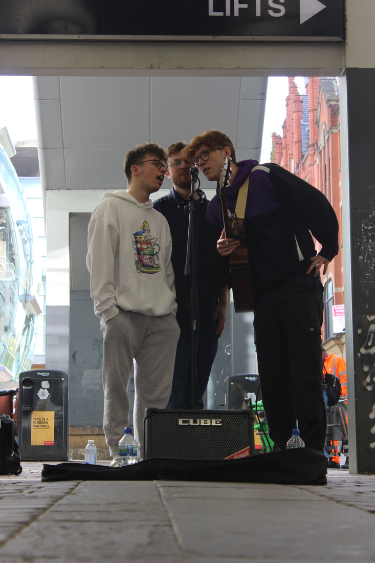
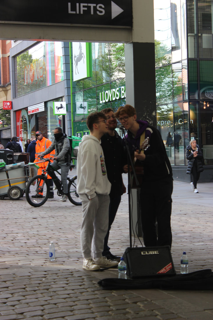
I found this image to be my best from this part of the shoot for many reasons, the angle at which I captured the photo was very low and the centralization of the 3 men with the speaker and microphone helps place them into this image naturally are some of the best parts of the photo. The camera settings that I had been using through the day kept changing, I was constantly changing my ISO, but at this point I was on Auto for this shot. My shutter speed was at around 1/1000 for this shot too, the f/stop here as well could've had a variety of options, but I chose to keep the background mostly in focus too, I would estimate an f/stop of f/16.
|
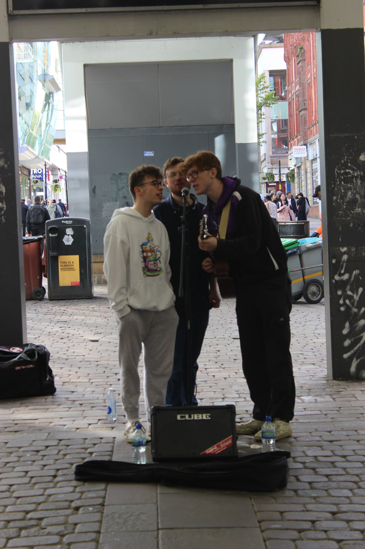
Worst
This image to me was the worst one from this part of the shoot, being one of the more rushed shots due to how little time I really had with the members of the public. The biggest issue I have in this picture is the fact the whole background being in focus, when I intended on my outcome to have the whole background out of focus, not letting in enough light resulted in the aperture being around f/32, this was one of the biggest issues I had throughout the day of this shoot, with some of my photos coming out just off to what I would've wanted to being completely off from what I wanted.
|
Spinningfields - Deansgate-Castlefield

|

|


Best
This one was one of my favourites to me out of all the shoots in general, I kept my ISO on Auto due to how quick I had to keep being with getting these shots, my white balance might've been sunny on this occasion as at this point in the shoot the sun came out more in Manchester. For this shot I tried a more close up angle by going up close behind the piano player, letting his piano playing dominate the image more than him, more to show off his ability but for also for how nice it looked to me. The colour of the white wavelengths on the piano coincidentally also map out well to the white colour of his shirt as well.
|
Worst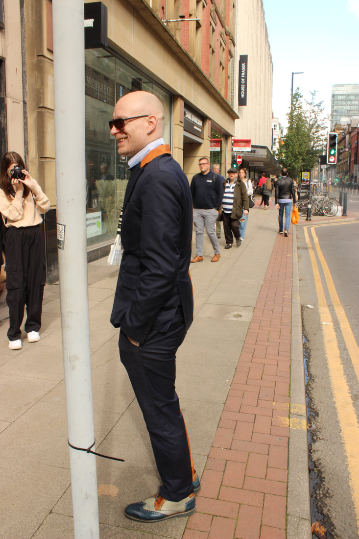
This image was the worst from this part of the shoot for how different and rushed it looks in contrast to the other orange side of his suit, which was two-toned. When comparing both, there are more noticeable problems to me in this image compared to other one, the first one being that unlike the other image, he is more off-centre in the frame, I should've also gotten in closer too as the other image was a more closer up image. I also think I could've avoided accidentally getting one of the other photographers with us that day in this shot, overall to me, there are many things I would correct to make sure that this image compliments the first orange side well.
|
|


|
|
|
|


Best
|
Worst
|
|
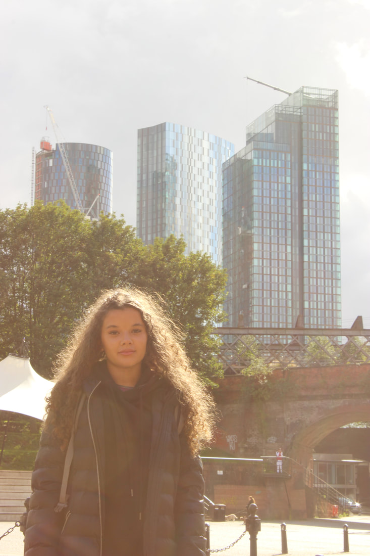
This image was one of the best from this part of the shoot for the how the model was positioned well with the background. Despite the white balance being Shade when it should've been Sunlight, it doesn't take away much from the fact the Manchester skyline behind and the tree and bridges/railroads works as an amazing background, the model being put off centre too means the architecture behind can be shown out more, the ISO here would've been at Auto, with me not really messing with the setting at all at this point in this shoot, keeping the model in focus but also having the background not be completely out of focus could lead to think about an f-stop of f/11-f/16 to be used for this photo.
|
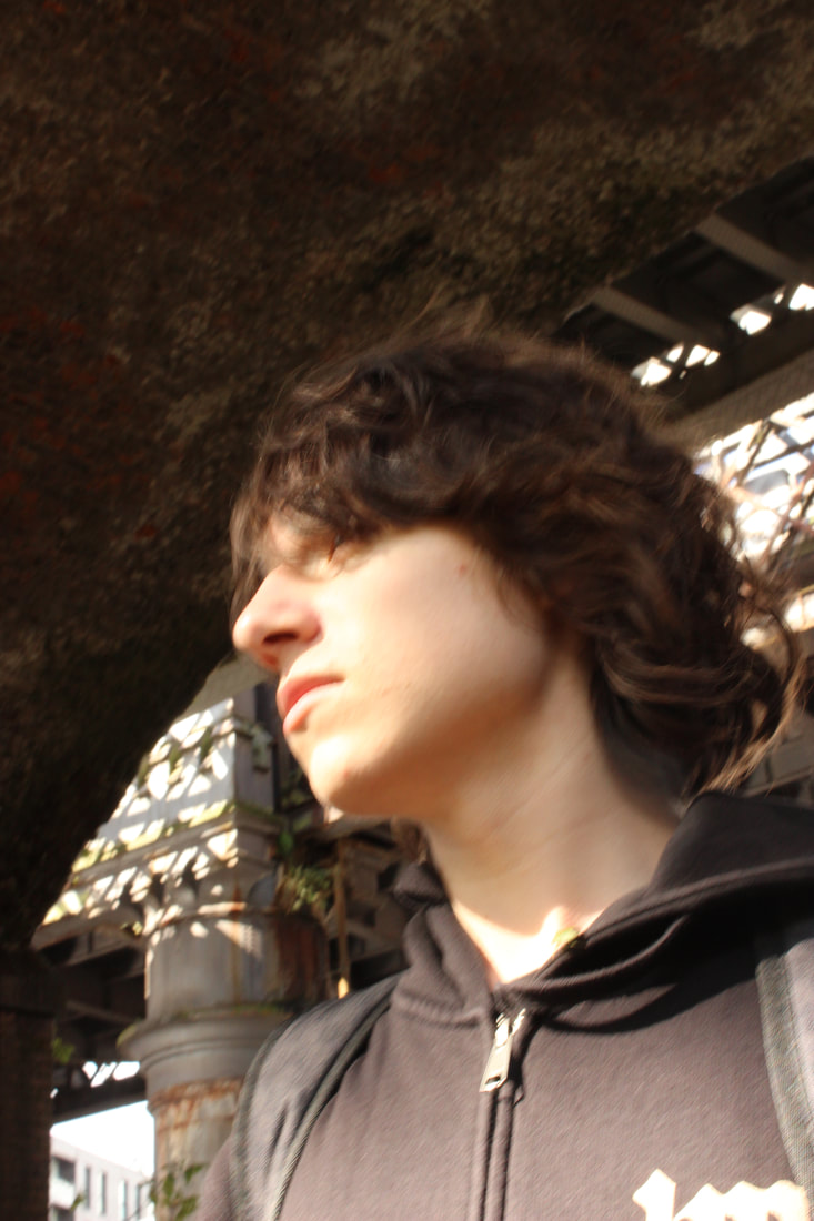
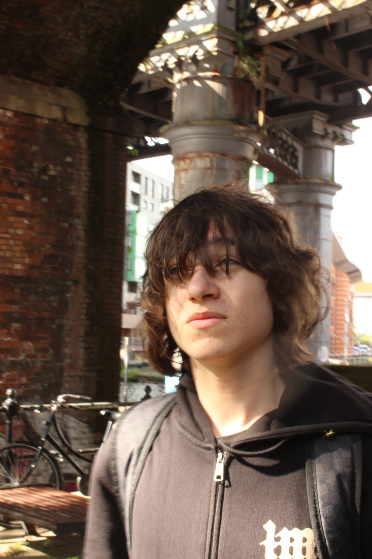
I found this image to be one of the worst images from this part of the shoot mainly for the model being out of focus, while the image came out in good quality, I feel as if I could've done better with the model in focus, as well as that the models expression could've been different. I didn't have as much direction in this shoot with the models I got when out, I wanted to see if letting the model decide would do anything, but I would go back and definitely add my input on what the model could be doing in different shots. The shakiness of the camera also doesn't really fit with the other pictures I got of the model here, the stillness of the camera in those shots helped them bring the model out from the background, making him the central focal point, but the outcome here makes him fall back into the background a little.
|
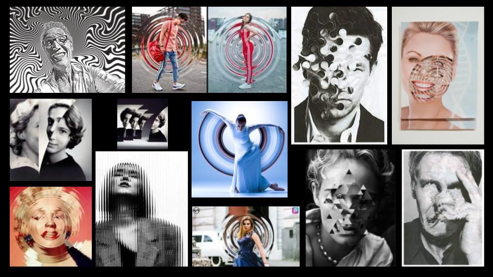
Identity Edit moodboard
Identity Halftone Edit 1
Video I used to help:
Process


Starting Product |
Finished Product |
|
|
|
What I used in Photoshop:
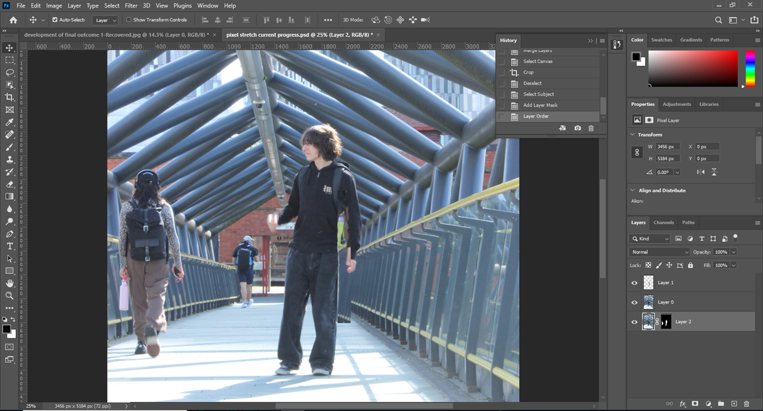
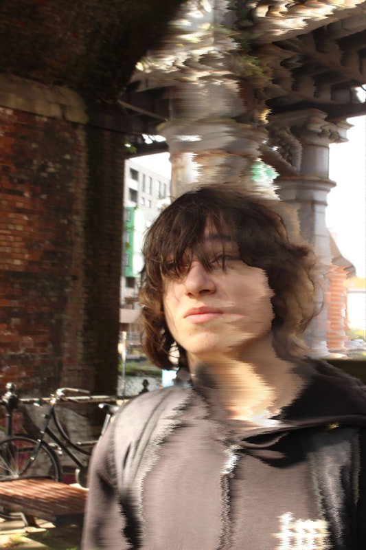
This edit allowed me to use different parts of photoshop that I hadn't really used before this edit, I used the filter gallery and got to understand it more through making this edit, as well as using radial blur for the first time. I found myself also using other tools or commands for the first time like stamp visible, which takes the layers you have selected and puts them all into one layer, tools like these will be useful for future usage as well to make it easier to look between layers. Although I didn't recognise it when making the edit, the outline makes it look like its her fingerprint, which is identity at its basics. At times, I also chose to take my own turns on the edit, I didn't fully follow the tutorial, skipping steps and sometimes making my own, which is why the outcome here compared to the video are so different, the lack of tutorials I could find led me to get creative with the edit. The step I made was using the Iris blur tool instead of the advised field blur, to me I felt like it fit more with the edit and could do more to the outcome, which looking back on now I feel like it did a bit. I really like this edit, even if it wasn't the initial idea in my head, the edit when finished was really nice to me, it's one of my edits that I heavily favour.
Identity Halftone Edit 2
Video I used to help:
Process (Alternative process goes up to the 2nd threshold layer adjustment snip)


Starting Product |
Finished Product |
Alternative Product |

|

|

|
What I used in Photoshop:
This time I used a different tutorial to make this image. I wanted to have an edit with this model in specific, on the shoot he was a great model, his clothing choices too really made it so that he would stand out. This edit though could've come out so much better compared to the finished outcome in the video, It still is a nice finished product but if I could, I would go back and get shots of him in a darker background, therefore I could've maybe had a better image to use for an edit like this. Like the first edit, I was finding myself using new tools or tools that I haven't incorporated into my edits much. Specifically in the adjustments area I used the: black and white, levels, curves and threshold tools in the adjustments are either for the first time or for the first time in a while. I ideally would've liked a better outcome from the final product, but I do think this outcome I have in front of me is nice too, midway through the edit I also decided to use that product I had at the time as a final product too, which is similar but slightly adjusted to what this outcome was, I chose to have it as an alternative outcome when I was messing around and adjusting the threshold layer.
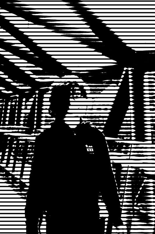
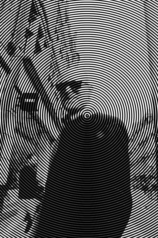
Identity Halftone Edit 3
Video I used to help:
Process(In Illustrator):


Process(In Photoshop):


Starting Product |
Finished Product |
|
|
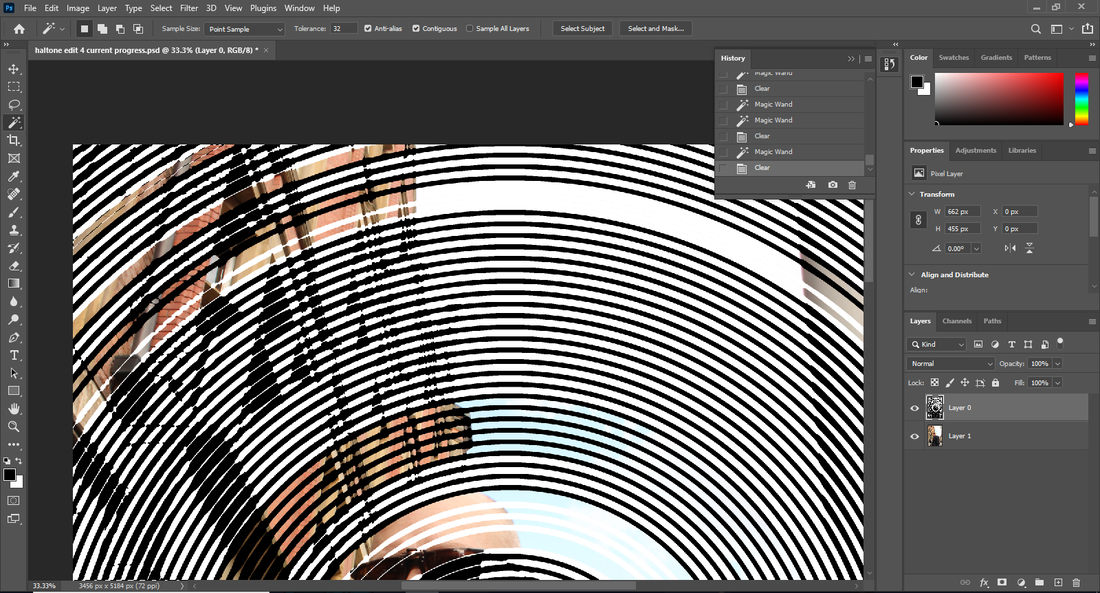
What I used in Photoshop:
This edit went differently than all my edits, out of all the halftone edits here too this was the only non-circular one, choosing 3 different tutorials allowed me to have a variety of halftone here and this edit here is one that I think is alright, I think that I could have another go at making a halftone edit with more darker backgrounds and not using photos from the outdoors, the 2nd and 3rd edits in these had a skewed outcome to what the tutorial showed, skipping some steps in order to keep the edit from becoming too unclear to make anything out here. This edit had me use a completely new program as well, in order to get the lines I used Adobe Illustrator, which I have a slight feel for now. All of these edits have had me experiment more than ever, using new tools as well as programs, on top of that putting my own steps in to shape the edit into more of an edit that fits my ideas. I have been able to take a new direction with how I go about these edits, I do want to come back to halftone edits sometime in the future when I have more ideal photos and closeups.
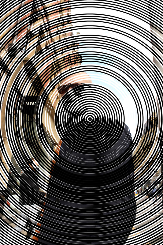
Combined Edit 1
Process:


Starting Product |
Finished Product |
|
|
What I used In Photoshop:
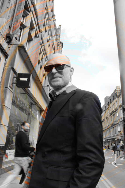
One of the few edits where I havent used a tutorial, instead choosing to go and use the magic wand tool and make this experimental edit, I chose to simplify the snipping process, dues to how long the process would be if I included every single use of the magic wand, I was specific to where I wanted to remove the circular halftone effect. I wanted it to be so that the colour behind the image was seeping through, which after finishing this edit is what I feel I have semi achieved in this edit.
Mock Exam edit:
Mock exam edit progress:


Pixel Sorting Edit 1
Video I used to help:
Process


Starting Product |
Finished Product |
Alternative Product |
|
|
|
|
What I used In Photoshop:
This edit had me again explore new parts of photoshop again, the new part was using the wind tool in the stylise section of the filter tab, which is how I got the distorting outcome. I again made another alternative outcome of this edit too, the only difference being the hard light blending change is applied to the image. I think that with maybe another picture there's potential for this type of edit to go even further, using a longer tutorial too could introduce me to tools I haven't used before either, I would like a good set of 3 edits in pixel sorting and this 1st edit has a final product that makes me confident of doing that, the final and alternative outcome both being equally nice to me.
Pixel Sorting Edit 2
Video I used to help:
Process


Starting Product |
Finished Product |
|
|
What I used In Photoshop:
For this edit I didn't use any new tools, but I was able to get more accustomed to the wind tool in the stylise section of the filter tab again. This edit did require me to work around some issues too, an example being that I needed to trim off extra parts that came with the model when using the quick selection tool to select the model. The difference in the edits that the wind pattern is going downwards and with the modified curves layer as well, this edit has more of a terrifying turn on it. I am generally pleased with this edit though as it isn't a carbon copy from the first edit, they're both pixel sorting edits but these 2 edits I have made show distinct differences in their final outcomes, what they project in connotations too are opposites to me, this edit gathers scary connotations whereas the first one gathers more smooth or tranquil connotations, feelings of calmness.
Pixel Sorting Edit 3
Video I used to help:
Process


Starting Product |
Finished Product |

|
|
Final Gallery
Halftone Edits
|
|
|
|
Pixel Sorting Edits
Alternative edit outcomes

|
|
|
Raw outcome photos
|

|

|

|
Evaluation
When first choosing identity as my student choice project, I had gone into it with the hope that I could capture a wide variety of people who represented themselves differently in many varieties, ranging from physical appearance to social status. As time went on I though I wasn't going to see much progress in general but I now feel that in the end, from the shoots that I have done and models used along with comprised and finished edits, that I have managed to embody and include identity into this student choice project nicely. The photographer I researched definitely helped me get to this point too, I used examples given to me and went on my own research to find my own photographers too, good examples being Theo Gould who I found myself and Marcel Duchamp, a photographer that was shown to me. My themes in identity weren't too specific, I didn't want to limit myself too much, however the models represented themselves I just embraced, I thought as if letting them remain natural in how they casually were forming their own part of what makes them them would make more authentic outcomes in general. I used a lot of the normal angles too, Rule of thirds crept in there a lot, additionally upper-body shots and full-body shots got in here and there, sometimes I would get creative with my shots as well too, but upon reflection there were definitely better ideas in my head that would have panned out into reality so much better. For what I have though, I am satisfied.
My edits were also ones that stood out, I got more experimental and confident in photoshop and along the way even was making my own steps, developing alternate outcomes that got their own edits too, I got more and more confident and comfortable in photoshop from this project, the hope now to naturally understand where some tools are in photoshop now, I know I can get to fully understand the program, I have gotten much more friendly with it over this project which I am happy to claim. Some of the edits that came out too generally satisfied me much more too, I don't think that I hate any of these images much at all. While I never got outrageously experimental over the project, I made sure to get ambitious at times, in my head I was looking at all the angles possible in which to get a shot and to visualise which one would have a really nice outcome depending on if my models were doing anything in the shot. The shot of the singers with the worms eye shot involved me getting right down to the floor dead centrally in the middle of the street so that I would get that outcome in the end, that photo has become one of my favourite images from this project too.
If I had more time I would have definitely gotten out to try do more shoots, the one Manchester shoot enough and missing a school organised shoot meant I had less content to work with on edits, yet I used as many different images as I could and made sure not to repeat models, this would haven't have been as big as a problem either as when I was in Manchester I encouraged myself to leave my comfort zone and asked people to get pictures with me as well, which was something I saw as a big barrier when taking on this project. From this project though, I think I would like people to understand that despite how limited the collage was, different identity always surrounds us, were always with people that hold identity, even if we cant see it, identity runs through everyone and it can even be with other people, identity shouldn't be subject to, it should be open for all.
